| Image |
Comment |
| 06/25/2006 07:26:16 PM |
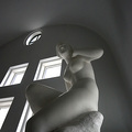
Listenby bbrightComment: ---Greetings from the Critique Club!---
First impression - bold move entering such subtle shadows in a Shadow challenge!
Frankly, I am not a big fan of statues as photo subject matter unless you are doing the lighting. Here the only decision from the photographer is the angle. That said, I do like this angle.
As for the quality of the photo, the natural light and stark walls make for a nice setting. I think you probably suffered in the voting due to the subtleness of the shadows. Most of the higher scoring images had the shadow as the subject or a major element.
I bit more contrast would have giving the image for punch. There is no true black here that I can see. If you use Photoshop, using Levels or Curves you can bring the darkest tone in the photo to pure black.
IMO, while within DPC rules, I recommend that you choose subject that are not someone else’s work of art.
I hope this was helpful. Feel free to contact me if you have any questions.
David
|
 Photographer found comment helpful. Photographer found comment helpful. |
| 06/24/2006 08:45:03 PM |
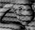
behind the wireby IreneMComment: ---Greetings from the Critique Club!---
First impression - classic French movie feel to this photo.
Meets the challenge - yes, although some voters may have penalized you since the shadow isn't the subject. I think it meets the challenge well. I am saying that based on a few comments on other photos in the challenge. Obviously the commenters on your photo thought it was outstanding. You usually do not see that much difference between the overall score and the commenters' score. This photo the difference is more than 2 points. Some people "got it", others didn't.
I wouldn't change much on this one at all. Excellent job on the black & white. The photo has a real B&W print feel to it. You don't see that often in the digital age. The composition is very good. The lines form the shadow draw the viewer's eyes across the frame to the subjects eyes which are sharp and have a nice glint. The unshaven face and direct light give the viewer a sense of "morning".
Good solid effort that probably would have scored higher in a portrait or photo nior challenge.
I hope this was somewhat helpful. It is hard to critique an image that has little fault to it!
Feel free to contact me if you have any questions.
David
|
| Photographer found comment helpful. |
| 06/24/2006 12:54:22 PM |
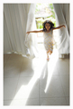
Playful!by davidus428Comment: ---Greetings form the Critique Club!---
First impressions - I may not be a good one to critique this shot since I thought it should have won the blue ribbon. I even left a comment on your image after the voting that states just that.
Meets the challenge - I guess this is where you may have suffered a little in the voting. I feel it met the challenge just fine. Some voters probably wanted to see the shadow as more of the subject. Their loss.
Composition is flawless. The shadow leads the eye to the lovely child and the curtains take you around the rest of the photo. The white blown our area around the subject sets her off nicely and gives the sense of light bursting into the room along with the subject.
The only negative IMO is the wide border. I prefer smaller borders leaving more room for the image.
While a 6.5 score is nothing to sneeze at I thought this was a 7+ picture.
Great job. I hope this was somewhat helpful. It's hard to critique such a strong image!
Feel free to contact me if you have any questions.
David
|
| Photographer found comment helpful. |
| 06/24/2006 12:21:43 AM |
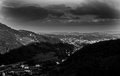
big fat cold dark shadowby gocComment: ---Greetings from the Critique Club!---
First impression - I wish I owned a vineyard! ;-)
Meets the challenge - OK, but . . . the shadow doesn't really add to the quality of the photo, IMO.
While this is indeed a shadow, if not for the challenge category, this picture does not do well on its own. The shadow gets in the way of a really nice scene that is particularly well photographed.
The choice to go black & white was a good one. The burning down in the sky area is a little over done though. The image is clear and crisp but lacks a true focal point. The eyes do not have a place to settle in within the picture area.
It is a nice photo that is exposed well and processed well. I think a more distinct focal point would have helped this entry a lot.
I hope this was helpful. Feel free to contact me if you have any questions.
David
|
| Photographer found comment helpful. |
| 06/23/2006 06:49:25 PM |
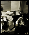
Noirby AghrisComment: ---Greetings from the Critique Club!---
First impressions - Really cool shot!
Meets the challenge - very very well.
I really like the fact that the shadows are not the subject, but the picture would not be as strong without them. The other strong aspect of this shot is the attention to detail. You have that '40s look in every thing from the typewriter to the clothes. The cigar and liquor are nice touches too. Personally. I voted this image higher than any image above it. It might have lost a vote or 2 on the fact that the shadow is not the subject. Some voters may have been strict on that.
The composition is flawless. The eye moves across the entire image allowing the viewer to take in all the detail.
Any score 7+ is rare. You should be very proud.
If there is a negative in my mind it is the wide border. I like borders, but less is more IMO. I would not have taken off for it.
It's hard to find fault with such a strong entry. I hope this was helpful anyway.
Feel free to contact me if you have any questions.
David |
| Photographer found comment helpful. |
| 06/23/2006 05:54:35 PM |
Painting the town redby TheMegalomaniacComment: ---Greetings form the Critique Club!---
First impressions - Great connection with the red wall and the subject.
This is one of the few "shadow only" shots that I think really works. Your high score reflects that.
I like the hot spot where the roller meets the wall, I just don't understand it. Maybe it was done in post processing or may it is just an actual hot spot on the wall. In any case, it looks good at first glance and then it makes me wonder.
I like that you went with a large negative space on this. That was a bold move that paid off. It would have been tempting to crop in tighter on the shadow, but I don't think that would have worked as well.
The texture on the wall works too. The texture gives it a grittier feel that if it were perfectly smooth. It gives the sense of being outside.
All in all a very strong image that the voters liked. Looks like a personal best for you too! Congratulations!
I hope this was helpful. Feel free to contact me if you have any questions.
David
|
| Photographer found comment helpful. |
| 06/23/2006 05:43:14 PM |
the orange also risesby aimeethetooComment: ---Greetings from the Critique Club!---
First impression - WOW! Great idea and execution!
Meets the challenge - perfectly
I like the border although it fights for attention from the image a little too much. Borders are a tricky thing. I use them most of the time, but I find less is more when it comes to borders. Perhaps if it wasn't pure white it would fade back from the main image a bit.
The idea for this shot is brilliant. The orange and sunshine connection works and comes across loud and clear.
The square crop leaves a but too much negative space on top IMO. I get that you were going for the square crop, but I think the image would have been better served with a slight horizontal crop leaving less space on top.
These are nit-picky things for such a strong image. I'm only trying to think of what would have taken this into the top 10 or top 5.
Any score north of 6 is a good score, so you're successful on that account.
Congratulations on your 11th place finish.
I hope this was helpful. Feel free to contact me if you have any questions.
David
|
| Photographer found comment helpful. |
| 06/23/2006 05:18:47 PM |
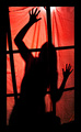
Trappedby PhotoTessComment: ---Greetings from the Critique Club!---
My first impression is that you probably got some low votes on the whole "is it a silhouette or is it a shadow" debate. Personally, I did not vote silhouette images any differently that shadow images, but I know some did.
The thick black border is a little distracting. IMO lees is more on borders. The wrinkles in the backdrop are distracting.
The composition is good. I like the way the frame is filled. The diagonal line created by the hands and arms takes the eye across the whole picture. The red tones add a sense of scariness to the shot. Good choice on the color.
I hope this was helpful. Feel free to contact me if you have any questions.
David
|
| 06/23/2006 03:55:19 PM |
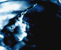
what lurks in the unknown shadows?by nlghttrainComment: ---Greetings from the Critique Club!---
Very interesting photo. I've looked at it for 5 minutes now and I keep seeing new things.
Meeting the challenge - I think you've basically met the challenge. This is surely shadowy. Some voters might have knocked it down a notch because the shadow is not a focal point of the photo. Most of the high scores were for photos that made the shadow the main subject or at least a major element in the photo.
The blues and blacks work very well. Perhaps a bit too much in the black void on the right side; especially when contrasted against the blown out whites in the upper left.
The composition works well as the eye moves across the image area. The only negative is that the end of the drop is not very sharp. The eye follows it up the arc only to get lost in the end.
The photo does a good job of creating texture and mood. This might have scored higher in a different challenge.
I hope this was helpful. Feel free to contact me if you have any questions.
David
|
| Photographer found comment helpful. |
| 06/23/2006 03:44:02 PM |
Sunburst Shadowby igoofryComment: ---Greetings from the Critique Club!---
My first impression is that I like the backlit palm leaf.
Meeting the challenge - This is most likely where your score suffered the most. While shadows are an element here, I don't think they are a strong enough element. IMO the challenge requires that the shadow be a major element of the photo or at least makes the photo better because of its presence. I don't think that happens here.
The busy background isn't helping the aesthetics of your photo either.
The composition is good. I like that the subject is of center. The eye is drawn in then out from the palm. The exposure and the angle are good too.
I think if the shadow element was more prominent this photo would have scored much better.
I hope this helps. Feel free to contact me if you have any questions.
David
|
| Photographer found comment helpful. |
Home -
Challenges -
Community -
League -
Photos -
Cameras -
Lenses -
Learn -
Help -
Terms of Use -
Privacy -
Top ^
DPChallenge, and website content and design, Copyright © 2001-2026 Challenging Technologies, LLC.
All digital photo copyrights belong to the photographers and may not be used without permission.
Current Server Time: 06/12/2026 08:46:55 AM EDT.