| Author | Thread |
|
|
06/26/2006 10:03:48 AM |
this is the work that I can expect from you for now on, correct?
great job. |
|
 Photographer found comment helpful. Photographer found comment helpful. |
|
|
06/23/2006 05:54:35 PM |
---Greetings form the Critique Club!---
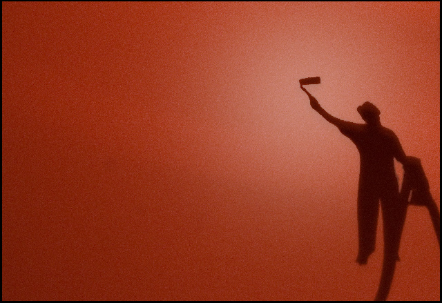
First impressions - Great connection with the red wall and the subject.
This is one of the few "shadow only" shots that I think really works. Your high score reflects that.
I like the hot spot where the roller meets the wall, I just don't understand it. Maybe it was done in post processing or may it is just an actual hot spot on the wall. In any case, it looks good at first glance and then it makes me wonder.
I like that you went with a large negative space on this. That was a bold move that paid off. It would have been tempting to crop in tighter on the shadow, but I don't think that would have worked as well.
The texture on the wall works too. The texture gives it a grittier feel that if it were perfectly smooth. It gives the sense of being outside.
All in all a very strong image that the voters liked. Looks like a personal best for you too! Congratulations!
I hope this was helpful. Feel free to contact me if you have any questions.
David
|
|
| Photographer found comment helpful. |
|
|
06/19/2006 09:35:07 PM |
|
Outstanding composition with a direct message. Congratulations on your top 20 finish. |
|
| Photographer found comment helpful. |
Comments Made During the Challenge  |
|
|
06/18/2006 07:27:54 AM |
|
One of the best in this challenge. |
|
| Photographer found comment helpful. |
|
|
06/17/2006 02:35:53 PM |
|
Love the idea, but there is no indication of being painted. Maybe could've tried taping a piece of cardboard to the top of the roller going to the top of the frame to create the illusion of painting. Still get a good score from me though. |
|
| Photographer found comment helpful. |
|
|
06/17/2006 02:28:54 PM |
|
| Photographer found comment helpful. |
|
|
06/16/2006 04:40:19 PM |
|
Different, clever, nicely executed. |
|
| Photographer found comment helpful. |
|
|
06/16/2006 10:11:04 AM |
|
Wonderful work with the color and comp. |
|
| Photographer found comment helpful. |
|
|
06/15/2006 08:26:27 PM |
|
Simple, yet tells a story. |
|
| Photographer found comment helpful. |
|
|
06/15/2006 07:16:47 AM |
|
| Photographer found comment helpful. |
|
|
06/14/2006 11:47:08 PM |
|
I like alot about this . The comp colors and originality are incredible nice light gradient that adds to the depth. |
|
| Photographer found comment helpful. |
|
|
06/14/2006 07:23:00 PM |
|
| Photographer found comment helpful. |
|
|
06/14/2006 01:24:21 PM |
Simple and so extremely effective. Really great use of the negative space. My fave into voting thus far.
edit: A top10 favorite now :) but still , really great job here.
Hope this does really well. |
|
| Photographer found comment helpful. |
|
|
06/14/2006 10:36:18 AM |
|
This is a great capture. Very creative. Nice used of color. You may want to blend your edges of the shadow a little more. The blure tool does a great job at that. |
|
| Photographer found comment helpful. |
|
|
06/13/2006 08:14:19 PM |
|
I love the simplicity of the composition here. The other thing I really like is the sharpness of the shadow. I've seen lots of entries where the shadow is just too fuzzy to make any impact. |
|
| Photographer found comment helpful. |
|
|
06/13/2006 09:51:02 AM |
|
great title, hope this does well for you as it really suits the challenge 8 |
|
| Photographer found comment helpful. |
|
|
06/13/2006 07:31:44 AM |
|
Really great idea, wish there was a touch more of the ladder in the photo. 8 |
|
| Photographer found comment helpful. |
|
|
06/12/2006 08:57:00 PM |
|
Great idea...and title :) |
|
| Photographer found comment helpful. |
|
|
06/12/2006 08:43:03 PM |
|
I really like this shot. Hopefully, it is a shadow, and not a silouette, this is obviously not the same thing. I am wondering how you did this... |
|
| Photographer found comment helpful. |
|
|
06/12/2006 07:28:38 PM |
I think this is actually a silhouette rather than a shadow, but I can't be sure so I'm giving you the benefit of the doubt.
Nice concept and I like the negative space. |
|
| Photographer found comment helpful. |
|
|
06/12/2006 05:42:33 PM |
Great idea and very well taken
9 from me.
Good luck i would like to see this ribbon
This would normally get a 10 from me, but i have found one shot that really stands out for me.
Kev |
|
| Photographer found comment helpful. |
|
|
06/12/2006 11:06:16 AM |
|
Very cute - nice composition, color and humor. |
|
| Photographer found comment helpful. |
|
|
06/12/2006 08:57:57 AM |
|
very simplistic in presentation,with great effect.... |
|
| Photographer found comment helpful. |
|
|
06/12/2006 12:35:12 AM |
|
| Photographer found comment helpful. |
Home -
Challenges -
Community -
League -
Photos -
Cameras -
Lenses -
Learn -
Help -
Terms of Use -
Privacy -
Top ^
DPChallenge, and website content and design, Copyright © 2001-2026 Challenging Technologies, LLC.
All digital photo copyrights belong to the photographers and may not be used without permission.
Current Server Time: 06/28/2026 05:45:15 AM EDT.