DPChallenge: A Digital Photography Contest You are not logged in. (log in or register
 
Browse Settings
Currently viewing:
Registered Userscarbrd

Show comments:

Per page:

Order:

Comments:


Comments Made by scarbrd
Pages:   ... [135] [136] [137] [138] [139] [140] [141] ... [185]
Showing 1371 - 1380 of ~1846
Image Comment
A Kiss for 10 Toes
07/10/2006 01:28:28 PM
A Kiss for 10 Toes2nd Place
by SandyP

Comment:
Beautiful moment! Not sure if the vignetting helps or not. Eyeleshes give just enough contrast to make the shot work. Nice attention to detail.
Photographer found comment helpful.
untitled
07/10/2006 11:03:19 AM
untitled3rd Place
by Stagolee

Comment:
nicely done. maybe a little too much sharpen, the outline halo on the horizon gives it away.
Photographer found comment helpful.
Connection
07/10/2006 11:01:26 AM
Connection1st Place
by Djabordjabor

Comment:
I like the look, maybe a bit over done though
Photographer found comment helpful.
Crank it all the way up
07/10/2006 10:58:53 AM
Crank it all the way up
by igoofry

Comment:
mine can go to 11! ;-)
Photographer found comment helpful.
Smiling Eyes
07/10/2006 10:58:07 AM
Smiling Eyes
by librodo

Comment:
nice group, looks a little over processed.
Photographer found comment helpful.
summer
07/10/2006 12:14:57 AM
summer1st Place
by ursula

Comment:
Awesome shot. I knew that score would be in the money. Congrats!
Photographer found comment helpful.
Mediocre Break
07/09/2006 01:54:21 AM
Mediocre Break
by freakin_hilarious

Comment:
---Greetings from the Critique Club!---

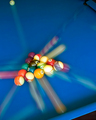
First impression - Nice motion blur, a bit too much Neat Image.

The clean blue table top along with the strong lines of the moving balls is perfect for this challenge. I like that the bulk of the exposure was on the rack before the break.

The composition is very nice, too. The eye is lead around the table by all the lines coming from the rack. The only lacking is some other element to show what caused the motion, a queue stick or hand would have added to the context of the image. I think that is perhaps why another shot along the same lines scored a little higher.

Technically the exposure is right on, just long enough to give a good motion effect. The place of the rack in the frame is right along the rule of thirds. I don't always buy into the rule of thirds thing, but it works well here.

A lighter touch on the Neat Image would go a long way. My rule is, if you can tell Neat Image was used, it was probably used too much.

Congratulations on your new personal best! Keep up the strong work.

I hope this was helpful. Feel free to contact me if you have any questions.

David
Photographer found comment helpful.
Windy
07/08/2006 02:44:58 PM
Windy
by electina

Comment:
---Greetings from the Critique Club!---

First impression - Not much motion going on here

Overall this is a very nice image. I don't think it meets the challenge very well. I don't get a sense of motion even though the hair is blurred due to the slow shutter speed.

There also appears to be dust on you sensor. There are distracting elements in the shadow area of the hair and on the face.

The composition is very good. The eye is an excellent focal point, and cutting the nose and mouth in half emphasizes the hair over the face.

The upper right corner is complete blown out. It doesn't bother me but some of the DPC voters may have issues with it.

Neat Image looks a bit overdone for this image.

This shot probably would have done much better in a different challenge.

I hope this was helpful. Feel free to contact me if you have any questions.

David
Photographer found comment helpful.
Whoosh
07/08/2006 02:29:40 PM
Whoosh
by banmorn

Comment:
---Greetings from the Critique Club!---

First impression - I wish I had a little for to focus on.

The eyes don't really have a place to go. I'm not talking about focus in the sharpness since. The top most flower is where my eyes goes naturally, but it is too close to the top and doesn't bring me back to the rest of the image.

Also there isn't any context to the motion. Not that there has to be, but I don't know why the flowers are moving.

Technically - The choice of colors and lighting are excellent! The black background works very well. The motion blur has a nice linear fell to it. The exposure looks just right.

If this shot had something more than motion for motion's sake, I think it would have done much better.

I hope this was helpful. Feel free to contact me if you have any questions.

David

Photographer found comment helpful.
Death Of A Cucumber, Birth Of A Salad
07/05/2006 11:49:15 PM
Death Of A Cucumber, Birth Of A Salad
by JSAYB

Comment:
---Greetings from the Critique Club!---

First impression - Color correction badly needed.

The yellow cast distracts from the image. It looks like the white balance was set for daylight (5500) and the shot was taken with tungsten lighting (3200). However it was shot this could have been corrected in post processing.

Composition - the bowl on the right doesn't bother me as much as some of the commenters. I think the composition would be improved if the hands and knife and cucumber were moved down in the frame. This would give more of a sense of a downward movement. (IMO, of course)

The concept here is very creative. A little more attention to the composition and the color balance would have garnered a higher score.

David
Photographer found comment helpful.
Pages:   ... [135] [136] [137] [138] [139] [140] [141] ... [185]
Showing 1371 - 1380 of ~1846


Home - Challenges - Community - League - Photos - Cameras - Lenses - Learn - Help - Terms of Use - Privacy - Top ^
DPChallenge, and website content and design, Copyright © 2001-2025 Challenging Technologies, LLC.
All digital photo copyrights belong to the photographers and may not be used without permission.
Current Server Time: 09/08/2025 05:49:38 PM EDT.