| Image |
Comment |
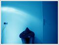
| 12/13/2003 06:03:40 AM |
blueby AesculapiusComment: I like the colour, composition with the door and the plugs as well as the pose of the guy. Technically it looks a little of focus, but maybe that's intended.
I do have a problem to see the challenge topic in it: to me feeling blue is a rather complex thing with many negative thoughts running through ones head. |
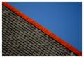
| 12/13/2003 05:59:54 AM |
roof lineby deceptiveComment: I like yours very much: clear structures, clear colour, clear composition but not boring at all. I took a while until I got how to turn the image to understand how the roof is build up. Good luck to you. |
 Photographer found comment helpful. Photographer found comment helpful. |
| 12/13/2003 05:56:09 AM |
A Novice Monk: Simple Life or Simply a Kid?by librodoComment: Wooonderfull! My this weeks favourite! I like the colors, the composition and the pose of the novice. And to me it fits the challenge very well although some people might say that it is not simple in an abstract way, but to me simplicity also means reduction to the essentials and that is shown here very well. Hope you win! |
| Photographer found comment helpful. |
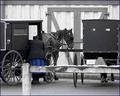
| 12/13/2003 05:55:29 AM |
Simple Lifeby cbellerComment: The connection between Armish-people and simplicity is very straight foreward and thus well choosen. The image itself however is somewhat crowded: one carrige might have been better. Also pure B&W might have been a better choice, because the blue dress attracts the attention of the viewer first, but the dress isn't of interest, or is blue a special armish color? Also, what happend to the head of the wommen, looks like being cut off. |
| Photographer found comment helpful. |
| 12/13/2003 05:45:43 AM |
blindby iraeComment: I like the color, the structure and the graininess. I would have liked it to see a little more, so that even without the title one could realize what it is. Good luck |
| Photographer found comment helpful. |
| 12/13/2003 05:43:26 AM |
Cube and Spotsby oskarComment: Good idea and well composed. Only a little too bright for me and could be also sharper too. |
| Photographer found comment helpful. |
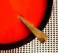
| 12/13/2003 05:09:32 AM |
Soupby TommyMoe21Comment: What a RED! Very strong!
I like the color and the composition very much! What I do not like so much is the background: having it structured in a grid is great, but what I do not like is that you used these rubber-coated stuff. It has a sub-structure (the shadows, variing thicknesses) that attract the attention and leads it away from the main subject. Good luck to you. |
| Photographer found comment helpful. |
| 12/13/2003 05:04:47 AM |
Diaryby KociComment: Fantastic play with light an shadow! Also the compostion is great, especially that it is not fully symmetrical but the distance between the shadows vary. Technically I like very much that the full dynamic range from black to white has been used here and of course it fits the challenge very well. A 9 from me. |
| Photographer found comment helpful. |
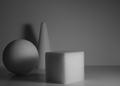
| 12/13/2003 04:31:06 AM |
Primariesby FactoryXComment: Taht's a great concept! Acctually I had something simillar in mid but didn't do so. I like the structure of the bodies and how the light and shadow play on them (for instance the shadow of the cube on the sphere. What I do not like so much is the shadow of the cone in the back: it's not well defined, not sharp and hence should have been avoided. Also the open space on the right is not necessary IMO: a quadratic cropping might have been OK too.
Anyway, your submission fits very well to the challenge and for me it's an 8 |
| Photographer found comment helpful. |
| 12/11/2003 06:58:54 AM |
Bare Symmetryby GPComment: This image for sure fits the challenge very well, however, due to the the very bright background it looks more like a drawing and thus a little flat. A little bit of structure from the wall or a different angel so one can see the 3-dinmensionality might have been better. Still, a 7 from me. |
| Photographer found comment helpful. |
Home -
Challenges -
Community -
League -
Photos -
Cameras -
Lenses -
Learn -
Help -
Terms of Use -
Privacy -
Top ^
DPChallenge, and website content and design, Copyright © 2001-2026 Challenging Technologies, LLC.
All digital photo copyrights belong to the photographers and may not be used without permission.
Current Server Time: 07/16/2026 02:33:26 PM EDT.