| Author | Thread |
Comments Made During the Challenge  |
|
|
12/16/2003 01:26:51 AM |
|
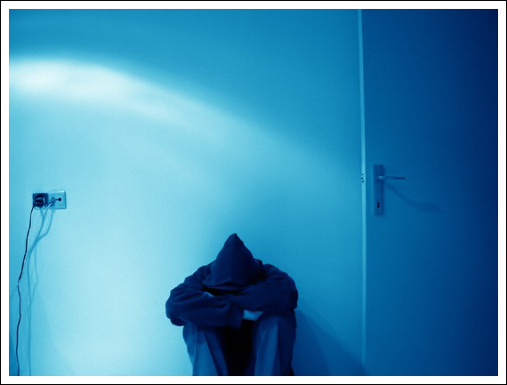
KISS...close the door, shot vertical, close in more on the model and do not include the cable wires |
|
|
|
12/15/2003 09:17:28 PM |
|
I like the blue coloration! The light streak from the left gives a nice effect, but I think the photo would be better if you cropped out the outlet, because it seems out of place. Great photo |
|
|
|
12/13/2003 06:03:40 AM |
I like the colour, composition with the door and the plugs as well as the pose of the guy. Technically it looks a little of focus, but maybe that's intended.
I do have a problem to see the challenge topic in it: to me feeling blue is a rather complex thing with many negative thoughts running through ones head. |
|
|
|
12/13/2003 05:08:14 AM |
|
I like the blue color here. |
|
|
|
12/12/2003 10:33:01 PM |
|
This is anice shot. Focus seems like it could be better. Hard to tell if you were going fro the soft focus look. Also, I would have cropped out the outlets, a bit distracting. |
|
|
|
12/11/2003 01:12:28 AM |
|
I think that this photo would have been more effective sans the power outlet, both aesthetically and for this challenge. Nice photo -7. |
|
|
|
12/10/2003 11:38:40 PM |
|
would be better if the cords where not visible on the lefthand side, in my opinion, the distract from the rest of the image. |
|
|
|
12/10/2003 11:23:49 AM |
|
Closing the door, and getting the outlet out of the frame would have been real cool. You could have cropped it vertically, leaving the subject centered at the bottom and increased your score dramatically. |
|
|
|
12/10/2003 11:05:52 AM |
|
Good use of negative space on top, maybe shift subject to one side or other. Picture says "Loneliness" more than "Simplicity" to me. |
|
|
|
12/10/2003 05:16:54 AM |
Overall interest : 2/3
Technical : 2/3 (great color , good compo but not sure about the electric outlet and the crop bottom of the model, perhaps a bit more sharpness too?)
Challenge fit : 2/2
Wow factor : 1/2 (probably the composition and idea? ) |
|
Home -
Challenges -
Community -
League -
Photos -
Cameras -
Lenses -
Learn -
Help -
Terms of Use -
Privacy -
Top ^
DPChallenge, and website content and design, Copyright © 2001-2026 Challenging Technologies, LLC.
All digital photo copyrights belong to the photographers and may not be used without permission.
Current Server Time: 07/01/2026 04:55:39 PM EDT.