| Author | Thread |
Comments Made During the Challenge  |
|
|
12/16/2003 07:35:53 AM |
|
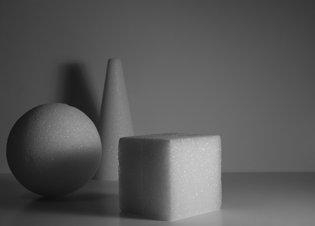
I liked it but looks a bit dark. |
|
 Photographer found comment helpful. Photographer found comment helpful. |
|
|
12/13/2003 04:31:06 AM |
Taht's a great concept! Acctually I had something simillar in mid but didn't do so. I like the structure of the bodies and how the light and shadow play on them (for instance the shadow of the cube on the sphere. What I do not like so much is the shadow of the cone in the back: it's not well defined, not sharp and hence should have been avoided. Also the open space on the right is not necessary IMO: a quadratic cropping might have been OK too.
Anyway, your submission fits very well to the challenge and for me it's an 8 |
|
| Photographer found comment helpful. |
|
|
12/12/2003 01:39:06 PM |
|
|
|
12/12/2003 08:02:45 AM |
+Composition is interesting. Great subject matter. I like the horizontal line going across the shot. Contrast is decent.
-Lighting on the cube is great. I wished that the ball and the cone were as well lit. The shadow off the cone on the wall is a bit distracting.
Score 9 |
|
| Photographer found comment helpful. |
|
|
12/11/2003 11:47:33 PM |
|
|
|
12/11/2003 02:44:56 AM |
|
I like he softness of your shot and the subtlety of the shadows and tint. Good shot! |
|
| Photographer found comment helpful. |
|
|
12/11/2003 12:44:21 AM |
|
Good idea. Good composition. I'm wondering if it would be even better if a second light on the left of the camera maybe a quarter the strength of the main light or maybe just a reflector to clear up a little bit the darkest area. |
|
| Photographer found comment helpful. |
|
|
12/10/2003 05:12:20 PM |
|
A very nice idea for simplicity (would have been GREAT for shapes too) I like the texture and sparkle of the styrofoam as it contracts to the background. Your lighting could be much better. Illuminating each figure equally and from more than one side - a white board to bounce the light back from the left would do well. |
|
| Photographer found comment helpful. |
|
|
12/10/2003 11:57:37 AM |
Technical: Most all images submitted fit the challenge. This one does on several levels. Exposure composition focus lighting all very good.
Personal: I love this! Reminds me of the basics of photography- so many ways to shoot such simple things.
My vote: 8
|
|
| Photographer found comment helpful. |
|
|
12/10/2003 10:19:00 AM |
|
Black and white would have more impact than the gray and gray you've got here. Bump up the contrast, and maybe try for a less static composition and POV. You were on a good track here, but could have pushed it a little to greater effect, IMO. |
|
| Photographer found comment helpful. |
Home -
Challenges -
Community -
League -
Photos -
Cameras -
Lenses -
Learn -
Help -
Terms of Use -
Privacy -
Top ^
DPChallenge, and website content and design, Copyright © 2001-2026 Challenging Technologies, LLC.
All digital photo copyrights belong to the photographers and may not be used without permission.
Current Server Time: 06/28/2026 09:39:44 AM EDT.