| Author | Thread |
|
|
12/17/2003 06:20:45 AM |
|
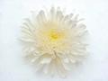
Now I thought this would win - I guess you placed pretty well, but I was sure I was going to see it on the front page. |
|
 Photographer found comment helpful. Photographer found comment helpful. |
Comments Made During the Challenge  |
|
|
12/16/2003 10:42:47 PM |
|
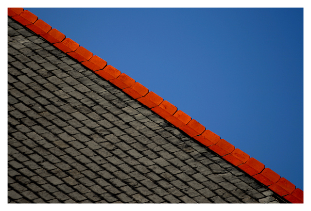
Great colors and texture contrasts, excellent detail, superb composition and you had to go ruin it, at least for me, with a frame and a white one at that. What is it with the frames here, I'll ask again. ALL other sites request that pictures not have frames....why here????? |
|
|
|
12/16/2003 08:27:47 AM |
|
interesting composition, good textures, nice colors especially the red but it doesn't give me a message of simplicity - I am drawn to the textures and lines in a way that is quite complex |
|
| Photographer found comment helpful. |
|
|
12/14/2003 08:12:53 PM |
|
Simple and beautiful, my favourite in this challenge, a 10! |
|
| Photographer found comment helpful. |
|
|
12/14/2003 07:44:35 PM |
|
Pretty simple. Nice choice of shot. Love the colors and the shapes. 7 |
|
| Photographer found comment helpful. |
|
|
12/14/2003 12:46:23 PM |
|
| Photographer found comment helpful. |
|
|
12/13/2003 04:11:42 PM |
|
Excellant attention to framing detail on this image. |
|
| Photographer found comment helpful. |
|
|
12/13/2003 11:04:42 AM |
|
Very good. I like the idea. One thing, because the roof is a much stronger element than the blue sky, I may have had less of it in the shot. I realize that would keep you from having the perfect angle with the red edge. But it might make for a stronger image. 9 |
|
| Photographer found comment helpful. |
|
|
12/13/2003 05:59:54 AM |
|
I like yours very much: clear structures, clear colour, clear composition but not boring at all. I took a while until I got how to turn the image to understand how the roof is build up. Good luck to you. |
|
| Photographer found comment helpful. |
|
|
12/13/2003 03:42:50 AM |
|
Very good picture. Can't be simpler. Very good composition and very well seen. -9- |
|
| Photographer found comment helpful. |
|
|
12/12/2003 06:15:38 PM |
|
Beautiful composition. It's like a photographer's version of Mark Rothko. ...And it reminds me of an idea- you could probably use the same strategy you used creating this photo for representing some world flags! That\'s also what your photo reminds me of. |
|
| Photographer found comment helpful. |
|
|
12/12/2003 02:32:16 PM |
|
The colors, design, angle ... all very nice! |
|
| Photographer found comment helpful. |
|
|
12/12/2003 02:05:43 PM |
|
Love it, the two colored areas separated by the strong red line, running from edge to edge, a simple as it can be. 10 In my top 3 |
|
| Photographer found comment helpful. |
|
|
12/12/2003 11:01:10 AM |
|
| Photographer found comment helpful. |
|
|
12/12/2003 08:10:29 AM |
|
Good eye for colors. I love theo range and blue together. Angle is good too. |
|
| Photographer found comment helpful. |
|
|
12/12/2003 05:17:30 AM |
|
Simple, great colour and angles - 8 |
|
| Photographer found comment helpful. |
|
|
12/12/2003 12:09:38 AM |
|
buenisimo lovely colors 10 |
|
| Photographer found comment helpful. |
|
|
12/11/2003 12:48:03 PM |
These colours are simply great together, and I love the red edge of the roof going in the diagonal. Roof pattern gives a very nice element to the photo and I really can\'t deceide whether this is a roof or stones of a road - well, yes, your title helps me. :-) Take 10 from me!
P.S. What about a one-pixel-wide border between the photo and the white border? Just an idea. |
|
| Photographer found comment helpful. |
|
|
12/11/2003 09:22:21 AM |
Overall interest : 1/3
Technical : 2/3 (too symetric compo IMO)
Challenge fit : 2/2
Wow factor : 1/2 (colors, aestetic ) |
|
|
|
12/11/2003 04:23:08 AM |
|
Love the red/blue contrast. Meets the challenge well. Excellent shot. |
|
| Photographer found comment helpful. |
|
|
12/10/2003 09:08:47 PM |
|
I like great contrast and this is that nice abstract 8 |
|
| Photographer found comment helpful. |
|
|
12/10/2003 03:16:22 PM |
|
awsome. the contrast between the red and blue is very nice. |
|
| Photographer found comment helpful. |
|
|
12/10/2003 01:28:29 PM |
|
I realy like that one, nice colors, creative composition according to the simplicity theme |
|
| Photographer found comment helpful. |
|
|
12/10/2003 12:21:06 PM |
|
Great shot... I like the contrast the red provides. |
|
| Photographer found comment helpful. |
|
|
12/10/2003 06:36:07 AM |
Superbe!!! Bravo ;-)
Biliana |
|
| Photographer found comment helpful. |
Home -
Challenges -
Community -
League -
Photos -
Cameras -
Lenses -
Learn -
Help -
Terms of Use -
Privacy -
Top ^
DPChallenge, and website content and design, Copyright © 2001-2026 Challenging Technologies, LLC.
All digital photo copyrights belong to the photographers and may not be used without permission.
Current Server Time: 06/29/2026 03:58:44 AM EDT.