|
|
|
Showing 5881 - 5890 of ~6008 |
| Image |
Comment |
| 05/09/2003 05:14:42 PM | Looking Outby sagestudioComment: Is this "Umbrella Boy"? This is one of my favourite pictures for this challenge. It's a good shot - the colours are very nice, the hand on the window is almost transparent. I hope you do well. ~9 |  Photographer found comment helpful. Photographer found comment helpful. |
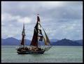
| 05/09/2003 03:20:10 PM | Old School Transportationby smellyfish1002Comment: From the Critique Club
Composition: Well composed photo, meets the challenge without problems. It's a peaceful photo, that reminds the viewer of times past. If anything, the picture could be cropped a bit all around (go in on the ship a bit more).
Colour / Lighting: Muted. The blueish hills in the background are very nice, as is the cloudy sky - both give the picture a real sense of depth. The green/purplish grey of the water beautifully sets off the blues of the hills and sky. The ship is a little dark, almost like a silhouette. I don't know if you tried it, but brightening up the picture a little might have given it more zest.
Focus: Seems a little on the soft side; the movement on the water surface probably intensifies the sense of very slight out of focus.
Frame: The stark black frame adds to the overall muted look. It might be worth it to try a white mat rather than the black one.
In my opinion: Good entry, pleasant to look at, but it's missing the strength, or spark, that you have in another one of your pictures, "A Trip to the Coast". Take care,
Ursula A |
| 05/08/2003 10:36:20 PM | | | Photographer found comment helpful. |
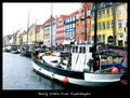
| 05/08/2003 10:34:33 PM | A friendly greeting from Copenhagen!by pollonosComment: Copenhagen must be beautiful. This is one of my favourite entries for this challenge, I like the colours, and the "mood" of the picture - makes me think I would like to sit at a cafe and enjoy the afternoon. | | Photographer found comment helpful. |
| 05/08/2003 05:33:27 PM | Have You Forgottenby blemtComment: Hello, Clara,
Greetings from the Critique Club.
I've been looking at your entry to the "Multi-Image" Challenge, and also at the other two photos you entered before. You must be very proud of your city. I've been to Washington DC twice, and I thought it was a surprisingly beautiful city - somehow I had imagined it much drearier - it actually was airy and beautiful.
On first impression I thought your entry was one picture cut into three images - the images are so well matched, especially the way the arm of the centre image goes over into the left side image. I very much like the different heights and widths of the three pictures.
Also on first impression the composition looks dark - but the more I look at it, the more the black matting, the dark status with the gold highlights, the dark, slightly blurred leaves on the blue/white sky in the background, look to be just right. I think this composition is one of those that would have benefitted from more viewers taking their time in evaluating the entries, but I also think that the individual pictures, as individual pictures, would benefit from better lighting.
The focus of the middle image is good, the two side images seem slightly less in focus, but only so slightly (look at the eyes on the statues). The gold highlights are beautiful. I like how the composition makes your eyes move from left to right, as if I were walking by the monument.
On the side pictures, the edges in some parts seem lost on the black matting. I also find the short lenght of the middle picture somewhat distracting - the arm that extends into the left picture is longer than the torso, the torso looks "cut-off". I'm wondering if it would have worked better to have the bottoms aligned, but keeping the pictures three different heights (tops uneven). Something to try.
Overall, this is a good entry - especially as a composition. I think on an emotional level it probably has a greater impact on Americans than on people from other countries, but anyone in the world should be able to feel the darkness of war and the need to remember the sacrifice of all women and men who defend their countries and their values.
I hope this helps, and I'm looking forward to seeing more of your entries! Take care,
Ursula A
BTW - what monument is this? Is this part of the Korean War Memorial?
PS - I gave it a rather low score during the challenge - sorry, it deserved better. I didn't look at it long enough. Message edited by author 2003-05-08 17:35:18. | | Photographer found comment helpful. |
| 05/08/2003 03:41:46 PM | Washed Up Leafs (out of the playoffs)by rogerspaulComment: Sorry about the Leafs, but "GO SENS!!!!"
Added later - I came back, because it's been bothering me that I left only a short message about the Sens, and not a very nice message at that, without mentioning that I really like your entry. It looks like a "drowning your sorrows" picture, but very nice. Two nitpicks: (1) the graininess of the blue, especially as it contrasts with the very pure blue border; (2) the glare to the bottom left. BTW, I think the border complements the picture quite nicely. I gave it an 8.
| | Photographer found comment helpful. |
| 05/08/2003 03:31:34 PM | Thoroughbred Parkby RLSComment: Greetings from the Critique Club,
It will be difficult for me to comment on this entry as a photo, as it is more "digital art" than photography.
First impressions: It meets the challenge, it is good to look at, I like the vertical arrangement, the border really complements the watercolour/oil pastels look. It's a good entry for this challenge, and your score reflected that.
Composition: Like I said above, I like the vertical arrangement in this case. The very thin white spaces between the pictures are just right. The contrast between the diagonal, colourful middle picture and the horizontal, sepia coloured top and bottom pictures gives a good sense of movement, much more than if the middle picture were by itself. The border is quite appropriate to the composition.
Effects: The effects are pronounced, but in this case they look right, they are not at all overdone. Your score might have suffered because of the post-processing, but, knowing now that the pictures are of statues, not real horses, I think presenting them this way was the better choice.
When you look at this entry from a distance, the top and bottom pictures look more like a "frame" than pictures. It's interesting to look at this entry close-up and from a distance.
I don't know what else to tell you - as it is, this is quite good. You might want to sell it as a poster. I looked at your portfolio, and you have four other multi-image compositions: I think this one is the best of the four. By the way, it is good to know that you weren't standing in the path of the horses when you took the picture!
Keep up the good work!
Ursula A | | Photographer found comment helpful. |
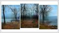
| 05/08/2003 12:08:38 PM | Three Views Around the Lakeby mariomelComment: Greetings from the Critique Club,
This is my first critique, I just joined the Critique Club, and I am so glad your entry came up! The three pictures are beautiful, each could stand on its own, and I think that as a composition the three look even better than individually. Your final score in the challenge attests to this.
The colours of the pictures are very good. The blues and greys are just intense enough to reinforce the calm, foggy mood. The browns, oranges, blacks, and bit of green on the ground set off the blues just right. The silhouettes of trees and land complete the moody tone.
The composition meets the challenge without problem. I like the white background, any other colour would overwhelm. I like the staggered spacing, although I think that these tree pictures could be arranged in a number of different ways and look good together. I like it that the inside spaces (spaces between the pictures) are smaller than the space outside - it works very well here, and helps to pull the three together.
I find the drop-shadows on the individual photos a bit distracting. They look a bit more like a "blur" than like a shadow. You probably added them before resizing the pictures? One possibility would be to resize first, then add the shadows.
The black border line around the three pictures is also a bit distracting IMO, mainly because it lays further back than the pictures (because of the drop-shadows). On the one hand, it pulls the three photos together, on the other hand, it doesn't really add that much. One possibility might be to place the three on the simple white background, no black line, but push them up just a little (as a group), so that the top white space is smaller than the bottom white space - just an idea. I think one could play around for quite a while here.
The best part of this composition is that I can come back to it and look at it over and over, and still like it, still be drawn into it. Congratulations on a job well done!
Ursula I. Abresch
PS - Did you notice that placements number 7, 8, and 9 in this challenge were taken by Canadians?
|
| 05/07/2003 09:30:38 AM | Tasting glassesby funnylooksComment: If your picture were sharp, it would be one of my favourites. The layout and the colours are good, but you need a better camera! | | Photographer found comment helpful. |
| 05/07/2003 09:16:18 AM | Black Coffeeby MonaComment: They talk about Jennifer and Brad, and Madonna, in your country also? | | Photographer found comment helpful. |
|
Showing 5881 - 5890 of ~6008 |
Home -
Challenges -
Community -
League -
Photos -
Cameras -
Lenses -
Learn -
Help -
Terms of Use -
Privacy -
Top ^
DPChallenge, and website content and design, Copyright © 2001-2026 Challenging Technologies, LLC.
All digital photo copyrights belong to the photographers and may not be used without permission.
Current Server Time: 07/17/2026 01:44:57 PM EDT.
|