| Author | Thread |
|
|
05/08/2003 05:33:27 PM |
Hello, Clara,
Greetings from the Critique Club.
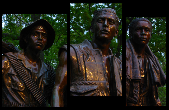
I've been looking at your entry to the "Multi-Image" Challenge, and also at the other two photos you entered before. You must be very proud of your city. I've been to Washington DC twice, and I thought it was a surprisingly beautiful city - somehow I had imagined it much drearier - it actually was airy and beautiful.
On first impression I thought your entry was one picture cut into three images - the images are so well matched, especially the way the arm of the centre image goes over into the left side image. I very much like the different heights and widths of the three pictures.
Also on first impression the composition looks dark - but the more I look at it, the more the black matting, the dark status with the gold highlights, the dark, slightly blurred leaves on the blue/white sky in the background, look to be just right. I think this composition is one of those that would have benefitted from more viewers taking their time in evaluating the entries, but I also think that the individual pictures, as individual pictures, would benefit from better lighting.
The focus of the middle image is good, the two side images seem slightly less in focus, but only so slightly (look at the eyes on the statues). The gold highlights are beautiful. I like how the composition makes your eyes move from left to right, as if I were walking by the monument.
On the side pictures, the edges in some parts seem lost on the black matting. I also find the short lenght of the middle picture somewhat distracting - the arm that extends into the left picture is longer than the torso, the torso looks "cut-off". I'm wondering if it would have worked better to have the bottoms aligned, but keeping the pictures three different heights (tops uneven). Something to try.
Overall, this is a good entry - especially as a composition. I think on an emotional level it probably has a greater impact on Americans than on people from other countries, but anyone in the world should be able to feel the darkness of war and the need to remember the sacrifice of all women and men who defend their countries and their values.
I hope this helps, and I'm looking forward to seeing more of your entries! Take care,
Ursula A
BTW - what monument is this? Is this part of the Korean War Memorial?
PS - I gave it a rather low score during the challenge - sorry, it deserved better. I didn't look at it long enough.
Message edited by author 2003-05-08 17:35:18. |
|
 Photographer found comment helpful. Photographer found comment helpful. |
|
|
05/05/2003 04:27:50 PM |
This was my no. 1 for this challenge. The way the light works is fantastic. I don't think the image is too dark (and there is nothing wrong with my monitor or its calibration), it works very good here. Combined with the light and the foliage in the background it creates the right mood & emotion.
I like it how you positioned the photos, with the arm of the middle man going on in the left one. |
|
| Photographer found comment helpful. |
Comments Made During the Challenge  |
|
|
05/04/2003 11:29:22 PM |
nice idea, however a bit dark.
they are three as a group. but still individuals. you represent that well here. |
|
| Photographer found comment helpful. |
|
|
05/04/2003 01:53:45 PM |
|
Really great idea. I like how the statues kind of blend in tone-wise to the surroundings. A lower point of view would make them appear to be more "heroic." The hightlights on the statues kind of distract somewhat. Focus and DOF works well for me. |
|
| Photographer found comment helpful. |
|
|
05/01/2003 07:18:15 PM |
Nice powerful image, however everything looks too dark
Maybe use a fill flash. Jacko. |
|
| Photographer found comment helpful. |
|
|
04/29/2003 12:06:51 PM |
|
I find the images very dark and the black background makes them even darker. Perhaps a lighter colur BG would help. |
|
| Photographer found comment helpful. |
|
|
04/29/2003 12:29:51 AM |
|
Pretty good... I like the way the arm on the middle image spans the two pictures. Lighting is a little weak but it does have a nice glow (the yellow parts). |
|
| Photographer found comment helpful. |
|
|
04/28/2003 12:34:17 PM |
|
Lovely composition. I think the dark quality to this really enhances the mood. |
|
| Photographer found comment helpful. |
|
|
04/28/2003 10:05:18 AM |
|
Wonderful emotional impact. I like the effect you've created by varying where the images lay in the frame while still keeping with traditional tryptich format. Technically very well done, also. This is just a beautiful shot. 10 |
|
| Photographer found comment helpful. |
|
|
04/28/2003 07:47:01 AM |
|
No, we haven't. I have a shot very much like this one from the same place. |
|
Home -
Challenges -
Community -
League -
Photos -
Cameras -
Lenses -
Learn -
Help -
Terms of Use -
Privacy -
Top ^
DPChallenge, and website content and design, Copyright © 2001-2026 Challenging Technologies, LLC.
All digital photo copyrights belong to the photographers and may not be used without permission.
Current Server Time: 06/28/2026 06:31:31 AM EDT.