|
|
|
Showing 351 - 360 of ~6008 |
| Image |
Comment |
| 08/15/2011 02:28:51 PM | Don't Look Down?by sjhulsComment: I love her expression, and I really like it that the whole outfit is sorta a climbing outfit (although the boots are more hiking boots I think). Good control of light also. What I don't like so much is the rotation. Yes, nothing in the challenge description said you couldn't rotate, but in this case it just doesn't make sense. It simply feels like a gratuitous rotation, to fit the image into the challenge. Sorry. ~5 |  Photographer found comment helpful. Photographer found comment helpful. |
| 08/15/2011 02:27:00 PM | Belleby stantheman1313Comment: Nice play on the challenge topic. Beautiful playful title also. The blues are good, and the little bit of dusk salmon on the horizon makes the image pop. I like the blur of the two people walking up the hill at far left ... it makes the whole scene less static. ~7 | | Photographer found comment helpful. |
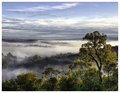
| 08/15/2011 02:24:31 PM | The Stringy-Bark Treeby MargaretNetComment: Beautiful photo. I am not sure how it fits with the challenge though. To my liking, there also is a bit too much sky - trimming it down so that the sky portion is only about 1/3 of the frame works better visually, for me. The sky has a few slightly blown areas that (what I assume is) the HDR treatment doesn't hide. The fog areas are fantastic. ~7 | | Photographer found comment helpful. |
| 08/14/2011 08:06:55 PM | |
| 08/14/2011 05:52:01 PM | Tipping Pointby hahn23Comment: A scene that would normally be photographed in landscape orientation, photographed in portrait mode instead. It's a fit for the challenge.
As a photo though, it's nice, but it isn't a spectacular landscape or action photo. It has a nice Summer memories quality about it. In spite of it being in portrait mode for the challenge, this is one of those that would benefit from being in landscape orientation (as a photo, not as a challenge entry). A tricky challenge for sure :) | | Photographer found comment helpful. |
| 08/14/2011 05:50:21 PM | Speechlessby michaelmonnComment: I am not sure how this addresses the challenge topic except for it being a "portrait" in "landscape" orientation. I guess, as such, it fits.
As to the picture, it's kinda funny. The expression is nice, you got your model to actually try and show speechlessness not only with his hand over his mouth, but also with his eyes - that's excellent! As a portrait though, the light is flat and the background is quite distracting. ~6 | | Photographer found comment helpful. |
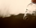
| 08/14/2011 05:47:30 PM | One Man's Trash...by colorcarnivalComment: I love it when people make pictures of everyday objects, and make them look like something spectacular. This is one of those. A simple plastic bottle, but it looks so beautiful here, with that angled bright light coming at it and shining through it, and with the blurred, almost moving background.
The composition is just right. The bottle, personifying an observer, is looking at yet pulling away from a wildish scene, awed to the point of bending backwards by that light. OK, so I'm exaggerating, but that's what it looks like. I love the sharp and more coloured bottle cap, a perfect topper to the whole thing.
As for fit to the challenge topic, like many pictures in the challenge it plays with horizontal/vertical without strongly addressing the topic, but well enough to fit. ~9 | | Photographer found comment helpful. |
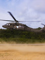
| 08/14/2011 05:12:15 PM | Blackhawkby sinistral_leoComment: I get the idea of what you did here to make this picture fit into the challenge. However, it doesn't really address the topic, but simply fits a picture into the topic, without the picture benefiting from it. In other words, I get what you're doing, but I don't think it worked well for the picture or as an entry to this challenge.
As to the picture itself, from what I can see it is a moment "in between". There is movement, but not enough to make it a movement picture. There are still portions, but they aren't entirely sharp. The background doesn't ad much to the image, the foreground however is beautiful (the blowing up sand and the ground texture). It feels like an action picture waiting for action. I wonder if a slower shutter speed to increase the sense of movement would work, or if, on the other hand, freezing the motion entirely would make a nice contrast between the hovering helicopter and the blown up sand. | | Photographer found comment helpful. |
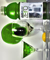
| 08/14/2011 05:06:31 PM | Strange happenings in the refrigerator...by antje1777Comment: For me, this picture didn't work very well either as a picture for the challenge, or as a picture just by itself.
As a challenge entry, the rotation is fine, that is artistic license on the part of the photographer, but to my thinking the rotation has to serve some sort of visual or story purpose to work. In this case, there is neither a visual reason or a story reason to rotate the image. The title, which tries to explain the rotation in a funny manner, is nice, but it doesn't work.
As a picture by itself, again, the rotation is very annoying. Outside of that, the picture is way too tight, and the light is both harsh and not very flattering to the subjects. It is difficult to photograph glass well. If you want to learn to photograph glass, look at the pictures by Irene here at DPC - she's a master at it! |
| 08/14/2011 04:42:03 PM | Just An Old Road IIby TiberiusComment: I like this picture very much. It plays around nicely with verticals and horizontals. It also has beautiful colours and textures. I would guess that some might argue that outside of the challenge, the photo is left hand side too heavy, but I think I like it regardless of it. ~10 | | Photographer found comment helpful. |
|
Showing 351 - 360 of ~6008 |
Home -
Challenges -
Community -
League -
Photos -
Cameras -
Lenses -
Learn -
Help -
Terms of Use -
Privacy -
Top ^
DPChallenge, and website content and design, Copyright © 2001-2026 Challenging Technologies, LLC.
All digital photo copyrights belong to the photographers and may not be used without permission.
Current Server Time: 07/18/2026 02:31:47 AM EDT.
|