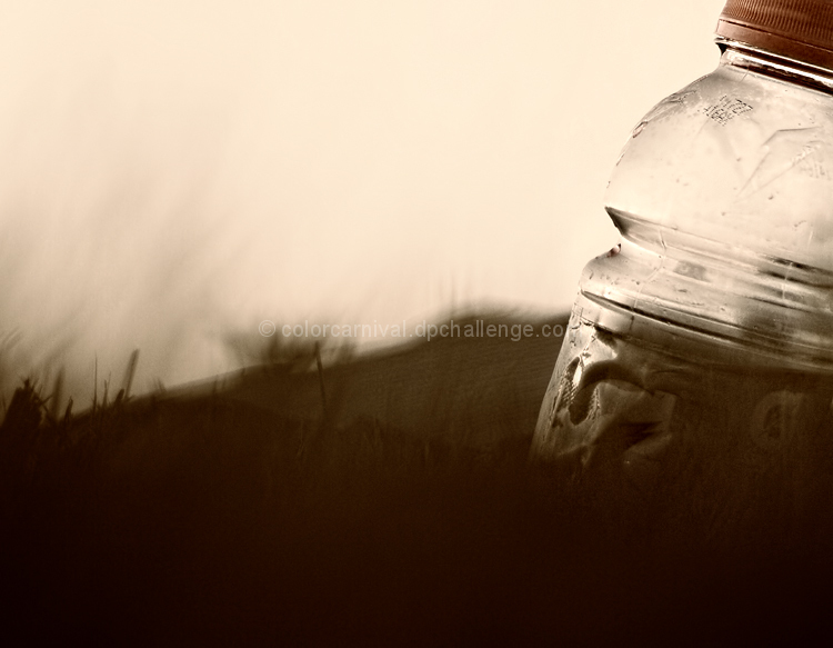
I was thinking that instead of taking a shot and rotating it for the challenge, that it might be more interesting to take a different approach. The idea here was to shoot an object that gets cropped off because of the horizontal plane. Therefore it would have fit better if it was shot in vertical. But I'm thinking that I did not convey that idea well to the majority of the voters. No surprise there really.
And I send love and kisses to all the commenters :)
**************
haha my new fave comment: "I love your trash!" - bvy
Statistics
Place: 79 out of 93 Avg (all users): 5.0673 Avg (commenters): 7.7778 Avg (participants): 5.0256 Avg (non-participants): 5.0923 Views since voting: 700 Views during voting: 209 Votes: 104 Comments: 16 Favorites: 0
I love it when people make pictures of everyday objects, and make them look like something spectacular. This is one of those. A simple plastic bottle, but it looks so beautiful here, with that angled bright light coming at it and shining through it, and with the blurred, almost moving background.
The composition is just right. The bottle, personifying an observer, is looking at yet pulling away from a wildish scene, awed to the point of bending backwards by that light. OK, so I'm exaggerating, but that's what it looks like. I love the sharp and more coloured bottle cap, a perfect topper to the whole thing.
As for fit to the challenge topic, like many pictures in the challenge it plays with horizontal/vertical without strongly addressing the topic, but well enough to fit. ~9






 Add photograph to your favorites
 Add photographer to your favorites


 Photographer found comment helpful.


