|
|
|
Showing 2411 - 2420 of ~6015 |
| Image |
Comment |
| 05/01/2007 11:45:01 AM | crisisby boysetsfireComment: No comment, except, I love it! And you're completely right. |  Photographer found comment helpful. Photographer found comment helpful. |
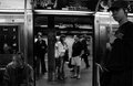
| 05/01/2007 11:38:49 AM | 1by sevilduvarciComment: He, he, I really like the expression of the guy at the bottom left :) As a b/w, it is very b/w, very black in some ways. Kinda graphic. Suits the subject.
As a composition, it's neat, although I'm not sure really what it's getting at. Maybe that's because I live in the country, and don't have much of an understanding of city things. What were you trying to show with this image? | | Photographer found comment helpful. |
| 05/01/2007 11:36:04 AM | Fire Doorby jackal9Comment: The tones look quite nice. I think the image would benefit if all the lettering were sharp (or maybe, the other extreme, just a little bit of it in focus). | | Photographer found comment helpful. |
| 05/01/2007 11:29:40 AM | Day 1 - Evby jonfrommkComment: He looks like he would make a great model (pity he's shy). I like the shape of the eye, it's rather unique. The lashes go straight down. Great skin texture also (I hate all that skin that looks like plastic, this one doesn't).
As a B/W, I think it needs more "umph", more contrast or something like that. It's a bit bland for a b/w. You have some good suggestions below.
As a composition, it's just way too much dead space. It's an interesting concept, to show half a face, but as it is I don't think it really works well. Again, there are some good suggestions below. | | Photographer found comment helpful. |
| 05/01/2007 11:25:41 AM | DAY 1. B&W. full moon ..by rozComment: I think that as a B/W conversion it is nice, the image shows nice grays, the vignette adds interest. As a picture, I'm not sure it's the best choice of picture to convert to B/W. I sort of imagine that this kind of picture could rely heavily on colour for its impact, a dark cross like silhouette in front of a moody ink blue sky with touches of red, white moon in the distance.
As a composition, I don't know, the moon is very small, the back post is somewhat out of focus, and overall the image doesn't have that much interest. I think it's a great idea to work off.
I'm wondering - you converted to B/W in RAW? Your options are more limited converting to B/W in RAW than in PS. You may want to try converting in PS - you probably already have, so what am I talking about :) | | Photographer found comment helpful. |
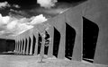
| 05/01/2007 11:11:07 AM | Strongby RetroesqueComment: There are 3 things I really like in this B/W, the sky is very beautiful, the light tree in front of the building offers a good balance to all the man-made structures, the shadows inside the arches (look like little windows). I find the angle at which you took this a bit odd, and I find the grass in front a bit too much of the same (and maybe, just maybe, slightly too bright - sort of like it needs more texture). However, the gentle texture of the cement walls is beautiful. | | Photographer found comment helpful. |
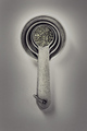
| 04/30/2007 12:06:57 AM | spoonsby mkComment: He, he, good work!!!! Congratulations :) | | Photographer found comment helpful. |
| 04/29/2007 04:51:01 PM | | | Photographer found comment helpful. |
| 04/29/2007 04:50:30 PM | caleb.jpgby wavelengthComment: I like it that you kept the focus on the eye, and I like the expression. IMHO, it is just a tad on the too shallow side. | | Photographer found comment helpful. |
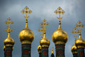
| 04/29/2007 04:49:37 PM | Russiaby LevTComment: Wow! So bright against the clouds. This really must be something to see in real life. | | Photographer found comment helpful. |
|
Showing 2411 - 2420 of ~6015 |
Home -
Challenges -
Community -
League -
Photos -
Cameras -
Lenses -
Learn -
Help -
Terms of Use -
Privacy -
Top ^
DPChallenge, and website content and design, Copyright © 2001-2026 Challenging Technologies, LLC.
All digital photo copyrights belong to the photographers and may not be used without permission.
Current Server Time: 05/05/2026 11:34:53 AM EDT.
|