| Image |
Comment |
| 03/13/2007 07:26:55 AM |
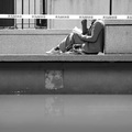
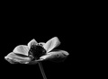
DANGERby yannComment: Hi,
The tonality of the photo is good, there are many contrasting tones that make this photo nice. The lighting and composition of the woman read is good. I will say I did laugh a bit when I saw her head was "cut off" The detail in the photo and overall sharpness of the photo are great as well which is important when dealing with B&W. IMO, however, the overall feel for the photo is its a bit flat. There is nothing in the photo to give a feeling of depth( no strong diagonals or verticals) and the horizontals make this feel for me( again just my honest feel) flat.
Hope this helps,
Rich
|
 Photographer found comment helpful. Photographer found comment helpful. |
| 03/13/2007 07:02:32 AM |
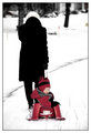
Going Homeby mia67Comment: Nice job with the white balance in the snow, its hard to properly expose in snow when trying to get a candid shot like this one. Good use of the cleared pavement in front of them to create a diagonal to add depth to the photo. I think the composition is good as neither of them are centered and the boy is on the lower 3rd horizontal.DOF maybe could have been a bit deeper to keep the mothers hat in focus, but it really doesnt make a difference.
I like the colorations and tonalities of this photo, it has an overall feel of B&W throughout the contrasts of the photo but has the boy in red as if a selective desaturation was done. This photo shows you have a very good eye for composition, know your camera and that you look for things that stand out or are different in your world.
Nice Job.
Rich |
| Photographer found comment helpful. |
| 03/13/2007 06:50:10 AM |
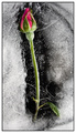
Oblivionby ValdoComment: I was one of the people who rated this shot an 8. I liked the simple effectiveness and sheer beauty overall of the photo. I thought you did a great job conveying the challenge topic, and the composition was very good.
My only thought when I looked at it in voting origionally was that I wished the greens of the stem were a bit darker. I think this would make them pop more and catch the eye better.
Another thing that has nothing to do with my vote, as I understand that people have to work with what objects they have but to make this stronger, IMO, it would help if the leaves of the stem were a bit closer to the rose.
Hope this Helps.
Rich |
| Photographer found comment helpful. |
| 03/13/2007 06:38:23 AM |
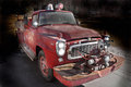
fire engineby guillermo21Comment: Nice Post processing, maybe a bit to close to the truck with the burn tool on the left side. The textured look helps tis photo well as it give a weathered look to the truck, however one suggestion I would make is not to use it on the windshield glass of the truck. Glass will not weather in the same way the metal will and it gives to much uniformity the way it looks now.
The Composition of the photo is good, as you created a diagonal with you subject giving depth to the photo. I would try using the saturation tool in photoshop just to see what this would look like with a bit brighter red tone.
Overall nice job with this technique.
Rich |
| Photographer found comment helpful. |
| 03/12/2007 03:26:43 PM |
Look at Me Please...by KrystleComment: Your idea was good, but here is a few things that would improve this photo:
In the composition, I like that the subject is not centered, but there is a bit to much dead space on the right. Crop to the first black line on the right to remove some of the dead space. Second and simialar, Close out the second red line using photoshop(clone tool)
The lighting is a bit harsh, if you look at the hair on the right side of the head there is little, to no definition to it. A bit of ambient light will give better definition and stop the slight color shift issue here also.
The last 2 items I will comment on are probably where you lost most of your points, they are DOF, in this case more DOF. This would have kept the camera more in focus and not given a soft overall feel to the photo. Also the other item is photo size, From my experience, DPC'ers do not like odd sized photos, they want large, sharp prints that they can look at quickly to pick up the main idea.
Hope this helps, and doesnt discourage. Portraits are difficult and take much time to master. I tend to shy away from them right now as mine do not come out very well either.
Rich |
| Photographer found comment helpful. |
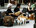
| 03/12/2007 03:00:56 PM |
Proudby TuckersmomComment: This is a nice street photo, the benches create a strong diagpnal that give depth. The dog who is staring at us is just above the lower right 3rd intersect and the girls face is on the upper right 3rd intersect. So the composition is technically good. IMO, the girls face is a bit soft maybe a bit more Dof would have brought out more detail. The only thing I do not like about the overall photo is the pole on the right side.
I think it you were to do a bit of Post processing, like contrast, saturation and maybe a crop to remove the pole, you could have a powerful street image from this.
Rich |
| Photographer found comment helpful. |
| 03/12/2007 02:39:24 PM |
Reaching for the lightby joekentComment: Hi Joe,
Let me start with the composition, I like how the flower is centered onto the lower intersection point of the rule of thirds. IMO it makes the photo techinically stronger than the average center weighted photo. Maybe a small crop of negative space on the right hand side but not to much to upset the postioning. The small diagonal created by the stem adds depth to the photo. But there may have been a bit of oversharping on the upper left side close to the petals and the lighting seems a bit harsh there.
The detail in the flower is very nice, the contrasting bulb and veins of the flower are sharp, in focus and very well light. In B&W the veins certainly help five a feeling of texture to the photo.
Overall an excellent photo to have in a collection. |
| Photographer found comment helpful. |
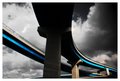
| 03/12/2007 01:18:05 PM |
Kyoto-Nara Expresswayby krglComment: I love the leading line created by the color on the highway. The sky is also very nice. Has a bit of a futuristic feel to it.
Rich |
| Photographer found comment helpful. |
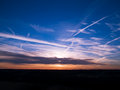
| 03/12/2007 01:12:11 PM |
Sunsetby fireserpentComment: Beautiful colors, nice sky trails. Great shot overall.
Rich |
| Photographer found comment helpful. |
| 03/08/2007 07:34:55 AM |
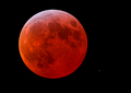
Red Moon Eclipse by CyMaNComment: Great shot, I would have cloned out the star in the lower right. It is to bright and competes with the moon. |
| Photographer found comment helpful. |
Home -
Challenges -
Community -
League -
Photos -
Cameras -
Lenses -
Learn -
Help -
Terms of Use -
Privacy -
Top ^
DPChallenge, and website content and design, Copyright © 2001-2026 Challenging Technologies, LLC.
All digital photo copyrights belong to the photographers and may not be used without permission.
Current Server Time: 06/26/2026 04:56:16 PM EDT.