| Author | Thread |
|
|
03/13/2007 07:26:55 AM |
Hi,
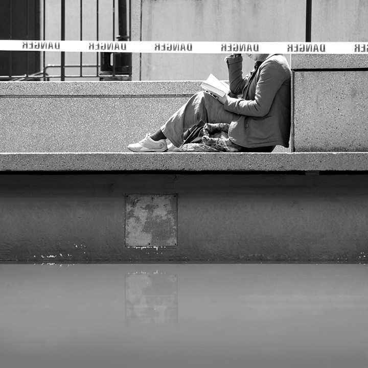
The tonality of the photo is good, there are many contrasting tones that make this photo nice. The lighting and composition of the woman read is good. I will say I did laugh a bit when I saw her head was "cut off" The detail in the photo and overall sharpness of the photo are great as well which is important when dealing with B&W. IMO, however, the overall feel for the photo is its a bit flat. There is nothing in the photo to give a feeling of depth( no strong diagonals or verticals) and the horizontals make this feel for me( again just my honest feel) flat.
Hope this helps,
Rich
|
|
 Photographer found comment helpful. Photographer found comment helpful. |
|
|
01/28/2007 01:31:13 AM |
This image was taken in 2006, I just had the wrong date settings in my camera.
I'm happy to see that at least 1 person found it nice. Hi goc! |
|
Comments Made During the Challenge  |
|
|
01/14/2007 08:09:46 AM |
|
interesting graphic image but I think I'd rather have no person or her head. Its slightly funny with her head cut off like that but not enough to make me really enjoy the image. |
|
| Photographer found comment helpful. |
|
|
01/13/2007 11:11:25 PM |
|
where is the rest of their head? |
|
| Photographer found comment helpful. |
|
|
01/12/2007 04:33:12 PM |
|
this doesn't look finished to me...5 |
|
| Photographer found comment helpful. |
|
|
01/12/2007 12:16:43 PM |
|
it looks like the top of his head is missing but other than that i like it. |
|
| Photographer found comment helpful. |
|
|
01/12/2007 08:29:49 AM |
|
Interesting. I like the linear quailty with the human form to ground it. |
|
| Photographer found comment helpful. |
|
|
01/12/2007 07:26:33 AM |
hmm regnad, It seriously looks like you have lopped off the top of her head.
And by no means is that a bad thing, it is such a calm image yet that regnad sign fkips it on its half lopped off head. I like it. 7 |
|
| Photographer found comment helpful. |
|
|
01/12/2007 04:12:58 AM |
|
AWESOME ! 10 from me ... congratz |
|
| Photographer found comment helpful. |
|
|
01/12/2007 01:07:10 AM |
Best: disorienting surroundings
Worst: Personally, I don't like how you chose to shoot from this angle... |
|
| Photographer found comment helpful. |
Home -
Challenges -
Community -
League -
Photos -
Cameras -
Lenses -
Learn -
Help -
Terms of Use -
Privacy -
Top ^
DPChallenge, and website content and design, Copyright © 2001-2026 Challenging Technologies, LLC.
All digital photo copyrights belong to the photographers and may not be used without permission.
Current Server Time: 06/29/2026 04:46:21 AM EDT.