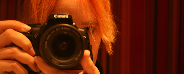
Your idea was good, but here is a few things that would improve this photo:
In the composition, I like that the subject is not centered, but there is a bit to much dead space on the right. Crop to the first black line on the right to remove some of the dead space. Second and simialar, Close out the second red line using photoshop(clone tool)
The lighting is a bit harsh, if you look at the hair on the right side of the head there is little, to no definition to it. A bit of ambient light will give better definition and stop the slight color shift issue here also.
The last 2 items I will comment on are probably where you lost most of your points, they are DOF, in this case more DOF. This would have kept the camera more in focus and not given a soft overall feel to the photo. Also the other item is photo size, From my experience, DPC'ers do not like odd sized photos, they want large, sharp prints that they can look at quickly to pick up the main idea.
Hope this helps, and doesnt discourage. Portraits are difficult and take much time to master. I tend to shy away from them right now as mine do not come out very well either.
Rich |