| Image |
Comment |
| 04/30/2007 04:22:06 PM |
Tulip Timeby scarbrdComment: I like the way the red tulip is there to contrast with the yellow - it lifts the whole set from being "dull yellow flowers" to having some actual interest. Same with the sunburst in the top |
 Photographer found comment helpful. Photographer found comment helpful. |
| 04/30/2007 12:16:10 AM |
Preparing a desperate saladby Rino63Comment: Hi from the Critique Club.
Fit: The shot contains kitchenware so it is a fit for the challenge. I wonder if some voters saw the food as DNMC elements?
Composition: The composition seems ok. We have string lines all leading to the one point. The decorations on the plate do seem to detract from these lines a bit.
Technical: As the commenters have noted, the oversaturation is a bit hard on the eyes! It is a good look in some ways but once we look at the image we find that the oversaturation is not really a key element in the image. The knife and fork seem to be the major elements so the colours seem to be a negative element.
Feel: I like the strong colours and grany feel the image has but the shot as a whole seems to be lacking a string message for me...what is the shot trying to say to me? Not even the title really helps me feel your intent.
PM me if you have any queries |
| Photographer found comment helpful. |
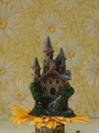
| 04/26/2007 11:02:15 PM |
Kingdom of the Ladybugsby EGoobieComment: Hi from the Critique Club!
There isn't much I can say that hasn't been said by commenters already but I'll try...
Fit: It has bugs so it fits the challenge!
Composition: The "subject" is quite centered and low in the frame. The extra space around the castle doesn't seem to do anything to enhance the image. Getting in closer to fill the frame more may have helped make the bugs stand out more too. It also feel like a leaning castle, is it vertical?
Technical: The lighting is a bit flat. It can be hard to walk the fine line between flat lighting and nasty reflections but in this case we needed more light to pick out the bugs from the castle. You have to really look at the image to find all the bugs.
Feel: I love the idea, antyhing out of the norm is good in my book.
PM me if you have any queries. |
| Photographer found comment helpful. |
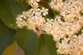
| 04/26/2007 02:45:03 PM |
Gleaning the Bountyby 777STANComment: Hi from the Critique Club.
Fit: There is an insect therre so no DNMC
Composition: The bee is a bit centered in the frame and he's also a bit small.
Technical: With no PP there isn't too much you can do. Minimal Editing means you need to tweak those camera settings before you shoot. In this case I think it needs a bit of contrast and maybe saturation boost?
Feel: There is a nice mix of colours but the bee just doesn't stand out enough from the flowers he is on.
PM me if you have any queries |
| Photographer found comment helpful. |
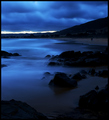
| 04/25/2007 12:39:06 AM |
|
| Photographer found comment helpful. |
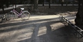
| 04/23/2007 07:55:04 PM |
Its getting dark! Pick me up soon!by libitumComment: Greetings from the Critique Club.
Fit: There is a bicycle in the shot so its meets challenge.
Composition: It feels fine, horizon is level, subject isnt centered. The bike rack on the right distracts a bit from the left of frame where we are supposed to be looking.
Technical: The longs shadows provide a nice emphasis on the bike. The mass of brown is a bit bleak feeling. Increasing the saturation or somehting on the pink may have helped draw the bike out from the browns a bit more (using selective colour not masking)
Feel: The image doesnt relly spek to me in the way that your notes say you intended.
PM me if you have any queries. |
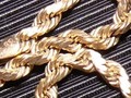
| 04/19/2007 03:46:09 PM |
gold chainby dcb300Comment: Hi from the Critique Club
From the comments Im not sure why you want a critique if the purpose was "just to enter a challenge" but I'll give you my thoughts anyway...
Fit: The image fits the challenge in that it contains chains
Composition: Composition seems ok in that there are strong lines in play.
Technical: First, read the tutorial that levyj413 has linked to. Small images always score low on DPC. The lighting is way too harsh, perhaps overexposed in places too.
Feel: Even if the image was bigger, it doesnt grab me in any way other than saying "chains on fabric".
PM me if you have any queries.
|
| 04/18/2007 02:05:12 AM |
|
| Photographer found comment helpful. |
| 04/17/2007 03:49:16 AM |
Eclipseby fainaComment: Hi from the Critique Club
Fit: This fits the challenge well.
Composition: A composition where the subject is dead centre is always going to be hard. "Dont put the subject in the centre" is a rule, and for a good reason. Our brains seem to like images where the subject is not in the centre.
Technical: I cant find much to fault technically.
Feel: The voters may share my general feeling that while there is nothing too wrong with the image, there is just nothing about it that makes me consider it above average. Hence the 5 votes come rolling in. It's good work for your first entry.
PM me if you have any queries. |
| Photographer found comment helpful. |
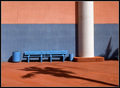
| 04/14/2007 05:22:13 AM |
Resting Placeby robgs57Comment: Hi from the Critique Club!
Composition: The composition is nice but something feels wrong. It's hard to put my finger on it but it could be that while the line between the pink and blue is level, where the wall meets the ground is not, or the balanced feel the pillar and bin gives the image. In any case its not a major but a feeling. I do like the shadow of the tree leading us to the seat and the nicely deliniated colours.
Technical: Not much to say here as the image is mostly nice, simple, and clean. Maybe a bit of cloning out of things such as the "lines" on the pillar near the top or some "things" on the ground.
Feel: I like the image but the score reflects that it doesn't have a "wow" to it. In a challenge with a topic that suited it better I am sure it would score closer to or over 6.
Keep up the good work, this is a great effort for your first entry! PM me if you have any queries.
|
| Photographer found comment helpful. |
Home -
Challenges -
Community -
League -
Photos -
Cameras -
Lenses -
Learn -
Help -
Terms of Use -
Privacy -
Top ^
DPChallenge, and website content and design, Copyright © 2001-2026 Challenging Technologies, LLC.
All digital photo copyrights belong to the photographers and may not be used without permission.
Current Server Time: 07/16/2026 06:01:15 PM EDT.