| Image |
Comment |
| 04/10/2006 01:21:58 AM |
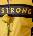
LiveStrongby MelethiaComment: I like this. Somehow the dark lines look a little grainy, but I don't know if that's the fabric or the photograph. This has a nice abstract feel to it, even though like the other commenter I don't know the significance of the yellow rose. |
 Photographer found comment helpful. Photographer found comment helpful. |
| 04/10/2006 01:19:56 AM |
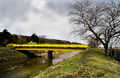
Freshly Paintedby Pug-HComment: Nice composition. What an ugly bridge, lol -- but nice of them to fix it for you just in time for the challenge. Overall this is a good shot. |
| Photographer found comment helpful. |
| 04/10/2006 01:18:42 AM |
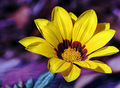
Complementary Flowerby jorrComment: The background is noisy and somehow the purple looks a bit overprocessed to me. Other than that, good composition, nice choice of subject (although I think you probably suffered from low scores simply because there were SO MANY flowers in this challenge, including mine, which suffered similarly). I like the detail in the flower's center. |
| Photographer found comment helpful. |
| 04/10/2006 01:17:02 AM |
Jammy Timeby timfythetooComment: Nice lighting, and especially nice composition. DPCers don't tend to rate family pictures very high, but this is a great one for the album, I think. It captures a nice moment in an artistic way. Even though I loathe Sponge Bob. :) |
| Photographer found comment helpful. |
| 04/10/2006 01:14:42 AM |
Clicheby nards656Comment: Yeah, I can see it's been done a lot, but 5.0? That seems lower than it should be. This is sharp, has good 'pop', is nicely saturated. The only things it has going against it are the slight curve in the top dividing line and the fact that we've seen it done a lot. Not enough to lower the score to where it was in my opinion. Nice shot. |
| Photographer found comment helpful. |
| 04/10/2006 01:12:31 AM |
Yellow IIIby ChinabunComment: I think that's a really nice shot, and I've no idea why it didn't score better. Not that 5.4 is *bad*, but I'd have figured on this one being more in the 5.7ish range. About the only thing I could think to improve it would be a vertical crop but that's just me. |
| Photographer found comment helpful. |
| 04/10/2006 01:10:58 AM |
Still Life In Black and Yellowby olddjComment: The colors are perhaps a wee bit flat and I wish I could see more detail in the carnations. It's also a little noisy, especially in the green. Perhaps that's a camera thing for you, as I notice that you ran noise reduction. I didn't come upon this in the voting, but if I had I'd probably have given it a 5 -- in focus, meets challenge, average image, with slightly flat lighting.
I do really like the composition, though. |
| Photographer found comment helpful. |
| 04/05/2006 02:30:17 AM |
|
| Photographer found comment helpful. |
| 04/05/2006 02:28:00 AM |
Patterns of Lightby JimDComment: Nice! nicely framed, symmetrical, sharp, and visually interesting. I like it. |
| 04/05/2006 02:27:14 AM |
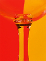
A Prism of Binary Databy ShamanComment: I think this would have been a more compelling image without the CD even in it. Nicely captured, though. |
| Photographer found comment helpful. |
Home -
Challenges -
Community -
League -
Photos -
Cameras -
Lenses -
Learn -
Help -
Terms of Use -
Privacy -
Top ^
DPChallenge, and website content and design, Copyright © 2001-2026 Challenging Technologies, LLC.
All digital photo copyrights belong to the photographers and may not be used without permission.
Current Server Time: 07/22/2026 02:14:57 PM EDT.