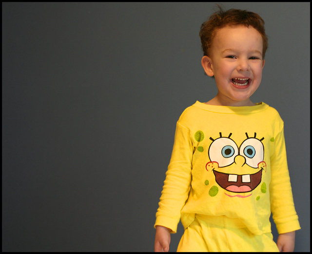
This time I used very little postprocessing (having learned from several past mistakes). I was sitting aorund thinking about yellow and not coming up with anything as my son was running around in his Spongebob jammies. It's not fruit or flowers but it is a kid so I expect to get dinged for it. I like it though. As long as it does better then Melethia I am good (love ya Melethia).
Cropped, saturation, minor cloning on some wall spots, burn, unsharpen mask and border.
Statistics
Place: 198 out of 404 Avg (all users): 5.2321 Avg (commenters): 7.2500 Avg (participants): 5.2500 Avg (non-participants): 5.1875 Views since voting: 1408 Views during voting: 223 Votes: 168 Comments: 16 Favorites: 0
Cute expression!!! SpongeBob is a hit with lots of people, not just the little ones either, I know a few in the late twenties to early thirties that love him. I too think a tighter crop on the left side would have worked a little better, as it stands I find my eyes traveling to that large empty space expecting to see something, which of course pulls my eyes off your cute subject. One other thing, seeing only a portion of his hands distracts me, maybe cropped right at the bottom of the shirt would have worked as the hand on the right side of the picture seems a wee bit soft. Overall cute and definately has yellow
I like kid shots. Don't worry about always pleasing the DPC crowd - they're a fickle lot. This is a nice shot and a great model. Your background is actually pretty good for being just a wall - good light. He's a little off-focus below the middle, but his smile is really the point of the shot. Nice job.
You captured a great shot here - I really like his expression.
Two things caught my attention on the technical side; The white balance looks wrong, it has a feeling of being too 'warm' like it was shot under incandescent light. Also the crop is a bit strange around his thighs. It's an unusual place to chop him off!
Good use of fifths. It's still a bit to the right, but it's pretty close.
Only complaint from me is that it seems a tiny bit too soft (mostly in the hand) and there's a nasty mark in the BG.
A crop in about 10-15% might have righted the composition (this far to the right almost suggests movement to the right to my eye, but this isn't supported by the picture) and lost the hand. It might have looked a bit weird to have sliced them off, but then it draws the attention to the mirrored faces. Tough call. I don't hate the current crop.
My opinion, I like the position but would try cropping off some of the empty space on left side of pic, leaving that beautiful smile closer to 1/3 from right side. Otherwise, nicely done and underappreciated!
I guess this is one of those frequently occurring occasions where I do not understand the voting patterns here! This is a really good shot that deserves a higher mark. Maybe I would have pulled the image across to the centre a tad more but this is such a bright, happy picture that I am not sure it would do that much too it.
Heh - this is way cuter than mine, that's for sure!
I LOVE the expression, and it works very well for the challenge - ie sunny disposition to go with the "yellow" jammies. I realize that moving the person out of the middle is generally more pleasing, but he's too close to the right for me. Just a hair to the left would have made the diff (maybe). The only other constructive crit I can offer is maybe, even though you're a bit gunshy on the post-processing, is to "pop" it a bit more. See what happens if you set the whites of the eyes on SpongeBob as pure white, for instance. But the most important thing is it's a wonderful shot of your kid!
Nice lighting, and especially nice composition. DPCers don't tend to rate family pictures very high, but this is a great one for the album, I think. It captures a nice moment in an artistic way. Even though I loathe Sponge Bob. :)
I am really impressed with the lighting on the background, maybe the cloning helped a lot, but the rest of the pic somehow doesn't match it. The smile is gorgeous :)
A nice expression - the shirt and the girl's smile match right on = )
Focus and composition are both good. Lighting could be improved imho. The shadow under her chin should probably be eliminated, but overall the lighting looks flat to me. The skin tone is a little warm for my taste, yours may be different.






 Add photograph to your favorites
 Add photographer to your favorites

 Photographer found comment helpful.


