| Image |
Comment |
| 04/15/2003 08:03:07 AM |
|
| 04/15/2003 08:02:30 AM |
|
 Photographer found comment helpful. Photographer found comment helpful. |
| 04/14/2003 12:04:45 AM |
|
| Photographer found comment helpful. |
| 04/13/2003 09:41:41 PM |
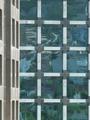
Reflextionsby bmarquezComment: Critique Club Comment:
I think that you have a nice vertical symmetry here. I don't think that all symmetry photo's need to be in landscape mode. I like your subject matter as well. You do suffer from having to take the photo from street level which introduces some interesting angles, but it's not enough to lessen the impact of your shot. I think that boosting the contrast would assist this photo. As it stands now, it's kind of flat. Cropping could be a little tighter. The building has natural crop points and if you used the bottom and top window lines, still including the building on the left, I think you'd have a stronger composition.
Your post processing is good, no artifacts from compression or resize.
I like this image, I would like to see a reshoot with the sun lower in the sky so as to introduce some more interesting colors and shadows. |
| 04/11/2003 05:04:55 PM |
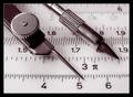
76 Degrees and fallingby boyte1Comment: Critique Club Comment:
Greatings!
This is a nice abstract. I am immediately drawn to the unusual camera angle used. I feel this angle works well as to give the image a more unique quality. The two elements of this shot that may have been tweaked are the oversaturation of the reflected light and the background being light enough to make out the edge of the container. I think the grey isn't bad, just that if it were a true black it might lend itself to better contrast to the thermometer. The hotspot in the blue object seems to overwhelm the picture making the 'glare' the main focal point. This keeps the eye from flowing up to the other one.
Your post processing seems good, no jpeg artifacts or other issues other then your image is only 467 pixels on its longest side. Using the full 640 would help us make out more detail.
This is a nice shot. I wouldn't mind seeing it used again with some new angles and backgrounds. |
| 04/10/2003 03:07:23 PM |
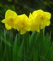
Aloneby AnnidaComment: Critique Club Comment:
Hi Da!
Seems I've seen this before :-) This picture is nice. It has great clarity and focus. ISO100 is nice and crisp. Your aperture of 4.0 gives enough DOF for a sharp foreground and softer background. I think the two things that stand out most is your lighting and subject matter. The DPC voters don't like statues. I've done them myself, and they don't fair well. And, your lighting. I think that it's a little harsh and if it was bounced or diffused some, the glare on the trunk would be lessened and softer. Your composition is nice, there just isn't that WOW that DPC voters look for. You met the competition theme well. I'd like to see some reshoots of this with more dramatic lighting. Maybe lower, or backlight to bring out a deeper mood in the shot. |
| Photographer found comment helpful. |
| 04/08/2003 10:03:38 PM |
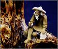
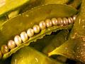
Fresh Sugar Snap Pearlsby GraciousComment: Critique Club Comment:
Hello again :-)
You have a nice composition here. I like the line of pearls and the mix of leafs below them. You already mentioned the few things I was going to comment on. The glare of the light, the color tone and saturation of the leafs, etc. The only other technical aspect would be the focus. It seems off some how. Not blurry really, but just not real sharp. Did you use a tripod for this shot? With that slow of a shutter speed you had to. If so, did you use a remote shutter release or timer? Maybe the focus issue is camera shake when you press the shutter. Your picture doesn't have any compression issues.
This is a nice concept and good composition. I think that as you get a handle on your lighting and colors you will be grabbing many ribbons. |
| 04/07/2003 10:20:36 AM |
Alice's Backdoorby mjf999Comment: A slightly tighter crop would probably make this a stronger composition. I like it a lot though, still a high scorer. -danny |
| 04/07/2003 10:14:49 AM |
Digital Spectrumby moonoComment: Awesome! I like this one a lot. This will for sure be in my top 10 this week. Well composed, nice colors! Great job! -danny |
| Photographer found comment helpful. |
| 04/07/2003 10:05:00 AM |
|
Home -
Challenges -
Community -
League -
Photos -
Cameras -
Lenses -
Learn -
Help -
Terms of Use -
Privacy -
Top ^
DPChallenge, and website content and design, Copyright © 2001-2026 Challenging Technologies, LLC.
All digital photo copyrights belong to the photographers and may not be used without permission.
Current Server Time: 06/11/2026 04:04:00 PM EDT.