| Image |
Comment |
| 07/24/2002 08:07:00 AM |
Gritty Determinationby GeneralEComment: Nice selection of papers, but they are obscured by the boring back of the sheet labeling what I'm seeing. If you laid it out again, with the ali-gator-grit logo where the black sheet is so that the photo was converging lines of color with a snip identifying the item...I think you'd be happier with your composition. |
| 07/22/2002 03:08:00 PM |
Weatheredby MrsKroComment: The color and texture dominant the photo and the challenge - 10 |
| 07/24/2002 07:58:00 AM |
|
 Photographer found comment helpful. Photographer found comment helpful. |
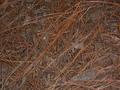
| 07/24/2002 07:57:00 AM |
Strawby rexharrisComment: without a secondary light source, this potentially cool image falls flat. Spend a little more time with the lighting and angle. Drop something interesting in one corner and you'll have a nicer shot. |
| 07/24/2002 03:54:00 PM |
Looks like a Fun Guy.by JonniboyComment: the lighting on this is especially wonderful. The illumination from behind show the delicacy, and yet so does the lighting from the front. With the sharp focus I can see the paper-thin components. Angling the symmetrical lines gives interest and a line for my eye to follow which draws me in, and keeps me in the picture. |
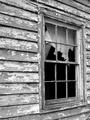
| 07/24/2002 08:02:00 AM |
Aged Eleganceby GotchaComment: I'd love to know where this is - not the US I'm guessing. Beautifully framed, well lit. Very postcard-esque...in a good way. The colors are rich and the mage sharp. Nicely done 9 |
| Photographer found comment helpful. |
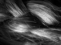
| 07/22/2002 03:16:00 PM |
Highlightsby sylkComment: beautiful text, great highlights. I like the diagonal slant to the braid. 10 |
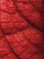
| 07/24/2002 08:20:00 AM |
Cabbageby brumosComment: The photo reminds me of setzler's Foliage submission in its ability to draw out the veins and texture of the botanical specimen. The diagonal veins add a focal point with their shadows to an otherwise wallpapery submission. (I'm not a big fan of wallpaper.) This however is eloquent and nicely done. What happens when you increase the light from behind? Do the colors wash out too much? |
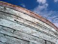
| 07/24/2002 08:23:00 AM |
bowby zacowacoComment: Very evocative and nicely composed. Good detail on the falking paint. The deep blue of the sky and white of the boat are great together. I can almost smell the freshness of a nearby body of water. |
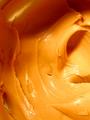
| 07/22/2002 03:13:00 PM |
Damn Skippyby spidermanComment: an extra point for the title. Beautiful portrayal of every day item. Light spots are a tad thin, but damn skippy, it's great. 10 |
Home -
Challenges -
Community -
League -
Photos -
Cameras -
Lenses -
Learn -
Help -
Terms of Use -
Privacy -
Top ^
DPChallenge, and website content and design, Copyright © 2001-2026 Challenging Technologies, LLC.
All digital photo copyrights belong to the photographers and may not be used without permission.
Current Server Time: 07/16/2026 04:54:07 AM EDT.