| Image |
Comment |
| 09/05/2006 09:27:36 AM |
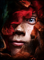
Lost in Timeby DjabordjaborComment: The colors around the face are deep, dark and rich. I really like how the face is peaking out from the folds of the blood red cloth. Lighting on the face is wonderful for you get to see the individual hiding there. The eye. That single, unhidden, stunning aqua blue eye reaches out and captivates us. The stare and color of that blue eye grabs and holds our attention. This is a very strong composition - Not sure how the title relates to the image but I am NOT dinging you down for it. |
 Photographer found comment helpful. Photographer found comment helpful. |
| 09/05/2006 09:16:20 AM |
Summer Loveby KineComment: I can't help but hear the song "Just the two of us" going through my head as I gaze upon this photo. The gold and orange hues are nice warm tones that are visually appealing and invoke the memories of summer days. The two figures in silhouette holding hands adds human interest and the element of romance to the image. My only critique on this image is that the distracting element of the sun flares that appear in the photo. A slight change in angle or position may or may not have eliminated that element. But as it appears here it detracts from the appeal of the photo because it breaks up that nice smooth tonal range of warm orange & gold colors. |
| Photographer found comment helpful. |
| 09/05/2006 09:09:24 AM |
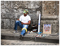
The Artistby ArtanComment: A nice candid capture of a street artist selling and displaying his talent and work. My critique is that I think the composition would be strengthened if you zoomed in or cropped out more of the stone wall surrounding him. Getting closer to the subject and even having him fully dominate the scene would be good because it gives the viewer an up close and personal look. Lastly I think that the composition would have greater visual impact if his face was not in the shadow of the hat - the brim actually covers his eyes. As such that his eyes are hidden from view and his face is not readily visible we don't get to see his expression. Showing the expression on the face would heighten visual interest. Is he lost in thought? Is he concentrating on his painting? We don't know because we can't see his face or eyes. Showing the human expression establishes a connection with the viewer and makes for a more compelling image. |
| Photographer found comment helpful. |
| 09/05/2006 09:01:25 AM |
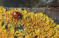
Microcosmby MatthewComment: I like the textures and colors that this composition presents to us. The yellow hues are bold and dominate the scene while there is the added element of color in that splash of red of the ladybug. In this small little ladybug's world it follows a yellow pathway - hmmm, makes me think of Dorothy as she followed the Yellow Brick Road:-)My only critique on this photo is that the top 20% of the image is nothing but negative space that does nothing for the overall composition. I think you could easily crop that out so that the attention stays tightly focused on the ladybug and the yellow plantlife. |
| Photographer found comment helpful. |
| 09/05/2006 08:50:57 AM |
"Tree Hugger"by GivemeashotComment: Butterfly? Moth? I don't see the hairy antenae that is typical with moths, but the coloration and design is that of a typical moth. So I am left wondering if it is a butterfly or moth. O.K. now onto the composition, lighting illuminates this moth/butterfly wonderfully so that we get to see ALL the lovely rich detail of it's color and patterns on it's wings. The composition even gives us the rough texture of the bark of the tree. |
| Photographer found comment helpful. |
| 09/05/2006 08:42:24 AM |
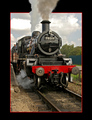
Puffing Billyby MarstonComment: I like the composition and the framing on your subject. You captured the steam engine from an angle that makes it appear that it is approaching the viewer - which always adds visual interest. But you carried the illusion one step further. The steam train's smoke rises out of the frame giving the photo an overall illusion that the train is about to chug right out of the frame and into our living rooms. I also how the frame is outlined by a thin red border that not only pops off the black border but it also compliments the red on the steam engine. |
| Photographer found comment helpful. |
| 09/05/2006 08:34:50 AM |
two ideas for make you smile :)by gastonComment: Wow, those bold and vibrant colors really pop off the page! The colors grab hold of the viewer by the collar and shout look at me! Love the set-up, lighting, and colors of this clown. Love the expression not just on the clown's face but also in his posture. It communicates the thought that he is saying, "I've got two ideas here for you to choose from. Pick one! Choose one and I will make you laugh." Wonderful work. |
| Photographer found comment helpful. |
| 09/05/2006 08:29:45 AM |
Monarch of the Thistleby mpreslarComment: Presentation in this photo is clean and sharp. The butterfly and thistle really pop off the page because of the stark white background. Sharpness of focus shows all the lovely details of the Monarch and the thistle. |
| Photographer found comment helpful. |
| 09/05/2006 12:38:32 AM |
I'm watching youby NuzzerComment: That wonderfully tight crop ensures that our eyes will become captivated by those vibrant & staring yellow cat eyes! Those bold & vibrant yellow eyes just 'pop' visually off the page and grabs our attention. The close-up also gives us some nice sharp details - such as the hair of the cat and the whiskers. |
| Photographer found comment helpful. |
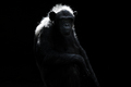
| 09/05/2006 12:31:30 AM |
Alpha Maleby babylonComment: I like how the light shining done on the chimp seems to illuminate and make the top half of him glow. It is that illuminating light that seperates his shape from the overall black background. I think the composition suffers from being a tad too dark because the chimp is surrounded in a sea of darkness. Negative space can be good for a composition but it doesn't seem to add anything to this one. The bottom half of the chimp all but disappears in the black background and his eyes are lost in deep shadow. Closer crop to make the male chimp the main focus of the image would greatly improve visual appeal. Giving us an up close & personal look at your subject tends to increase visual appeal. Also, playing with levels and/or brightness/contrast may yeild some more details of the chimp's face and maybe even make his eyes visible. |
Home -
Challenges -
Community -
League -
Photos -
Cameras -
Lenses -
Learn -
Help -
Terms of Use -
Privacy -
Top ^
DPChallenge, and website content and design, Copyright © 2001-2026 Challenging Technologies, LLC.
All digital photo copyrights belong to the photographers and may not be used without permission.
Current Server Time: 06/11/2026 09:43:18 PM EDT.