| Image |
Comment |
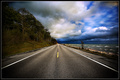
| 09/21/2007 11:56:00 AM |
Into the Stormby shamerComment: A very lovely emulation of the original. While the original is of the desert yours is like the seaside companion to the piece. Love the colors of the threatening storm and the white caps you can see on the ocean surface - really gives an ominous feeling of a storm threatening as we travel this road. I don't have any suggestions on how to improve this other than I think the treelined side of the road could be more visible. Playing with either Brightness/Contrast or Gamma levels could correct this issue. |
 Photographer found comment helpful. Photographer found comment helpful. |
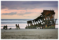
| 09/21/2007 11:48:32 AM |
A Ships Demise - Tribute ala DrAchooby jenesisComment: Nice early morning color tones, composition of elements, and sharpness of details! While it does not have the soft roll of the waves awash around this decaying boat it is still a wonderfully composed shot. A very lovely emulation on the original - well done. |
| Photographer found comment helpful. |
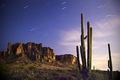
| 09/21/2007 11:36:44 AM |
Monte de Espuma - Second Viewingby Rob OComment: Wow, very lovely capture! I love the clouds, the color hue of the sky and the play of light & shadows along the craggy mountains! Nicely done. My only suggestion on how to improve the visual appeal of this image is to balance the elements a bit more. I think a composition of having the full (you only have the top portion of it) cactus off to far right hand side while the craggy mountains dominate the far left and span to the middle of the shot would be visually stunning. It would provide a full length of elements for the eye to travel across the length of the photo. |
| Photographer found comment helpful. |
| 09/21/2007 11:29:48 AM |
Pool Position by TlemetryComment: An interesting shot but the composition is WAY too busy with so many different colors and patterns. Sometimes less is more. Keeping an image simple and clean in design and composition of elements makes for a much more appealing image. The gold crackle background, the various design patterns in the plates and the two different color flowers stuck on top of one another just makes the eye dance for we have too much color, textures, and patterns here that nothing really stands out. Lighting could be better in that it doesn't seem that everything is illuminated evenly - an overhead light source in addition to the one on the side would evenly illuminate all objects and showcase them more. Lastly the flowers are out of focus while the plate has more detail - focusing on the flowers will make the details of the flower really stand out. |
| Photographer found comment helpful. |
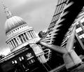
| 09/21/2007 11:16:10 AM |
B&W view of imagineer's Pride of londonby takinou42Comment: Nice angle that provides interesting lines for the eye to follow in the composition. B & W tones are good and you have a nice dynamic range in your composition. The main suggestion I have is that you need better sharpness in that 'bridge'. It is too blurred for the viewer to appreciate the details like we see in the building. I can't tell if it is due to you focusing on the building while moving causing the blur on the bridge or if you need to increase the DOF by using a smaller aperture of (8 or above) so that both foreground and background are in sharp detail. |
| Photographer found comment helpful. |
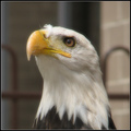
| 09/21/2007 11:09:22 AM |
Icon II (a tribute to Dr. Achoo, from the Soft Focus 2)by david_cComment: Wow, I love how you caught the regal poise of this bald eagle. Sharpness and details especially on the textures of the neck feathers are spectacular! The main problem with this emulating the original is the background. It doesn't appear to have a natural blue sky/green tree background setting that the original appears to have. A zoo shot (which is what I think this may be) tends to be difficult in showcasing the beauty of an animal in it's natural surroundings. I know that you most likely are not able to get this majestic bird without the stone building backdrop so the key would be to increase the bokeh effect. Using an aperture of 2.4 - 4 and a fast shutter speed should blur more of the background - the trick would be to find a correct setting without loosing those wonderful details in your main subject. Aside from those points this is a great shot. |
| Photographer found comment helpful. |
| 09/21/2007 10:59:37 AM |
Trying to Stand Tall with Nuzzerby LN13Comment: You have some nice color tones that are vibrant and rich hues in this composition. Details and sharpness are really good on this capture. The main flaw I think that takes away from the beauty of this photo is that backlighting on your main subject. The shadows on the petals really do call attention to the flower BUT they are distracting and more importantly we don't get to see the lovely details of texture on the flower petals. A front lighted sunflower would have been a better subject for the light would play evenly across your subject showing us more details in the textures. |
| Photographer found comment helpful. |
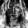
| 09/21/2007 10:39:05 AM |
Tribute to "Dirty"by lovethelightComment: Wow! Great emulation of the original. You have an excellent dynamic range in your B&W tones. The clarity of details in wonderful especially in your model's face. My only critique is that I think you could have zoomed in a bit more to crop it just at neck level. The bottom 2/8 do nothing for the overall composition. Keep the focus squarely on your model by bringing the viewer up close and personal. Wonderful job you did here. |
| Photographer found comment helpful. |
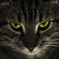
| 09/21/2007 10:34:20 AM |
18 months (a prelude to Yanko's 18 years)by skewsmeComment: Your composition is an above average pet portrait shot. But there are a few things that need improvement to move this out of an above average shot to a stellar shot. In the original it is the amber golden glow of the cat's eyes that draw the viewer in for they are very hypnotic. While the colors of this cat's eyes are vibrant and bold it lacks that hypnotic amber glow because of the slight green tinge in the eyes. Lighting could be better so that all portions of this feline's face are evenly illuminated. The nose of the cat gets lost in the shadows. Another area that needs a tad more improvement is the sharpness in the details of this feline. The lack of sharpness is most noticeable on the whiskers of the cat. A higher aperture (6.3 and above)and an ISO of 50-100 will give you a sharper DOF and greater detail. Of course, you would have to use a slower shutter speed and cat's can be notorious for not cooperating when you want them too:-) |
| Photographer found comment helpful. |
| 09/21/2007 10:24:59 AM |
iBook - Blue Ribbon winner for Paper 7/11/2007 - 7/17/2007 Challengeby JaimeVinasComment: Your lighting, sharpness and details are good in this composition. But there are a few things you can do to improve the visual impact of the composition. First is to change the angle slightly. To me, it looks like the camera is positioned slightly above the apple rather than at eye level to it. Placing the main element at eye level will make it easier for the viewer to 'read' the pages. In addition you need to angle the open wedge of this apple a bit more away from the viewer so that the pages are a bit more readable. In your composition they are at an angle that does not make them easy to see. Kudos for trying to make the edges nice, sharp and rounded to conform to the shape of the apple. There are a little rough edges here. For your viewers to 'bite' that the pages naturally belong in the apple it really has to look the part. Sometimes the devil is in the details. Rounding off the edges of the book pages to be nice & sharp as well as cleanly rounded (not an easy task I'm sure) will pay off in the end. None-the-less a good emulation on the original. |
| Photographer found comment helpful. |
Home -
Challenges -
Community -
League -
Photos -
Cameras -
Lenses -
Learn -
Help -
Terms of Use -
Privacy -
Top ^
DPChallenge, and website content and design, Copyright © 2001-2026 Challenging Technologies, LLC.
All digital photo copyrights belong to the photographers and may not be used without permission.
Current Server Time: 06/18/2026 11:27:59 PM EDT.