| Image |
Comment |
| 05/07/2006 12:08:44 AM |
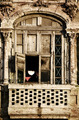
Underwear and evening sunby gudbjargarsonComment: ::: Critique Club :::
Hi, my name is Kari and from the critique club.
Interesting to do a critique on your image but it is difficult if you don't give us any information in your photographers comments. When we do a critique, we go past just the photographic result, that's what voters comments do. The critique looks at what you were trying to achieve, how you wanted it to look and what issues you had in getting the image captured and ready for voting.
First Impression - the most important one:
Well done, love the framing and cropping to definately play the shot.
Composition:
hard to do a not centred shot here, nice that you have cropped to the frame and better that they hang their knickers if a single frame.
Subject:
Meets the challenge extremely well.
Technical (Colour and light):
Here i felt it may be a little overcontrasted .. but I have no idea what you were after with this shot without your comments ...
To grow its vote?:
Look at the comments you got .. this is a great shot ... every thinks something different ... not sure how to improve really.
Summary:
Great shot .. nice to at least see it on your profiles front page.
If you've got any questions about this critique, please feel free to contact me via the PM system.
Cheers
Kari |
 Photographer found comment helpful. Photographer found comment helpful. |
| 05/07/2006 12:03:28 AM |
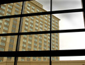
Windows Through The Panesby neophyteComment: ::: Critique Club :::
Hi, my name is Kari and from the critique club.
First Impression - the most important one:
Yup. Have to concur with the other commentors .. it lacks a little on on the interest side.
Composition:
The composition is fine .. and it works for what it is.
Subject:
Meets the challenge.
Technical (Colour and light):
Sharp .. nice colours ... good contrast .. the sky being gray just detracts from the interest .. it is hard that we can't just dictate the weather.
To grow its vote?:
Find a point of interesting which captures the viewer.
Summary:
Solid portfolio shot .. well done ..
If you've got any questions about this critique, please feel free to contact me via the PM system.
Cheers
Kari |
| Photographer found comment helpful. |
| 05/06/2006 11:03:07 PM |
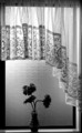
The vaseby trainComment: ::: Critique Club :::
Hi, my name is Kari and from the critique club.
Interesting to do a critique on your image but it is difficult if you don't give us any information in your photographers comments. When we do a critique, we go past just the photographic result, that's what voters comments do. The critique looks at what you were trying to achieve, how you wanted it to look and what issues you had in getting the image captured and ready for voting.
First Impression - the most important one:
Well thought out shot .. seems to be playing on the sillouette .. but I don't think it quite made that ...
Composition:
Not centred ... which I like, I like the drop of the curtain .. looks like the glass in the toilets over here in NZ ... but who cares I am surmising ... the composition it self works well for this shot.
Subject:
Meets the challenge with all the kiwi ingenuity.
Technical (Colour and light):
I know lots thought the black and white worked .. but I am not sure that it does with the use of only backlighting ... unsure really ... I like the silouette type feature and feeling to this shot.
To grow its vote?:
You already know how to ribbon and do better .. but just keep doing really ..
Summary:
Love to see you still doing fantastic as always .. been interesting having the critique what i think is one of our own.
If you've got any questions about this critique, please feel free to contact me via the PM system.
Cheers
Kari |
| Photographer found comment helpful. |
| 05/06/2006 10:57:04 PM |
Enjoying the viewby JudiComment: ::: Critique Club :::
Hi, my name is Kari and from the critique club.
First Impression - the most important one:
Naked man I am always in :) although with the balcony reflections you do wonder if he feels a little jailed ...
Composition:
I really like the crop used here for the two layers of best to finish on the half .. the first play the horizontal thirds ... maybe a little mush cropped at the top .. but not sure about that ... I also think he does support your hobbies really well .. keep him on.
Subject:
Kinda meets the challenge .. the actual reflection in the window seems to create the frame which is a really clever use ...
Technical (Colour and light):
I like this ... good and sharp .. not as grainy as I thought it would be with ISO 500 ... and quite crisp.
To grow its vote?:
include the window frame to get that working ... who cares though this worked it out.
Summary:
I think you have just done great here ... I know what painkillers can do .. so well done.
If you've got any questions about this critique, please feel free to contact me via the PM system.
Cheers
Kari |
| Photographer found comment helpful. |
| 05/06/2006 10:50:16 PM |
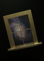
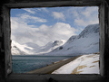
Window on The Universeby dannyleeComment: ::: Critique Club :::
Hi, my name is Kari and from the critique club.
First Impression - the most important one:
I lik this .. the angle works well .. is a little narrow for my taste... also at 406 * 562 the impact is a little lost .. try maximising a little up to 640 on longest side.
Composition:
this works but is a little centred in the frame ... is the horizontal was slightly wider this may have helped.
Subject:
meets the challenge with a lot of invention . .congrats on the "out of box" thinking.
Technical (Colour and light):
I like this .. the galaxy could have been a little brighter .. but it still works .. the flect at the top of the window frame should perhaps not be there.
To grow its vote?:
Maximise the size ... think about the rule of thirds ... and go for it.
Summary:
For the second pic this is great ... keep it up!
If you've got any questions about this critique, please feel free to contact me via the PM system.
Cheers
Kari |
| Photographer found comment helpful. |
| 05/06/2006 10:39:58 PM |
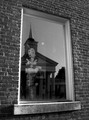
Clock tower through windowby cresusComment: ::: Critique Club :::
Hi, my name is Kari and from the critique club.
First Impression - the most important one:
Good picture, well taken .. a couple of distractions that need a little work.
Composition:
The picture is skewed mildly and I think rotatation to correct this would have helped .. there is a slant .. I am not sure that line you rotated this to previously .. but the tower itself the open window and the frame are not straight - and this struck me on first viewing during voting.
Getting in the whole window frame may have helped .. or pushing the window as wide as possible to remove destration of the dirty glass and the handle ... Just a couple of ideas.
Subject:
Meets the challenge.
Technical (Colour and light):
I thinnk these are fine, but going from the comments received you may no longer .. check out what happens when the contrast is upped .. I think it may kill the picture .. but you never know.
To grow its vote?:
Just play around and see what happens ...
Summary:
Keep on trying you are improving all the time ... can't wait to see more.
If you've got any questions about this critique, please feel free to contact me via the PM system.
Cheers
Kari |
| 05/06/2006 10:29:15 PM |
Abanded view!by birgirComment: ::: Critique Club :::
Hi, my name is Kari and from the critique club.
Interesting to do a critique on your image but it is difficult if you don't give us any information in your photographers comments. When we do a critique, we go past just the photographic result, that's what voters comments do. The critique looks at what you were trying to achieve, how you wanted it to look and what issues you had in getting the image captured and ready for voting.
First Impression - the most important one:
Nice ... well framed lovely colours ... maybe a little small ...
Composition:
I love the leading lines here through the road ... taking the eyes into the thirds.
Subject:
Meets the challenge and does it well.
Technical (Colour and light):
Nice and crisp ... technically a very good shot.
To grow its vote?:
Try maximising the size a little more to create a bigger impact .. we can go up to 640 on the longest side.
Summary:
Well done on the top 10 .. for a more through critique please include details in your photographers comments.
If you've got any questions about this critique, please feel free to contact me via the PM system.
Cheers
Kari |
| Photographer found comment helpful. |
| 05/06/2006 10:24:23 PM |
Bonjour!by ClubJuggleComment: ::: Critique Club :::
Hi, my name is Kari and from the critique club.
I hate getting the site council pics .. but here ya go :)
First Impression - the most important one:
Love the concept .. looks a little unnatural/uncomfortable.
Composition:
This is nicely done, the use of the different panes is ok ... but could have been played further by having the hand fully in the first bottom pane. The model (I know its you) looks uncomfortable ... don't know why as you have photographed yourself before ... oh well.
Subject:
Meets the challenge.. and how does it ... just hang the window from the ceiling .. this is a unique take on the challenge .. at least you got no reflection.
Technical (Colour and light):
Love the colours ... black and white I think may have been overkill ... the strong colours against the white really do work.
To grow its vote?:
Couple of things .. think of yourself as a model when you are ... and what the photographer would say ... loosen up .. relax ... also try several different crops .. this may have worked better using the actual frame as the crop ...
Summary:
I think this is a good shot .. this is also out of the box .. so keep thinking that way.
If you've got any questions about this critique, please feel free to contact me via the PM system.
Cheers
Kari Message edited by author 2006-05-06 22:25:58. |
| Photographer found comment helpful. |
| 05/06/2006 05:00:23 PM |
Through a Glass Darklyby xianartComment: ::: Critique Club :::
Hi, my name is Kari and from the critique club.
First Impression - the most important one:
I love your first statement ... yup cold nudd .. and all that ... I though during voting that this was great .. and now am shown and hopefully you are that it was a fantastic idea and you pulled it off.
Composition:
I really like how you have utilised the window to make the four componants of the picture. With each of the componants having their own piece of the puzzle ... this creates a wonderful illusion.
Subject:
Meets and exceeds the challenge.
Technical (Colour and light):
the colour is good .. the lighting is well done ... I think the frame utilisaion works well. The comments you have recieved sum up other thoughts.
To grow its vote?:
Well this is interesting question ... this sort of shot works for some but not all .. but that can be said of ALL photos which are processed. I don't get the ones and twos ... but hey there are only three of them ... I think we call them trolls ... and then the anti art people will come in ... technically a good shot .. I think you choose the right panal to be clear ... Personally I think that this is great.
Summary:
Love it .. keep it up .. can't wait to see more. Does this pave the way for an exit from team suck????
If you've got any questions about this critique, please feel free to contact me via the PM system.
Cheers
Kari |
| Photographer found comment helpful. |
| 05/06/2006 05:18:53 AM |
Reflections of Justiceby SJCarterComment: ::: Critique Club :::
Hi, my name is Kari and from the critique club.
First Impression - the most important one:
What is the focus .. am I looking at the reflection or the toy .. there is a lots .. if not too much going on here.
Composition:
Hard to tell the two compositions are fighting each other. I think this is where you got hit. You have choosen to focus the reflection in the title .. which tells people what to look at .. but are fully focused on the toy which seems to bug people.
Subject:
Meets the challenge with total gusto.
Technical (Colour and light):
I like the use of black and white if we are focusing on the reflected image .. for the toy I think colour would work. I like the use of natural lighting as well.
To grow its vote?:
Choose a image and create that ... I think you have done ok .. but have confused ... people like to be clear on the picture quite often ..
Summary:
This appears to be a new type of shooting for you .. a risk yes .. but keep challenging yourself you did ok.
If you've got any questions about this critique, please feel free to contact me via the PM system.
Cheers
Kari |
| Photographer found comment helpful. |
Home -
Challenges -
Community -
League -
Photos -
Cameras -
Lenses -
Learn -
Help -
Terms of Use -
Privacy -
Top ^
DPChallenge, and website content and design, Copyright © 2001-2026 Challenging Technologies, LLC.
All digital photo copyrights belong to the photographers and may not be used without permission.
Current Server Time: 07/19/2026 10:46:39 PM EDT.