| Image |
Comment |
| 05/08/2006 03:56:08 AM |
Sunshinyby moniepennyComment: ::: Critique Club :::
Hi, my name is Kari and from the critique club.
First Impression - the most important one:
Such natural colours ... a beautiful portrait.
Composition:
I like this for a portrait ... I would mke mention that the nose looks a little centred in the shot ... making this emphasis a little ... the wyws are almost on thirds .. slight higher crop may have achieved this and removed the emphasis from the nose.
Subject:
meets the challenege and I think is a well formed portrait.
Technical (Colour and light):
As with the other commentors I like that is not too processed and she looks totally human ... its a great change .. although being so young she looks really fresh as well.
To grow its vote?:
take a look at more of librodos shots ... he often uses the forehead to help with the framing as well ... the flowers slightly lower so that her chin is in the chot even with a shallow DOF may have helped complete the fact .. I don't know ... just some thoughts.
Summary:
Good solid shot ... and really deserving of being on the front of your profile.
If you've got any questions about this critique, please feel free to contact me via the PM system.
Cheers
Kari
|
 Photographer found comment helpful. Photographer found comment helpful. |
| 05/08/2006 03:50:37 AM |
Funding the War against the Middle Classby BakerBugComment: ::: Critique Club :::
Hi, my name is Kari and from the critique club.
First Impression - the most important one:
Very clever ... and yes i can see that picture used in the lifestyle and commentary sections of our papers here.
Composition:
plays nice on thirds and uses the leading lines to draw the eye into the picture.
Subject:
meets the challenge ... although I don't think I would like to smell of the cash after :)
Technical (Colour and light):
Natuaral light ... well shot and good DOF to blur the floor.
To grow its vote?:
This is your highest scoring to date and you are learning heaps .. keep taking things on board and thinking outside the square.
Summary:
Great shot .. well done.
If you've got any questions about this critique, please feel free to contact me via the PM system.
Cheers
Kari |
| Photographer found comment helpful. |
| 05/08/2006 03:47:06 AM |
The Fallsby I Enjoy HamComment: ::: Critique Club :::
Hi, my name is Kari and from the critique club.
I'm sorry, but without any input from you in technical details or comments, it's just not possible to critique this image.
When we do a critique, we go past just the photographic result, that's what voters comments do. The critique looks at what you were trying to achieve, how you wanted it to look and what issues you had in getting the image captured and ready for voting.
|
| Photographer found comment helpful. |
| 05/08/2006 03:45:54 AM |
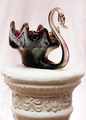
Antique Crystal Swanby fotomann_foreverComment: ::: Critique Club :::
Hi, my name is Kari and from the critique club. But you know all that anyways.
First Impression - the most important one:
OK ... not really my taste ... but a solid studio shot.
Composition:
This I found a little too centered .. just below the middle of the shot is the swan sitting on the mantle ..I would have like a little higher abopve the swan placing the mantel to the thirds ... Also this is cropped quite tight on the mantle .. I know what bugs me is that I would like to see the swan sitting on something a little larger .. e.g. winder .. to help really balance it.
Subject:
Meets the challenge .. hard not to.
Technical (Colour and light):
I think you have done well here ... there is no flaring the from flashes and lighting ... and the bird is quite elegantly lit.
To grow its vote?:
I hate this question ... take a picture of a boat in a pond ... I have no ideas .. this is after all free study .... I believe it is each to their own here ...
Summary:
Just some detracted thoughts .. hope they make a little sense ... I know you were playing here ... but I think that is how we all learn ...
If you've got any questions about this critique, please feel free to contact me via the PM system.
Cheers
Kari |
| Photographer found comment helpful. |
| 05/08/2006 03:40:23 AM |
Yellow / Purple Springby Goldwing_edComment: ::: Critique Club :::
Hi, my name is Kari and from the critique club.
I'm sorry, but without any input from you in technical details or comments, it's just not possible to critique this image.
When we do a critique, we go past just the photographic result, that's what voters comments do. The critique looks at what you were trying to achieve, how you wanted it to look and what issues you had in getting the image captured and ready for voting.
Some hints for the future:
==============Composition ==============
Composition is about leading the eye into an image (painting or photo). Research shows that the eye enters bottom left and travels up to top right ("Leading Lines Rule"). Once in there, the same research tells us that the eye finds comfort when the point of interest (POI) sits on a thirds line or intersection ("the Rule of Thirds").
|
| Photographer found comment helpful. |
| 05/08/2006 02:26:41 AM |
|
| Photographer found comment helpful. |
| 05/08/2006 02:18:46 AM |
|
| Photographer found comment helpful. |
| 05/08/2006 02:18:18 AM |
Displeased & Pretty Cross!by 777STANComment: Really too small a picture ... you should really try to get it 640 on the long side to create a bigger impact. In addition this is a four word title .. |
| Photographer found comment helpful. |
| 05/08/2006 02:16:35 AM |
|
| Photographer found comment helpful. |
| 05/08/2006 02:16:12 AM |
|
| Photographer found comment helpful. |
Home -
Challenges -
Community -
League -
Photos -
Cameras -
Lenses -
Learn -
Help -
Terms of Use -
Privacy -
Top ^
DPChallenge, and website content and design, Copyright © 2001-2026 Challenging Technologies, LLC.
All digital photo copyrights belong to the photographers and may not be used without permission.
Current Server Time: 07/19/2026 06:11:44 AM EDT.