|
|
|
Showing 1871 - 1880 of ~2213 |
| Image |
Comment |
| 01/08/2006 07:22:22 PM | City Lifeby KRAZY2101Comment: With the size of the picture being so small a lot of the impact has been lost. |
| 01/08/2006 07:19:43 PM | Walking with Grandpa by bobdaveantComment: I love the look of that grandpa, I wish I had one of those. What a great short. It is sharp where it needs to be, the only issue is, is the black and white overkill, or as a colour did it not work? |  Photographer found comment helpful. Photographer found comment helpful. |
| 01/07/2006 10:25:07 PM | In the Shadeby kerrangComment: ::: Critique Club :::
Hi, I am Kari and from the critique club.
What a great picture you have taken.
First Impression - the most important one:
The pattern really works, the colours work, and the border complements the picture well.
Composition:
The angle that you have chosen for the lampshade works well to give the pattern required for the challenge. To some degree I wish to see more of the edge of the shade ... but am not sure if that would work.
Subject:
The choice of a lampshade is inspired. I did not actually figure out during scoring that this is what the photo was of.
Technical (Colour and light):
The colours are nicely contrasting. Using a border for this picture has worked well, and unlike some other pictures that I have seen it has not counted against you having one. The lighting and DOF are both very complementary for this shot..
To grow its vote?:
It is a good shot, this is a solid portfolio shot. There are many subjects and treatments that are fine photographs but just don't get a huge popular vote, this is just how things are.
Summary:
The picture is really good, and it works.
If you've got any questions about this critique, please feel free to contact me via the PM system.
Congratulations and well done.
Kari | | Photographer found comment helpful. |
| 01/07/2006 06:51:48 PM | Red & Greenby rigriderComment: ::: Critique Club :::
Hi, I am Kari and am fairly new to the critique club.
What a amazing picture you have taken.
Great to do a critique on your image but it is difficult if you don't give us more information in your photographers comments. When we do a critique, we go past just the photographic result, that's what voters comments do. The critique looks at what you were trying to achieve, how you wanted it to look and what issues you had in getting the image captured and ready for voting. So a few more details helps.
First Impression - the most important one:
I think that this is a great picture, it creates interest, and from the voters comments has creeped out a few people (hehehe) I don't know if that was your intention but I think that is kinda cool.
Composition:
Reading through what has been said and also taking into account some additional factors like that they are frosted balls and not shiny I think that you have done a great job. The use of cotton wool to hold the balls, and the sharpness of the hangers is really good.
Subject:
This truely does meet the challenge and you have a received a lot of comments with it.
Technical (Colour and light):
I love that the colours are so deep and luscious. I think that if you were not trying to freak people out some different angles for the lighting may reduce that impression, but the current lighting gives a good pattern which only adds to this as a challenge contender.
To grow its vote?:
It is a great shot, to increase the score I would look at the lighting angles, maybe even try this with the shiny rather than frosted balls.
Summary:
The picture is cool, it works on so many different levels.
If you've got any questions about this critique, please feel free to contact me via the PM system.
Congratulations and well done.
Kari
| | Photographer found comment helpful. |
| 01/07/2006 04:24:24 PM | Sunriseby photogenixComment: ::: Critique Club :::
Hi, I am Kari and am fairly new to the critique club.
What a lovely picture you chose for the patterns challenge, something new to try with shells.
Great to do a critique on your image but it is difficult if you don't give us any information in your photographers comments. When we do a critique, we go past just the photographic result, that's what voters comments do. The critique looks at what you were trying to achieve, how you wanted it to look and what issues you had in getting the image captured and ready for voting.
First Impression - the most important one:
This is a good picture, it creates interest, but doesn't quite hold it for long.
Composition:
I wonder two things:
Would a slightly wider crop have worked better. Increasing the width of the subject and expanding to incorporate more of the "rays" reaching out.
It is also very centred ... would it have worked with the sunrise coming from the vertical third?
Is the picture slightly oversharpened. There is a lot of grain showing on the shell .. is this due to the level of sharpening used .. it may not be oversharpened, but is a thought - mind you then it may be too soft ... but the sunrise is a soft thing quite often.
Subject:
Excellent choice of subject matter and great use of shell to convey your image.
Technical (Colour and light):
I think that the colouring is nice and deep .. and that the lighting you have use works well for what I think you are aiming for.
To grow its vote?:
It is a well above average shot, I think looking at the crop may have helped in growing the score, just to create a wider appeal to people.
Summary:
Good concept and well executed. The picture itself is nicely balanced and well shot.
If you've got any questions about this critique, please feel free to contact me via the PM system.
Cheers
Kari |
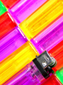
| 01/07/2006 02:49:24 PM | Neon Lightby fotomann_foreverComment: ::: Critique Club :::
Hi, I am Kari and I have just completed the below critique on your image Neon Light as requested.
First Impression - the most important one:
Interesting picture, I remember those lighters from when I used to smoke .... damn that is something that I could have used them for once I quit!
Composition:
This is an interesting image, bright and probably underrated as suggested by your post challenge commentators. I like the leading line that drags my eye up oen lighter and into the other ... and the use of various colours.
Subject:
I think that you have met the challenge and met it well. A good and unusual choice of subject is something I kinda expect from you.
Technical (Colour and light):
It does appear well lit with the light bouncing off the lighters and creating nice bands around the rims. I feel that it is not quite sharp enough ... maybe this is a personal thing.
To grow its vote?:
It deserved better than it got, but I am not sure how much better.
I am wondering if the size of the picture didn't help with if being a bit smaller than 640 .. also did it loose any detail through compression?
Summary:
This is a good concept that you have taken and executed. The picture itself is nicely balanced and well shot.
If you've got any questions about this critique, please feel free to contact me via the PM system.
Cheers.
Kari | | Photographer found comment helpful. |
| 01/07/2006 04:25:13 AM | | | Photographer found comment helpful. |
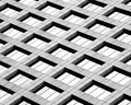
| 01/07/2006 04:12:11 AM | Window Latticeby banmornComment: ::: Critique Club :::
Hi, I am Kari and am fairly new to the critique club.
This is a great image, and that is shown by your fourth placing in the patterns challenge.
Clearly from your body of work this is something that you are clearly good at and have a great eye for.
First Impression - the most important one:
This picture is balanced and is just amazing ... how the hell did he create it.
Composition:
To my eye couldn't really be improved a hell of a lot.
Subject:
Patterns and this definately met that subject extremely well.
Technical (Colour and light):
Nice lighting ... I would love to see the orginal to see how your post editing worked to improve the picture - as this is a good piece of work.
To grow its vote?:
The difference between first and forth is .5 ... perhaps shooting those who gave you 1s would help, but they will have had their reasons ... but that is about all.
Summary:
Fantastic shot, well in your genre ... and you have done well - again.
If you've got any questions about this critique, please feel free to contact me via the PM system.
Congratulations and well done.
Kari | | Photographer found comment helpful. |
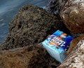
| 01/07/2006 03:05:33 AM | "Light" On The Rocksby LVEComment: ::: Critique Club :::
Hi, I am Kari, I have been issued your photo for the critique club.
Let me start by what an strange finding you have made.
First Impression - the most important one:
I thought this was an interesting photo. The water is either murky or moving, but is not sharp (may be because of the murkiness). The fact that it just looks like a carton washed up and not like the box of beer which is full is an oops for the picture .. .an empty carton is trash/rubbish but bottles of beer is a definate oops.
Composition:
The actual composition is fine, but to make it look more like an oops it would have been good to see something of the bottles ... I think then the viewer would be more engaged.
Subject:
Subject missed slightly as people didn't really get it .. this I think is shown by the voting.
Technical (Colour and light):
Technically is an ok photo. There is a problem with the water but it isn't a major component ... did there need to be more water .. I am not really sure the thing is to try on the picture that you have and see how you can improve.
To grow its vote?:
Showing the actual beer I think would have put it in context for people.
Summary:
This is a good concept that you have taken and executed. The picture itself is nicely balanced.
If you've got any questions about this critique, please feel free to contact me via the PM system.
Cheers
Kari |
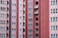
| 01/07/2006 12:47:03 AM | Windowsby Serdar_SariComment: ::: Critique Club :::
Hi, I am Kari and am fairly new to the critique club.
Well that is done, your first entry and to do as well as you did ... you need to be congratulated. You have a fantastic eye and you showed us how to use it in capturing this shot.
You made it to the top half of the voting in the challenge. That is great.
Great fun to do a critique on your image but it is difficult if you don't give us any information in your photographers comments. When we do a critique, we go past just the photographic result, that's what voters comments do. The critique looks at what you were trying to achieve, how you wanted it to look and what issues you had in getting the image captured and ready for voting.
First Impression - the most important one:
You met the challenge and created what I think is an effective entry. But as I go through the critique I have picked up on a couple of things that may help with future entries.
Composition:
This is a well composed shot. In the comments you received it was mentioned that there is someone in the window - in fact there are several people in this shot ... I believe it adds to the reality of your shot.
Subject:
The subject matter chosen really did meet the challenge. Within the shot there are a number of patterns without any of them being so totally imposing to cut out the others.
Technical (Colour and light):
The lighting used in this shot was good, and did not create any problems for the viewer. I did wonder if these buildings ever came into full light as this may have helped in creating a further definition in the picture.
The lines in the photo itself are not sharp and are slightly out of focus. This can be helped by using your photographic programme to sharpen the lines. Sharpen after reduction of the photo.
Also some thought about changing the contrast may assist in the picture not appearing as flat.
To grow its vote?:
I think this is a good first entry. I would look at using your photographic programme to improve what is already a well taken shot.
Summary:
Well done, keep entering and keep learning.
If you've got any questions about this critique, please feel free to contact me via the PM system.
Congratulations and well done.
Kari | | Photographer found comment helpful. |
|
Showing 1871 - 1880 of ~2213 |
Home -
Challenges -
Community -
League -
Photos -
Cameras -
Lenses -
Learn -
Help -
Terms of Use -
Privacy -
Top ^
DPChallenge, and website content and design, Copyright © 2001-2026 Challenging Technologies, LLC.
All digital photo copyrights belong to the photographers and may not be used without permission.
Current Server Time: 07/18/2026 03:20:21 PM EDT.
|