| Image |
Comment |
| 06/09/2003 10:07:49 PM |
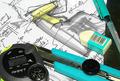
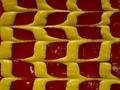
myworkspaceby sanandanComment: Too much happening here. Your eye is not drawn to any particular subject. Very chaotic. Maybe that was your intent. Aside from that the levels/colour/saturation or something is out of whack. I'm commenting on something I know little about. 5 |
 Photographer found comment helpful. Photographer found comment helpful. |
| 06/09/2003 09:59:02 PM |
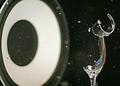
Stampby rickhd13Comment: I like this one alot. It was my favorite. Man that's some super macro action you going on there. Superb DOF. The B & W only adds to it. I'm going to go out on a limb here and say that this was probably shot with a Canon EOS-10D. Close? I even think I might know who shot this. Great work.
7 |
| Photographer found comment helpful. |
| 06/09/2003 07:32:11 AM |
Rack Reflectionby dan_pendletonComment: If you had cropped this in tighter, portrait style (long side up and down), it would have been a much stronger image. Too much yellow and red takes away from your subject. 5 |
| Photographer found comment helpful. |
| 06/09/2003 07:26:01 AM |
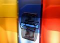
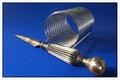
Ready For Incoming Mailby GraciousComment: The blue and the silver go very well together. However you can see that the surface is not entirely clean. A more diffused lighting setup would have made the picture much stronger. Also if you had cropped a little differently. Maybe if the ball end of the letter opener was approx. the same distance from the bottom as it is from the side. 6 |
| Photographer found comment helpful. |
| 06/09/2003 07:01:39 AM |
|
| Photographer found comment helpful. |
| 06/09/2003 06:59:01 AM |
Pump Up the Volume by jab119Comment: Congrats on the ribbon. Very deserving. This type of shot takes quite a bit of effort to execute I imagine. I cannot even fathom how you set this up, I have to be honest. Would you please fill us in on the details. I am sure others would love to learn from this as much as myself.
Regards,
Owen |
| Photographer found comment helpful. |
| 06/09/2003 12:13:36 AM |
Split Secondby crabappl3Comment: Hats off to you crabappl3. Good job. My alarm clock didn't fare quite so well as yours. Try 44th. Cheers.
Owen |
| Photographer found comment helpful. |
| 06/04/2003 01:00:20 AM |
|
| Photographer found comment helpful. |
| 06/03/2003 11:46:19 AM |
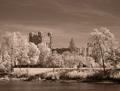
The Castleby inspzilComment: I gave it a 6 Bob (I rarely give higher than a 7, and 8 or 9 only if exceptional - never 10, it's perfection after all). I loved the infrared thing you have going on there. You're right, the power lines are distracting. Maybe if you had shot it from further along the river(to the right, looking at the building). Maybe it would have obscured the lines and also shown more of the building. Just a thought.
Regards,
Owen |
| Photographer found comment helpful. |
| 06/03/2003 11:24:03 AM |
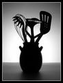
Silouette des ustensilesby orussellComment: Originally posted by inspzil:
O - I admit I'm one of the ones who marked down for originality in this challenge. I think if you could've done something a little different with the lighting on this one, It would've helped. And its not at all because I think the lighting is bad on this one, just maybe not had it the same across the whole picture. I picture this in my head with the bright light in the middle and substantially darker on both sides, like putting some kind of "v" directly behind the vase so that the light on both sides of it was diverted, so it wasn't quite so intense. Maybe if you could've made it where it looked like the light was coming OUT of the vase it would've done more for me. Just thoughts though. Its really a solid picture as is. Bob |
Bob,
These are the kinds of comments that make a photographer strive for something better.
Thanx,
Owen |
Home -
Challenges -
Community -
League -
Photos -
Cameras -
Lenses -
Learn -
Help -
Terms of Use -
Privacy -
Top ^
DPChallenge, and website content and design, Copyright © 2001-2026 Challenging Technologies, LLC.
All digital photo copyrights belong to the photographers and may not be used without permission.
Current Server Time: 07/16/2026 04:59:36 AM EDT.