Make: EASTMAN KODAK COMPANY
Model: KODAK DC4800 ZOOM DIGITAL CAMERA
Orientation: Upper Left (1)
X Resolution: 230.00
Y Resolution: 230.00
Resolution Units: Inches
Exposure Time: 1/8
F Number: 8.00
Exposure Program: Aperture Priority
Date/Time: 2003:01:09 20:27:06 (The date is always wrong, I keep resetting but it still messes up. Sorry)
Date Digitized: 2003:01:09 20:27:06
Shutter Speed: 1/8.00
Aperture: f/8.00
Exposure Bias: 0.00
Max Aperture: f/2.73
Subject Distance (M): 0.26
Metering Mode: Average
Light Source: Tungsten
Flash Fired: No
Focal Length (mm): 7.00
Color Space: sRGB
Exposure Index: 100.00
Sensing Method: One chip color area
Statistics
Place: 30 out of 86 Avg (all users): 5.7383 Avg (commenters): 5.7500 Avg (participants): 5.6909 Avg (non-participants): 5.7885 Views since voting: 1241 Votes: 107 Comments: 6 Favorites: 0
Overall
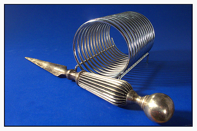
You’ve prepared a scene around the theme of waiting. The letter rack is empty, the knife on hand, the title clear. Graphically, there are three main subjects; the blue – silver colour combination, the objects themselves and the shapes which they produce. Shadows are also present, and I will return to them later. The question for this critique is whether or not the elements support the theme. Largely, any answer I give will be subjective, but I will try to elucidate my reasoning.
Technical
I’m treating this shot as an art photograph. The scratches on the blue backing, the slightly soft focus on the knife, the strong shadows on the right and in the top corners all disqualify this from any commercial use. (For that, Orussell’s diffuser suggestion would have helped tremendously, or actually use the lighting as a graphic element within the shot, always a viable, but dangerous, alternative.)
I feel that you tried to use lighting to create a sharp effect on the metal. However, there are large shadows under the knife, behind the letter rack, and the top corners are dark, suggesting that the single light source used wasn’t sufficient to fully light the entire scene. It might have been better to have cropped a little off the top and up until the handle in the right to minimise any damage caused by shadows. If you really wanted the shadows, and the corrugated shadow from the letter rack would have been interesting if done clearly, then I suggest that you deliberately play with the light source to create that effect.
You set the automatic exposure for the entire scene. Rather than balance such a scene, average metering calculates an 18% average, which is fine for scenes containing lots of different colours and light intensities. Here, you only have navy, silver and gold. Reproducing accurate colours using average metering is a matter of chance here. Better would have been to meter for one colour only, then to manually change the exposure accordingly. For example, a reading of the silver would produce a dull silver. You’d need to increase the exposure by about 2 stops to produce a glittering silver. The blue and the gold might be lighter, but not much. Certainly, the dark shadows would have been reduced, and more detail would have been visible in the knife body.
Artistic and Conceptual
Here, I’ll try and answer my earlier question. How do, if they do at all, the combined elements support the theme of waiting? The knife suggests a strong line. How is the line used here? It moves from bottom right to above middle left. Does it take us out, or lead us into another part of the photograph? Actually, I think that the placing doesn’t do anything deliberately at all. The circular theme in the letter rack is strong. A tunnel is formed, and you angle it to take us away from the starting point at the knife body. Are we led anywhere thematic or connected to any other place in the scene? The end of the tunnel itself forms an oval. Is that oval linked, too?
The knife and the letter rack have a common element; one is predominantly linear with a circular part, while the other is predominantly circular with a linear element. I would like to see these elements combine somehow, and for that ‘somehow’ to suggest the theme of waiting.
Suggestions
I don’t feel that this scene answers my questions. So, I’m going to suggest a few changes, some things you might think about in relation to these objects.
Be totally aware of all graphic elements in your shots. Play with them, experiment with combinations, see how other elements are formed when combinations interrelate. Make the arc at the end of the letter rack match, or belong to, a similar shape in the knife. Find angles which connect the given angles in your objects.
Thematically, play with the elements. A knife on top of the letter rack might suggest waiting more than one just placed by the foot. Or even through the rack, diagonally, or from the top? The straight lines in the rack might be juxtaposed parallel with the line of the knife creating a subdued feel or placed perpendicularly for a more dynamic contrast, supporting waiting? The arc and the tunnel both suggest waiting, don’t they? Can they be used thematically?
If this were me, (goodness forbid) I might tie the knife to a very thin thread and hold it above the rack with the tip pointing slightly upwards. I’d place the rack off-centre but face-on with the camera. Using a face-on camera angle, I would expose just for the brightest point, the silver, and shoot a macro shot from as close as I could from in front of the rack using a wide aperture. The resulting shot should be quite dynamic. I might try varying the scene by placing the knife behind the rack to the upper part of the resulting circle. At all times, I would be thinking about the shapes and connotations created. Take a couple of dozen shots, then choose.
I’m sorry, but I didn’t vote. I would have given a 4.
Its a nice picture, but to me it just has an auction-house catalogue feel to it (lol, not that i've ever looked at one before... maybe antiques roadshow). Nice choice of BG colour. Good luck with it.
The blue and the silver go very well together. However you can see that the surface is not entirely clean. A more diffused lighting setup would have made the picture much stronger. Also if you had cropped a little differently. Maybe if the ball end of the letter opener was approx. the same distance from the bottom as it is from the side. 6