| Image |
Comment |
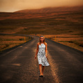
| 06/08/2006 05:41:06 PM |
Out from somewhere by LalliSigComment: Your title fits the picture perfectly since there's nothing close to her except emptiness. Good DOF to keep the focus on the subject. |
 Photographer found comment helpful. Photographer found comment helpful. |
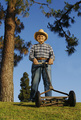
| 06/08/2006 05:39:32 PM |
Papa with the Pushmowerby bvoiComment: This is a really neat picture. The angle makes Papa seem larger than life, and you've done a good job of surrounding Papa with the tree. The smaller tree by his right leg pulls the eyes away from your main subject. |
| Photographer found comment helpful. |
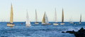
| 06/08/2006 05:37:14 PM |
Sail The Shipby gliphixComment: Nice composition with the ships, and the rock on the right is a nice reference point. The picture seems a bit flat (best way I can explain it) but I don't know how it could be fixed. |
| 06/08/2006 01:08:05 PM |
Great River Bridge (Nightshot 3)by fordmanf1Comment: The composition here is much improved over your original and makes the picture more interesting. You listened to the comments about sharpening, but to me it looks a bit oversharpened. Just my opinion, of course. |
| Photographer found comment helpful. |
| 06/08/2006 12:57:33 PM |
Triangle Challenge 5/10/2005 : Michigan Handiworkby tfarrell23Comment: This is a big improvement compared to your original. The biggest difference is the loss of the beam in the foreground. I like what you did with the color.
The highlight on the wood in lower right is nice, but the open space looks a bit blown out. |
| Photographer found comment helpful. |
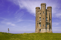
| 06/08/2006 12:45:07 PM |
157452 - Broadway Towerby ArtanComment: There's a lot to like in the original and this one. I like the light and color of the grass a bit more in the original. However, the clouds and color of the sky are much improved. There's also more detail in the tower. |
| Photographer found comment helpful. |
| 06/08/2006 12:39:52 PM |
Heaven's Light IIby taterbugComment: Nice composition and colors in your picture. Indeed it's as if the light is coming from heaven. The neck has a bit of glare on it. |
| Photographer found comment helpful. |
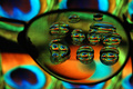
| 06/08/2006 12:38:42 PM |
Eyes IIby banmornComment: Clever title and picture - it took me a few seconds to realize you were using glasses. Color are vibrant. A bit of sharpening may make the eyes jump off the screen. |
| Photographer found comment helpful. |
| 06/08/2006 12:36:41 PM |
Grandeurby rjksteschComment: Your title really sums it up here, and the guy looking upward is effective. An improvement may be to clone out the white dot just to the left and above the guy. |
| Photographer found comment helpful. |
| 06/08/2006 12:30:26 PM |
Colour and form IIby pacpintoComment: I like the composition and the colors work really well together. There's a bit of distracting reflection in the purple and red, but it's not too bad. Good job. |
| Photographer found comment helpful. |
Home -
Challenges -
Community -
League -
Photos -
Cameras -
Lenses -
Learn -
Help -
Terms of Use -
Privacy -
Top ^
DPChallenge, and website content and design, Copyright © 2001-2026 Challenging Technologies, LLC.
All digital photo copyrights belong to the photographers and may not be used without permission.
Current Server Time: 07/17/2026 06:19:06 AM EDT.