| Image |
Comment |
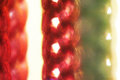
| 03/21/2009 12:13:53 AM |
15-march 09 unconventional. itsy bitsy spiderby rozComment: I really like those deep reds, Roz, and don't think the processing ruined it. It would be nice to see the spider a bit brighter, but it works as is, because it takes a bit of effort to get there and is more rewarding. |
 Photographer found comment helpful. Photographer found comment helpful. |
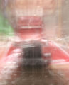
| 03/21/2009 12:09:13 AM |
Peterbilt BLURIIby rodfulkComment: I really like the blur, wonder how this would look with a bit more contrast. Did you move camera or was truck moving? |
| Photographer found comment helpful. |
| 03/21/2009 12:01:50 AM |
manageby bladComment: I mostly like the processing, but I think the blue is drawing attention. Changing that blue to one of the other colors would probably balance it out a bit more, IMO. I do like the guy's pose, it seems a bit stiff and yet natural. |
| Photographer found comment helpful. |
| 03/20/2009 11:36:40 PM |
Strings of light II BLURIby rodfulkComment: Nice and abstract - my kind of shot. I think you should take a few more of these, make big prints, and sell them at an art show for $500 each. Have fun with the reversed lens, can't wait to see more. |
| Photographer found comment helpful. |
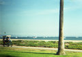
| 03/20/2009 11:30:28 PM |
The Scenic Routeby GermaineComment: I haven't followed the challenge close enough to know who/what Diana is, but I like the retro feel this has. Now I'm off to find out more about Diana... |
| Photographer found comment helpful. |
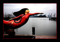
| 03/20/2009 11:28:34 PM |
Norfolk Mermaid.jpgby JerseyGenieComment: I like how he mermaid reigns over the picture, and good job bringing out that detail. I agree about the oversharpening, but it's almost to a level to be an "artistic effect". Feel free to tell people it was intentional for that purpose. :) |
| Photographer found comment helpful. |
| 03/19/2009 12:52:09 PM |
One and lonely.by anferhComment: This was one of my faves during the challenge. Take away those ones and twos and this would have scored more higher, where it belongs. What a sad commentary on DPC. |
| Photographer found comment helpful. |
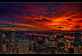
| 03/18/2009 10:04:51 AM |
Manhattan Lightsby NeilComment: I thought this would have scored better also, but to me it looks like the saturation was boosted, especially compared to your print version. The print version looks more natural, IMO. |
| Photographer found comment helpful. |
| 03/18/2009 09:35:23 AM |
|
| Photographer found comment helpful. |
| 03/17/2009 11:40:56 PM |
|
| Photographer found comment helpful. |
Home -
Challenges -
Community -
League -
Photos -
Cameras -
Lenses -
Learn -
Help -
Terms of Use -
Privacy -
Top ^
DPChallenge, and website content and design, Copyright © 2001-2026 Challenging Technologies, LLC.
All digital photo copyrights belong to the photographers and may not be used without permission.
Current Server Time: 06/15/2026 04:08:42 AM EDT.