Backlit Under Cloudsby
RebeccaComment: Greetings from your own critique club.
First Impression:
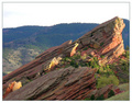
Lacks contrast. That's probably more to do with staring at so many DPC images that push that to the max however. If that wasn't the case I might have been attracted to the framing of this more so.
Composition:
Speaking of framing I like this the most in your photo. The horizon isn't in the middle which is good and the main focus, the top of the rock is located in the "rule of thirds" area. I don't think there is anything I would change in the way you composed this shot.
Subject:
Is interesting. Good texture although I probably would have sharpened it or boosted the contrast a tad more. However, I may not be the best judge for this since I'm often accused of doing that too much to my images. :)
Technical (Colour and light):
A bit overexposed and there's a haze in there that saps the color somewhat. Also, it would have been better if you managed to get more light raked over the bottom part of the rocks like how the top part is. However, that may have been impossible given the environment or timing of this shot.
Improvement:
Really just remove the haze and boost contrast a bit. If you us photoshop I suggest using the unsharp mask tool which can help with both. If you are unfamilar with using that tool for that purpose here is a
link that explains it. Also, I might add if you want to appeal more to the DPC voters I'd also suggest boost the saturation. In a lot of images I've seen do well the "wow" factor is carried or supported heavily by bright bold colors. However, that's something for you to decide if you want to cater to that. The image in my opinion doesn't need it but that's just me.
Summary:
A good image. Looking at the voting pattern of this photo it seems to me that even the slightest of tweaks (like the contrast/haze adjustment) could have really helped the score by turning those 4 votes into 5s and 6s. When it comes to these challenges that's all you're really trying to do (i.e. minimize the low votes). Anyway, I hope this critique is helpful and didn't come off as harsh. If you have any questions feel free to email or PM me. I look forward to seeing more of your work!