| Author | Thread |
|
|
05/14/2006 12:07:09 AM |
Greetings from your own critique club.
First Impression
Nice shot.
Composition:
Very good composition.
Subject:
I really like the subject.
Technical (Colour and light):
The color and lighting in the front is perfect, but needs to be bumped little bit in the backgroud.
Improvement:
Color saturation in the background, contrast and lighting.
Summary:
Very nice picture, would have finished higher with better PP.
Cheers!! |
|
 Photographer found comment helpful. Photographer found comment helpful. |
|
|
05/10/2006 01:34:22 AM |
From the CTP MkII
First Impression: 5. Dang, this photo's hard to crit. It's a nice shot, mind you, but looks raw. Nothing that a little PP won't fix, but still...
Composition: 5. The rock's okay but the background's bugging me. I don't think it does justice to the rock thing. Methinks you should've tried shooting from a higher or lower angle, so as not to "cut" the rock lip.
Subject: 5. Like my comment above, the rock's doing just great. It's the sky this time. Never shoot bald skies. DPCfolk don't like bald skies.
Technical: 5. This is where you failed, I guess. Subjects with dynamic range are pretty hard to shoot. Still, some PP like some contrast masking, selective saturation and desaturation, some levels and curves, and you're good to go.
Summary: Your photo's got a lot of potential. But a reshoot would be better.;p
Disclaimer: The following crits are personal opinions, not photographic dogmas. Please see them as suggestions, not claims of mastery nor a show of hauteur.;p
Message edited by author 2006-05-10 01:35:46. |
|
| Photographer found comment helpful. |
|
|
05/09/2006 04:04:45 PM |
Hi from the CTP2 club!!
I wouldn't have centered this pic.
The focus is good except for the front rock (But I personaly struggle with focus)
The border is a bit distracting.
I like the lighting, it reminds me when I used to hike with my parents:)
The best of luck for the future:) |
|
| Photographer found comment helpful. |
|
|
05/08/2006 08:46:11 PM |
Comment from a member of your own commenting club :-)
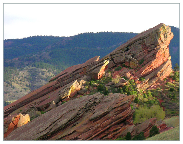
This is a picture showing a stone in front of a hill far away.
Although it is a beautiful stone it is not something that makes you want to see it again. Maybe an animal or a person in front of it or on top of it would make a big different.
What is good?:
1. Good use of rule of thirds.
2. Leading lines make you look at all the picture.
3. Colours are good.
4. Focus is good.
5. Frame colour/darkness fits the picture well.
What could be better?:
1. The sky, like in many of my own pictures is blown, probably not because of wrong adjustments but just because it is like that when you take the picture.
2. Wait for a better day to take pictures :-)
Hope this helps!
Edited: Deleted an empty line
Message edited by author 2006-05-10 20:26:47. |
|
| Photographer found comment helpful. |
|
|
05/08/2006 02:06:10 PM |
hiya from the ctp2!
First Impression:
nice. a good starting point of an image, but... it could be much much more.
Composition:
very good composition. the angle of the rock formations works well, as wel as the slightly anthropomorphic face at the peak.
Technical:
all fine, but, again, i want more! ;-) if the saturation were up, the rocks would pop - the reds and yellows would glow. the atmospheric perspectve works quite well, but more contrast and darker for the background hills would really bring the rocks out.
the sky is very bright, and brings the viewers focus away from the rocks to...white. i can see a tiny bit of detail in the sky, again, more showing would be great. either really bumping it and turning it into a threatening sky, or just enough to focus on the rocks.
if the foreground grass were burned a bit, this would draw the viewer's gaze in more. again, the whole thing should be more saturated. redder reds, greener greens.
Summary:
a nice image with the potential to be much, much more.
Message edited by author 2006-05-10 19:01:04. |
|
| Photographer found comment helpful. |
|
|
05/08/2006 02:49:28 AM |
Greetings from your own critique club.
First Impression:
Lacks contrast. That's probably more to do with staring at so many DPC images that push that to the max however. If that wasn't the case I might have been attracted to the framing of this more so.
Composition:
Speaking of framing I like this the most in your photo. The horizon isn't in the middle which is good and the main focus, the top of the rock is located in the "rule of thirds" area. I don't think there is anything I would change in the way you composed this shot.
Subject:
Is interesting. Good texture although I probably would have sharpened it or boosted the contrast a tad more. However, I may not be the best judge for this since I'm often accused of doing that too much to my images. :)
Technical (Colour and light):
A bit overexposed and there's a haze in there that saps the color somewhat. Also, it would have been better if you managed to get more light raked over the bottom part of the rocks like how the top part is. However, that may have been impossible given the environment or timing of this shot.
Improvement:
Really just remove the haze and boost contrast a bit. If you us photoshop I suggest using the unsharp mask tool which can help with both. If you are unfamilar with using that tool for that purpose here is a link that explains it. Also, I might add if you want to appeal more to the DPC voters I'd also suggest boost the saturation. In a lot of images I've seen do well the "wow" factor is carried or supported heavily by bright bold colors. However, that's something for you to decide if you want to cater to that. The image in my opinion doesn't need it but that's just me.
Summary:
A good image. Looking at the voting pattern of this photo it seems to me that even the slightest of tweaks (like the contrast/haze adjustment) could have really helped the score by turning those 4 votes into 5s and 6s. When it comes to these challenges that's all you're really trying to do (i.e. minimize the low votes). Anyway, I hope this critique is helpful and didn't come off as harsh. If you have any questions feel free to email or PM me. I look forward to seeing more of your work! |
|
| Photographer found comment helpful. |
|
|
05/08/2006 01:14:46 AM |
This isn't as good as some of your other shots, but it's not bad.
The lighting on the rock in the forground is actually really cool, and I like the way the greenery in the cracks contrasts with the red. What holds this back, I think, is the background. It seems over exposed, and just sort of 'blah'. It does make a nice contrast to the foreground though. Maybe if you could have arranged for some blue sky that day Ü. |
|
| Photographer found comment helpful. |
Comments Made During the Challenge  |
|
|
05/05/2006 11:03:55 PM |
|
Interesting lighting but seems a bit overexposed. You're unfortunately also hindered some by a really boring sky. |
|
| Photographer found comment helpful. |
|
|
05/04/2006 09:16:13 AM |
|
Nice morning Garden of the God's shot. |
|
|
|
05/03/2006 09:37:06 PM |
|
|
|
05/03/2006 10:27:00 AM |
|
Nice diagonal in the rocks, lighting appears a little harsh |
|
|
|
05/02/2006 08:38:32 PM |
|
great shot. the trees give a great sense of scale. i find the title too descriptive. |
|
| Photographer found comment helpful. |
|
|
05/02/2006 06:06:28 PM |
|
A little more post processing (contrast especially) could really make this more dramatic. Decent composition though. Too bad about the white/gray sky. |
|
| Photographer found comment helpful. |
|
|
05/02/2006 05:13:29 PM |
|
Beautiful landscape and great capture. I love where the sun is, you got it at the perfect time. |
|
| Photographer found comment helpful. |
|
|
05/02/2006 11:44:33 AM |
|
Very nice for side lighting. |
|
| Photographer found comment helpful. |
|
|
05/01/2006 05:59:27 PM |
|
what would it look like in B&W? |
|
| Photographer found comment helpful. |
|
|
05/01/2006 11:13:42 AM |
|
If only there was some hue and detail in the sky. |
|
| Photographer found comment helpful. |
Home -
Challenges -
Community -
League -
Photos -
Cameras -
Lenses -
Learn -
Help -
Terms of Use -
Privacy -
Top ^
DPChallenge, and website content and design, Copyright © 2001-2026 Challenging Technologies, LLC.
All digital photo copyrights belong to the photographers and may not be used without permission.
Current Server Time: 06/29/2026 03:06:57 AM EDT.