| Image |
Comment |
| 05/26/2006 10:13:57 PM |
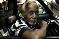
The Driver by librodoComment: Greetings from the Critique Club!
What can I say? Another great portrait from a master. The thing I like most about this is how you composed the shot. He's centered, his elbow and the top part of his hair is cut off and the background is busy yet this turned out to be great photo. What that tells me is your focus was primiarly on him and capturing him rather than giving us something totally contrived and unreal. As such you've told me everything I need to know about this person to understand him and his enviroment. I can't think of anything else you'd want to acheive than that. Congrats on the ribbon and I look forward to seeing more of your work! |
 Photographer found comment helpful. Photographer found comment helpful. |
| 05/26/2006 10:06:38 PM |
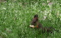
my profile for a peanutby gazdiComment: Greetings from the Critique Club!
Technicals:
The lighting is adequate and the color is good. Since the challenge ran under advance editing I think you could have done more in post to bring out the subject more (i.e. brighten up the body, eyes to strength the focal point).
Subject/composition:
You probably already know that choosing this subject was the main reason you scored so poorly. Voters were expecting to see a human portrait in their working/living environment and you gave them something completely different. The composition is ok but could have been better (more off-center).
Summary:
A cute photo but one that didn't meet the challenge. If this was an animal portrait challenge this probably would have scored in the mid-5s in my opinion. Overall it's good but it lacks that something extra to score better than that. My suggestion there is if available work on this some more in post processing to bring out the subject. There's some detail there that could be enhance in photoshop or equivalent. Message edited by author 2006-05-26 22:51:11. |
| Photographer found comment helpful. |
| 05/26/2006 08:37:51 PM |
|
| Photographer found comment helpful. |
| 05/26/2006 08:34:31 PM |
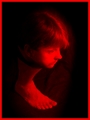
Who's that girl?by Rae-AnnComment: I scored this image an 8 because it struck me as a great self portrait. I don't know you well but for this moment in time the camera caught you I felt I did and that's what makes a good self portrait, IMO.
And for that effort what does DPC do in typical fashion? It places it 183rd. Good grief. Most of the images that ranked ahead of this could only dream of the substance this had but alas we as a community just want our daily fix of exploding landscape backdrops, cool looking props and super tack sharp eyeballs that were dodged and burned to mathematical perfection. It would be great if ONE TIME a challenge rewarded authenticity over the constant illusions that ribbon each week.
Edited to add: Sorry about the rant. Just had to vent a bit. :) Oh and btw, there's nothing technically with your photo in my opinion. To me it lives and breathes and tells a thousand words and that is all any photographer/photoshop artist could hope to acheive so well done! Message edited by author 2006-05-26 20:36:40. |
| Photographer found comment helpful. |
| 05/26/2006 03:27:03 PM |
No Place on the Pedestal for Limp Cheeseby fotomann_foreverComment: I left a similar comment on Rikki's shot but I can't believe this didn't score at least a 6 in a challenge were high scores were dished out like they were going out of style. Oh well. Maybe this is for the best regarding your enemeies (i.e. giving out low votes versus something more vengeful). :P Message edited by author 2006-05-26 15:27:59. |
| Photographer found comment helpful. |
| 05/26/2006 03:20:27 PM |
"i'm just a verb"by RikkiComment: Look at those low votes. Ok maybe you're not carrying a cool looking axe with bulging muscles or jumping around in an Icelandic paradise but this wasn't that bad. Your score is actually worse than normal since the average in this challenge was a 5.8 something. Ok maybe I shouldn't bring that last part up. :P Message edited by author 2006-05-26 15:21:03. |
| Photographer found comment helpful. |
| 05/26/2006 02:22:44 PM |
|
| Photographer found comment helpful. |
| 05/25/2006 05:12:53 PM |
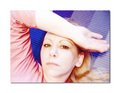
down timeby margiemuComment: This photo is nice and sharp and full of color and clarity. The camera settings you used and the lighting worked out great so good job there. I also like the composition. The main focus is off-center and I view this image from left to right which is natural for me.
The only suggest I have for improvement is maybe having your mouth closed or show teeth. You seem to be in the middle of that which gives you an odd expression. Other than that I like the pose. You got a nice catch light in your eyes and your hair flows well through the image. Good job all the way around. |
| Photographer found comment helpful. |
| 05/25/2006 05:04:25 PM |
Moi-memeby overcloverComment: Returning for comments and bumping up. Cool composition. Love the b/w choice. Just as a minor nitpick I would have liked to see either sharper eyes or less sharp glasses. As a result your eyes take a slight back seat to the glasses which is the first thing I notice. However, if this was used as a ad for a eye glass company this would work perfectly. Regardless of that I like this a lot. Good luck! |
| Photographer found comment helpful. |
| 05/25/2006 01:33:56 AM |
|
| Photographer found comment helpful. |
Home -
Challenges -
Community -
League -
Photos -
Cameras -
Lenses -
Learn -
Help -
Terms of Use -
Privacy -
Top ^
DPChallenge, and website content and design, Copyright © 2001-2026 Challenging Technologies, LLC.
All digital photo copyrights belong to the photographers and may not be used without permission.
Current Server Time: 06/22/2026 12:00:50 AM EDT.