| Author | Thread |
|
|
05/26/2006 08:34:31 PM |
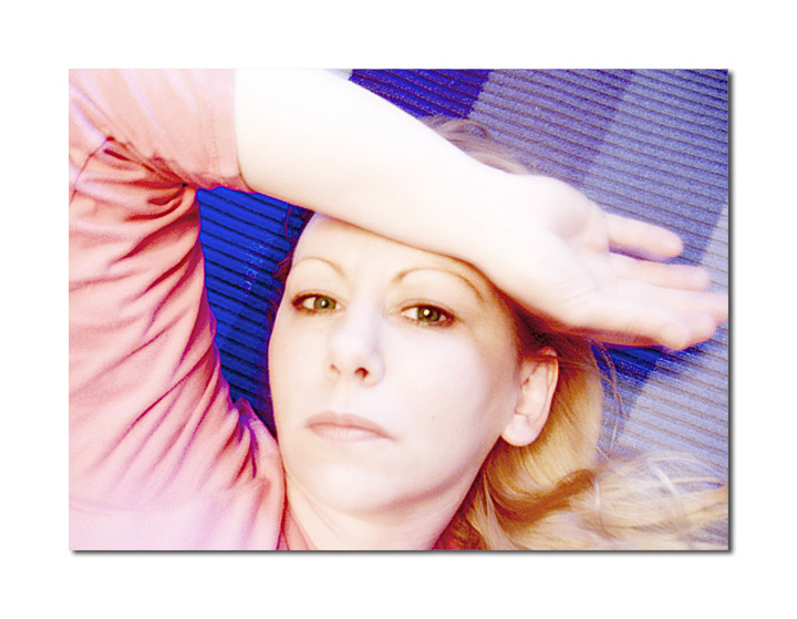
I scored this image an 8 because it struck me as a great self portrait. I don't know you well but for this moment in time the camera caught you I felt I did and that's what makes a good self portrait, IMO.
And for that effort what does DPC do in typical fashion? It places it 183rd. Good grief. Most of the images that ranked ahead of this could only dream of the substance this had but alas we as a community just want our daily fix of exploding landscape backdrops, cool looking props and super tack sharp eyeballs that were dodged and burned to mathematical perfection. It would be great if ONE TIME a challenge rewarded authenticity over the constant illusions that ribbon each week.
Edited to add: Sorry about the rant. Just had to vent a bit. :) Oh and btw, there's nothing technically with your photo in my opinion. To me it lives and breathes and tells a thousand words and that is all any photographer/photoshop artist could hope to acheive so well done!
Message edited by author 2006-05-26 20:36:40. |
|
 Photographer found comment helpful. Photographer found comment helpful. |
|
|
05/26/2006 06:27:11 AM |
|
What?!? Well I liked this Rae, voters are goofs. |
|
| Photographer found comment helpful. |
Comments Made During the Challenge  |
|
|
05/25/2006 04:41:48 PM |
|
Colors look cross processed or something. It is sort of a neat effect if intentional. Hope you don't get too many negative comments about it. With advanced editing, you could have darkened the upper and lower left corners to help keep the viewer's eye from falling out of the frame. |
|
| Photographer found comment helpful. |
|
|
05/24/2006 09:32:27 PM |
|
very pretty pose...hand movement slightly distracting but I like the photo a lot.....nice colors good luck.....8 |
|
| Photographer found comment helpful. |
|
|
05/24/2006 07:12:13 AM |
|
This has interesting things going on with line. |
|
| Photographer found comment helpful. |
|
|
05/23/2006 02:43:03 AM |
|
| Photographer found comment helpful. |
|
|
05/21/2006 08:42:51 PM |
|
The eyes are quite out of focus |
|
| Photographer found comment helpful. |
|
|
05/21/2006 06:53:55 PM |
|
Blow outs have an interesting textural effect on your shirt sleeve, but otherwise I'm not crazy about it. You're too washed out. |
|
| Photographer found comment helpful. |
|
|
05/21/2006 03:03:44 PM |
|
A little light but still nice. |
|
| Photographer found comment helpful. |
|
|
05/20/2006 06:16:52 PM |
|
nice pose, a bit overexposed but still works |
|
| Photographer found comment helpful. |
|
|
05/20/2006 12:16:37 PM |
|
that's Rae-Ann! And now you have that song stuck in my head, thanks so much.:) You're lovely as always. |
|
| Photographer found comment helpful. |
|
|
05/20/2006 08:17:33 AM |
|
Very effective use of high key! |
|
| Photographer found comment helpful. |
|
|
05/19/2006 11:19:21 PM |
|
| Photographer found comment helpful. |
|
|
05/19/2006 07:18:03 PM |
The first idea was Wendy Slocum.
Cool contrast in dark vs light and blue vs red. Also good how the arm creates a flow in the scene. |
|
| Photographer found comment helpful. |
|
|
05/19/2006 01:41:49 PM |
|
I like the lighting in the actual picture but I think the addition of the white border makes it look a little blown out. |
|
| Photographer found comment helpful. |
|
|
05/19/2006 12:45:54 PM |
|
One good thing about being able to use a 720 px image size is the possibility to use a decent border without having to decrease the image size too much as in the normal 640 px challenges. Here you have shown it can be done well. A Fitting border to a good image! |
|
| Photographer found comment helpful. |
|
|
05/19/2006 12:41:57 PM |
Hi Rae-Ann! This is very nice! Now it's your turn with the colors. :-)
Great Work! |
|
| Photographer found comment helpful. |
|
|
05/19/2006 12:20:03 PM |
|
Just too soft, I think.. great light in the eyes, but they really need to be sharper in my opinion. Great colours. |
|
| Photographer found comment helpful. |
|
|
05/19/2006 08:34:55 AM |
|
| Photographer found comment helpful. |
|
|
05/19/2006 03:15:24 AM |
|
Very creative, appealing and nicely mounted. I love the colors in there. You resemble Kathleen Turner. :) |
|
| Photographer found comment helpful. |
|
|
05/19/2006 03:14:07 AM |
|
I'm not sure who you are but you are very attractive. I like the "what do you want?" look. |
|
| Photographer found comment helpful. |
|
|
05/19/2006 01:56:57 AM |
|
I like how your arm frames this. I also like the faded colors. One suggestion would be to selectively mute that blue a bit that's framed by your arm and face. It stands out too much, IMO. |
|
| Photographer found comment helpful. |
|
|
05/19/2006 01:45:53 AM |
|
Indeed, who is she. Nice pose and colors, I like it centered with the arm up and over. |
|
| Photographer found comment helpful. |
|
|
05/19/2006 12:19:45 AM |
|
Well hello there :) I see you're all comfy taking SP as you've had great practice ;) Good luck Rae ;) |
|
| Photographer found comment helpful. |
Home -
Challenges -
Community -
League -
Photos -
Cameras -
Lenses -
Learn -
Help -
Terms of Use -
Privacy -
Top ^
DPChallenge, and website content and design, Copyright © 2001-2026 Challenging Technologies, LLC.
All digital photo copyrights belong to the photographers and may not be used without permission.
Current Server Time: 07/01/2026 03:28:40 AM EDT.