| Image |
Comment |
| 06/02/2006 12:44:42 AM |
Still loving you ...by choppersComment: I don't see this image as flat or boring in fact I find it to be the opposite. The tonal range is very good and overall the image is very contrasty, two things you don't find in flat images, IMO.
As for the color, I think you made the perfect choice. This image is about texture not color. You got your score because most people didn't feel this was right for still life and not because of the quality of the photo, which judged on just that is a 7 in my book. |
| 05/31/2006 11:55:35 PM |
|
 Photographer found comment helpful. Photographer found comment helpful. |
| 05/31/2006 11:29:00 PM |
|
| Photographer found comment helpful. |
| 05/31/2006 11:20:22 PM |
|
| Photographer found comment helpful. |
| 05/31/2006 11:08:21 PM |
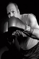
Heavyweightby cloudsmeComment: Greetings from the Critique Club!
I'm surprised this only scored a 5.7 something. I liked the image but the distortion at the very top I think was a bit too extreme. Overall, I like the pose but I think I would have liked to see more of your face or cover it some more. It's sorta at that inbetween spot where you want to see more or less, if you know what I mean.
Beyond that the technicals are super. I like the b/w feel especially since this is a boxing theme. The tonal range is also good as is the detail. I think this should have scored higher especially since this was a high scoring challenge. Good luck in the future! |
| Photographer found comment helpful. |
| 05/31/2006 10:56:50 PM |
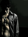
Whateverby KronusComment: Greetings from the Critique Club!
I really like the aggressive crop and how you have yourself off-centered and to the right. The lighting is what holds this back as others have mentioned. Since you're wearing a hood that light source would have probably served you better if it was located below and pointed up or to the left but level to your face so the light would rake over your face from left to right as opposed to diagonally from the top.
I would lose the sunglasses but if you feel it makes the shot then just get more light on it so it doesn't look like it's just a black void. Now there is some lighting on the sunglasses but it's so faint. You could brighten that up more in photoshop or similar using the dodge tool or selectively applied curves/levels. Speaking of levels a straight auto levels would probably fix that strange color cast or convert the image to black white. My rule of thumb is if the color isn't an important part of the image or it's hurting it I'll convert to b/w and if I want color back I'll try out some duotone combinations. The more I look at it I believe this image would look a lot better as a b/w or brown duotone look. |
| Photographer found comment helpful. |
| 05/31/2006 10:11:29 PM |
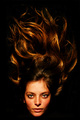
faithby renefunkComment: Nice editing on the subject but the background has an odd posterized look to it. I would have made that a solid color especially since it would be easy to do in advance editing. |
| Photographer found comment helpful. |
| 05/31/2006 10:06:48 PM |
|
| Photographer found comment helpful. |
| 05/31/2006 10:00:42 PM |
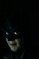
Prince of Darknessby rameviComment: Nice idea. The image could be brighter in my opinion especially the details in the shadow areas, which the calibrated-challenged might not be able to see. |
| Photographer found comment helpful. |
| 05/31/2006 09:53:31 PM |
|
| Photographer found comment helpful. |
Home -
Challenges -
Community -
League -
Photos -
Cameras -
Lenses -
Learn -
Help -
Terms of Use -
Privacy -
Top ^
DPChallenge, and website content and design, Copyright © 2001-2026 Challenging Technologies, LLC.
All digital photo copyrights belong to the photographers and may not be used without permission.
Current Server Time: 06/22/2026 02:50:43 AM EDT.