| Author | Thread |
|
|
05/31/2006 10:56:50 PM |
Greetings from the Critique Club!
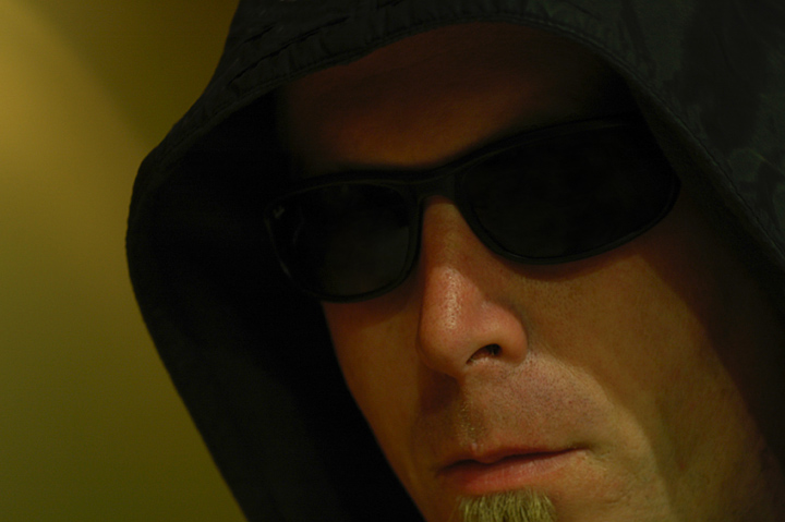
I really like the aggressive crop and how you have yourself off-centered and to the right. The lighting is what holds this back as others have mentioned. Since you're wearing a hood that light source would have probably served you better if it was located below and pointed up or to the left but level to your face so the light would rake over your face from left to right as opposed to diagonally from the top.
I would lose the sunglasses but if you feel it makes the shot then just get more light on it so it doesn't look like it's just a black void. Now there is some lighting on the sunglasses but it's so faint. You could brighten that up more in photoshop or similar using the dodge tool or selectively applied curves/levels. Speaking of levels a straight auto levels would probably fix that strange color cast or convert the image to black white. My rule of thumb is if the color isn't an important part of the image or it's hurting it I'll convert to b/w and if I want color back I'll try out some duotone combinations. The more I look at it I believe this image would look a lot better as a b/w or brown duotone look. |
|
 Photographer found comment helpful. Photographer found comment helpful. |
Comments Made During the Challenge  |
|
|
05/24/2006 07:15:54 AM |
|
Hey good stuff. The look, the background and the crop is all good. |
|
| Photographer found comment helpful. |
|
|
05/23/2006 07:07:07 AM |
|
Nicely done low-key shot - 8 from me |
|
| Photographer found comment helpful. |
|
|
05/22/2006 10:33:38 PM |
|
Interesting! Seems to have a bit of a yellow tint to it. |
|
| Photographer found comment helpful. |
|
|
05/21/2006 07:08:49 PM |
|
I didn't know the Unibomber was a DPCer! |
|
|
|
05/20/2006 06:23:22 PM |
|
cool shot, a bit of brightness and contrast would have been great |
|
| Photographer found comment helpful. |
|
|
05/20/2006 08:10:07 AM |
|
The extreme closeup and cut off edges are effective - a reminder that less is more. |
|
| Photographer found comment helpful. |
|
|
05/19/2006 05:02:22 PM |
|
|
|
05/19/2006 12:09:43 PM |
|
I think the rather flat lighting could have been improved slightly, though it does give it a certain mood. You may have gone b/w with this image and turned up the contrast. There is a kind of green/yellow cast that could have been removed with curves or by going duotone. Nice otherwise. |
|
| Photographer found comment helpful. |
Home -
Challenges -
Community -
League -
Photos -
Cameras -
Lenses -
Learn -
Help -
Terms of Use -
Privacy -
Top ^
DPChallenge, and website content and design, Copyright © 2001-2026 Challenging Technologies, LLC.
All digital photo copyrights belong to the photographers and may not be used without permission.
Current Server Time: 06/29/2026 01:00:07 PM EDT.