| Image |
Comment |
| 11/15/2005 12:26:07 PM |
|
 Photographer found comment helpful. Photographer found comment helpful. |
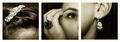
| 11/15/2005 12:25:32 PM |
Shannonsby jeffzoetComment: I liked her better all cut up in polaroids... Nice lighting though. |
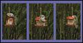
| 11/15/2005 12:24:11 PM |
Evening at Sleafordby John WhiteComment: One of those "one picture" triptychs. I like this one. I busted someone else for a 3D border, but I think it works here. 7 |
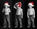
| 11/15/2005 12:23:27 PM |
Bad Santaby beautyqn25Comment: Ha, love it. The center panel is priceless. 9 If I have a beef, there is slightly too much reflection on his torso. You might have been able to lower that by using a different channel mixer ratio. |
| Photographer found comment helpful. |
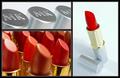
| 11/15/2005 12:22:14 PM |
For Any Moodby karmatComment: I like it. A good "advertising" theme. The colors and lighting are superb. 8 |
| Photographer found comment helpful. |
| 11/15/2005 12:21:42 PM |
Going Outby mandyturnerComment: Neat idea. I think the crops bewteen the center and right picture are unfortunate. The line which starts down her jaw (in the right panel) seemingly curves up the other side of her face (in the center panel). This makes the brain try to "put the face together" and of course that doesn't work. |
| Photographer found comment helpful. |
| 11/15/2005 12:19:53 PM |
Devotionby sajinComment: Nice. Tigers are so gorgeous. I think this works well as a triptych telling a story. 8 |
| Photographer found comment helpful. |
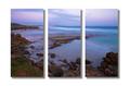
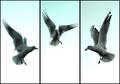
| 11/15/2005 12:19:04 PM |
Aerial Balletby RiponladyComment: I like this. Only beef is the slightly different exposure on the left. But this was a hard challenge to get things exaclty right (I don't think I did). The symmetry is nice. The gulls look a little blue though. 7 |
| Photographer found comment helpful. |
| 11/15/2005 12:17:59 PM |
Night shiftby cabaComment: Hmmm, wonderful picture. I'll give you points for creativity, but ultimately I don't think I like the cat's eyes. 6 |
| Photographer found comment helpful. |
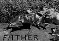
| 11/14/2005 11:32:16 PM |
goodbyeby TammerComment: I didn't look at the comments before leaving my own. I gave this a 6 in the original voting. I think the composition is good with the Father being at the bottom. However, a tigher crop so there is less grass may have been good. Cut the picture just above the top of the leaves. You get grass to the left, but not too much. I'd also add just a touch more stone beneath the Father.
I'm finding a common theme among these pictures I'm commenting on and that is low contrast. I went into photoshop and think this pic has much more pop if you go into levels and change them to 20/1.00/215. This, in essence, adds contrast and I think it looks better. |
Home -
Challenges -
Community -
League -
Photos -
Cameras -
Lenses -
Learn -
Help -
Terms of Use -
Privacy -
Top ^
DPChallenge, and website content and design, Copyright © 2001-2026 Challenging Technologies, LLC.
All digital photo copyrights belong to the photographers and may not be used without permission.
Current Server Time: 06/11/2026 09:00:53 PM EDT.