| Author | Thread |
Comments Made During the Challenge  |
|
|
11/20/2005 09:36:39 PM |
|
very professional looking! excellent....looks like it belongs in a magazine! |
|
 Photographer found comment helpful. Photographer found comment helpful. |
|
|
11/20/2005 04:48:53 PM |
|
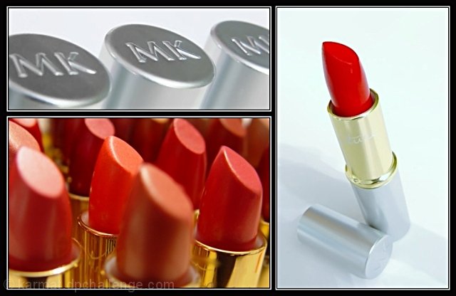
6 - Good use of triptych to 'showcase'. Criticism; not much, difficult with the size restrictions anyway, but perhaps 'sharper' on all, more 'fore focus' in the lower left shot and slight contrast/lighting(?) adjustment in 3/right shot, may have made this better in my opinion. Good 'commercial' aspect. |
|
| Photographer found comment helpful. |
|
|
11/20/2005 01:39:59 PM |
|
Looks like an advert. All very clear and well taken. Good product shots. |
|
| Photographer found comment helpful. |
|
|
11/20/2005 02:24:20 AM |
Reurning for compliments in a very fine layout and professional ad-like composition.
One of my top 10 favorites in this challenge (8) |
|
| Photographer found comment helpful. |
|
|
11/18/2005 10:14:49 AM |
|
WOW. All I can say is QUALITY. Very, very nice, are you sure you didn't scan this from a 2-page ad in Vogue? ;-) Perfect lighting, color, exposure, etc. Cool, original idea for arranging the triptych. Nice variety of angles. |
|
| Photographer found comment helpful. |
|
|
11/17/2005 11:11:36 PM |
|
great examples of stock photography of a product. |
|
| Photographer found comment helpful. |
|
|
11/16/2005 09:58:06 PM |
|
| Photographer found comment helpful. |
|
|
11/16/2005 09:10:25 PM |
|
I like the title it matches very well |
|
| Photographer found comment helpful. |
|
|
11/16/2005 04:26:53 PM |
... so long as you're in the mood for red?
I could see this as an ad without much more work
good luck |
|
| Photographer found comment helpful. |
|
|
11/15/2005 10:41:47 PM |
|
Neat. Would work well for an ad. I find the out of focus lipstick in the front to be a bit bothersome, though. |
|
| Photographer found comment helpful. |
|
|
11/15/2005 06:44:33 PM |
|
This could be an advertisement for MK lipstick. I really like the placement of your pictures. |
|
| Photographer found comment helpful. |
|
|
11/15/2005 06:40:36 PM |
|
I would see this in a magazine as an ad. (That's a compliment I hope) |
|
| Photographer found comment helpful. |
|
|
11/15/2005 02:24:19 PM |
|
| Photographer found comment helpful. |
|
|
11/15/2005 12:22:14 PM |
|
I like it. A good "advertising" theme. The colors and lighting are superb. 8 |
|
| Photographer found comment helpful. |
|
|
11/15/2005 11:34:21 AM |
|
This is great. It looks like a professional advertisement photo. Great job. The lipsticks look 3-dimensional. I love it. |
|
| Photographer found comment helpful. |
|
|
11/15/2005 09:14:53 AM |
|
This would make an awesome shot for a magazine advertisement. Good Luck. |
|
| Photographer found comment helpful. |
|
|
11/14/2005 11:01:54 PM |
|
i love it, very nice shots. well done. 7 |
|
| Photographer found comment helpful. |
|
|
11/14/2005 06:19:43 PM |
|
Looks like a make-up advertisement. Nicely done. |
|
| Photographer found comment helpful. |
|
|
11/14/2005 03:15:23 PM |
|
This would make a great ad. I wish all the lipsticks in the lower left panel were in focus. |
|
| Photographer found comment helpful. |
|
|
11/14/2005 01:55:45 PM |
Nice crisp, clear, colorful cosmetics.
Oh and creative too.
Well done.
Nearly forgot to mention clever! |
|
| Photographer found comment helpful. |
|
|
11/14/2005 11:05:47 AM |
|
Nice. Could be a sales postcard or mailer for Mary Kay! The only thing I don't like is the out of focus lip stick in the foreground of the open tubes of lipstick. |
|
| Photographer found comment helpful. |
|
|
11/14/2005 02:57:50 AM |
|
A great combination! Very well executed - nice photos, simple & elegant borders, perfect arrangement. Definitely and advertising-esque collection. Well done. |
|
| Photographer found comment helpful. |
|
|
11/14/2005 01:19:29 AM |
|
I love this, and I'm not even a girly-girl makeup kind of woman. :) Would be excellent as a poster in a department store, or something. Balance is good, I love the colors, all three images are well-done, and I like the focus in the bottom left frame. 10. |
|
| Photographer found comment helpful. |
|
|
11/14/2005 12:06:31 AM |
|
| Photographer found comment helpful. |
Home -
Challenges -
Community -
League -
Photos -
Cameras -
Lenses -
Learn -
Help -
Terms of Use -
Privacy -
Top ^
DPChallenge, and website content and design, Copyright © 2001-2026 Challenging Technologies, LLC.
All digital photo copyrights belong to the photographers and may not be used without permission.
Current Server Time: 06/29/2026 03:21:02 PM EDT.