| Image |
Comment |
| 04/26/2006 04:44:16 PM |
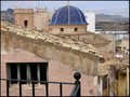
Old townby imagine74Comment: I'm torn on this one. The blue roof is really cool, but the rest of the picture is blah for color. When that occurs, I recommend B&W and go with textures and shapes. I pulled this into PS and tried a B&W treatment. The blue channel gave it some nice moodiness and then I really upped the contrast and lowered the brightness (+30/-30). It, to me, gives it more of an actual old feel. However, then I don't get to see that cool blue roof, so I don't know. The other criticism is the roof is very centered. Cropping or composition should have thrown that subject to one side or the other.
The technicals are well done except you shot at midday and that always leads to a less interesting picture. The same at sunrise or sunset would likely have been better. |
 Photographer found comment helpful. Photographer found comment helpful. |
| 04/26/2006 04:39:51 PM |
Old Ideaby idnicComment: Well, a nicely done shot Cindi. You have been around long enough to know that voters don't do well with abstract. "old idea" certainly is abstract, especially when it was "new" a month ago and won a ribbon. I guess we check our sense of humor at the door on this site. Technicals are done very well and the fractal pattern is quite crazy. it lacks the color oomph of rikki's, but that would have made it seem even less old.
I've started calling the narrow minded on the site "knuckleheads". It somehow makes me feel better. On this picture, the knuckleheads beat you down. |
| Photographer found comment helpful. |
| 04/26/2006 04:28:49 PM |
Covered Bridgeby debapakaComment: The covered bridge is a nice subject. The presentation is a bit static. We not only have a very centered composition, but the light is almost directly overhead and that doesn't give us much to work with. It also causes the left side of the bridge to fade into shadow. Perhaps you could have shot either early in the day or late to give it more contrast and hopefully the light would have cast some more interesting shadows to give texture. I do like the red and wish we could have presented more of the whole side there. Finally, shooting early or late may have helped the sky which as it is now, while not blown out, isn't too exciting. |
| Photographer found comment helpful. |
| 04/26/2006 04:25:55 PM |
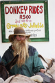
It's a bit of old ... hat ... man ... transportby tonyvComment: Hmm, a few thoughts here.
1) I love the man. That beard is a wicked subject.
2) The guy is nicely offcentered.
3) I go back and forth between color and B&W. Color captures that great sign well, but B&W gives it an older feel to it (and that's what we were going for).
4) A different crop may have helped with more of the donkey displayed. Unfortunately right now all we get is a portion of the ass's ass.
5) It's not like you could have asked him to take it off, but I really think his jacket limits the shot. It is the most modern looking thing in the shot and that shade green (like fir trees) just never transmits well on a picture. It dominates too many pixels to be ignored. Some dodging of this right side to bring it out of the shadows may have helped a bit too.
I think I would have given this a 5 or 6. |
| Photographer found comment helpful. |
| 04/26/2006 04:20:42 PM |
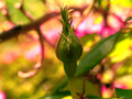
New life buddingby KelliComment: OK, I gave this one a 3 on the vote through. That seems pretty harsh considering you got a 5.15. My thoughts:
1) The composition is quite centered. Try to move the subject to one side (usually the right side with space on the left).
2) The thing that really got me was the supersaturation. The pink line that is just to the right of the bud looks completely blown out and that doesn't make for a good look. You can also see the saturation in the red dots on the bud itself.
3) The lighting is a bit harsh. perhaps try in the morning or evening.
Good things are the nice DOF and the sharp focus of the subject. I think you did well there. |
| Photographer found comment helpful. |
| 04/26/2006 02:58:11 PM |
They Once Prayed Hereby posthumousComment: I can't see your camera settings, but the first thing I thought was the picture was noisy. It might actually just be the way the brick is on the facade.
A few thoughts:
1) The color is very drab. I usually recommend that we switch to black and white in situations like this. The color is giving us nothing and is probably dragging us down.
2) The composition is very static. The building is quite centered and it's a typical "off axis" presentation of a building.
3) The brick, as mentioned above, either didn't capture well because of the light, or the processing or something. It looks very muddled and not contrasty enough. You need more contrast to the picture. |
| Photographer found comment helpful. |
| 04/26/2006 12:35:46 PM |
First Posing Sessionby olddjComment: The good things:
1) The composition is nicely off center.
2) Her outfit. I like the Chiaroscuro effect of the black blending in with the background. The necklace is a nice touch too. (After reading the other comments I came back to add that my laptop monitor has trouble with very darks. On my screen her dress blends almost perfectly with the background and I like that. I saw others wanted it to either stand out MORE or blend in MORE. I think that's a fair criticism)
3) Her expression. I enjoy that she isn't looking at the camera and has a nicely demure smile on her face.
The big bad:
The flash washed her out quite a bit and I think this kept it from doing better. When we were voting one portrait after another, things like this would jump out and people would vote low. To be honest, I gave it a 4 and I can say it was for this exact reason, although now that I look at it closer, I think I was a too harsh. The rest is good and should have been rewarded.
On a second look, the one thing that you lose with her lookinng away is any color to her eyes. They look very dark and we don't get that splash (although it looks like her eyes are brown/hazel anyway). Message edited by author 2006-04-26 12:38:50. |
| Photographer found comment helpful. |
| 04/25/2006 12:36:44 PM |
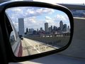
Passenger Windowby amyr37Comment: But it's not a building window...just kidding. Not a bad capture. It ultimately doesn't really take us too far, but it isn't a bad attempt either. 5 |
| 04/25/2006 12:35:23 PM |
Here I amby marvinComment: The picture is overall too dark. The only brightness is a blown or overcast sky, which doesn't add a whole lot either. Her expression is nice, but I also feel she is being lost in the picture. |
| Photographer found comment helpful. |
| 04/25/2006 12:34:19 PM |
Anticipationby jrjrComment: Cute. the biggest problem is the doll's face is blown which is not good since she's the subject. I do like the selective desat. 6 |
| Photographer found comment helpful. |
Home -
Challenges -
Community -
League -
Photos -
Cameras -
Lenses -
Learn -
Help -
Terms of Use -
Privacy -
Top ^
DPChallenge, and website content and design, Copyright © 2001-2026 Challenging Technologies, LLC.
All digital photo copyrights belong to the photographers and may not be used without permission.
Current Server Time: 06/20/2026 01:43:48 AM EDT.