| Author | Thread |
|
|
04/29/2006 10:39:09 PM |
|
Given my own portrait skills, feel free to take a large grain of salt here, but I'll comment anyway. I've read the critique club's thoughts - bad idea to do first, sorry, and I see what he's talking about. But that's the technical criticism. And when I just look at the picture, I see a lovely woman in a very nice shot. I very much like the background color, and don't see it blending with the dress. The set up was good, the make up is not over done, and her hair is beautiful. We all have things to learn here. But you're doing quite well. The eighteen people who scored this below a four were either in a hurry, or need to relax and just enjoy photography a little more. |
|
 Photographer found comment helpful. Photographer found comment helpful. |
|
|
04/29/2006 08:46:46 AM |
Greetings from the Critique Club!
I see that you have already received a lot of very good feedback from both during and after challenge. SOme of what I will say here will echo some of these opinions I am sure.
The good stuff that I see in this images is the composition and focus. Both look just fine to me. It would probably be worth experimenting with her looking a little bit more forward, but I like the concept.
On the technical side, what it mainly boils down to is the lighting. The flash seems pretty harsh; there is a distinct shadow to the model's left, especially near her chin where it is easy to spot. The pearl necklace is also reflecting far too much of the flash, the pearls look blown out in the center and become distracting. I like the pearls though, they add a lot to break up the darker elements.
If you could try this again, but with natural light, I think you would have a dramatically different and much better shot. Fill flash could be used at very low power to get a catchlight if necessary.
Take care, and keep shooting!
Rich. |
|
| Photographer found comment helpful. |
|
|
04/26/2006 08:49:04 PM |
|
What can I say, I love the photographer and the subject. I thought this was really well done, but can see where a little different lighting would have helped. |
|
| Photographer found comment helpful. |
|
|
04/26/2006 12:35:46 PM |
The good things:
1) The composition is nicely off center.
2) Her outfit. I like the Chiaroscuro effect of the black blending in with the background. The necklace is a nice touch too. (After reading the other comments I came back to add that my laptop monitor has trouble with very darks. On my screen her dress blends almost perfectly with the background and I like that. I saw others wanted it to either stand out MORE or blend in MORE. I think that's a fair criticism)
3) Her expression. I enjoy that she isn't looking at the camera and has a nicely demure smile on her face.
The big bad:
The flash washed her out quite a bit and I think this kept it from doing better. When we were voting one portrait after another, things like this would jump out and people would vote low. To be honest, I gave it a 4 and I can say it was for this exact reason, although now that I look at it closer, I think I was a too harsh. The rest is good and should have been rewarded.
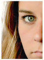
On a second look, the one thing that you lose with her lookinng away is any color to her eyes. They look very dark and we don't get that splash (although it looks like her eyes are brown/hazel anyway).
Message edited by author 2006-04-26 12:38:50. |
|
| Photographer found comment helpful. |
|
|
04/25/2006 07:49:31 AM |
|
I think a tighter crop and maybe the model gazing closer in the direction of the camera would have been good - flirting with the camera maybe? Nice colors. Standing a bit further away from the background may have gotten rid of the little shadow. Nice shot. |
|
| Photographer found comment helpful. |
|
|
04/25/2006 06:46:42 AM |
|
The pose is definitely designed to show off the hair. I think looking more towards the camera (as in yout "other choice") may have been better. Shame about the bit of shadow on the wall, too, but it's a good colour. |
|
| Photographer found comment helpful. |
|
|
04/24/2006 07:40:08 PM |
|
Jacque, I think you did very well with this challenge! Lovely model, lovely pose. I can see a very subtle difference between the dress and the background, but a soft light on the floor going up behind the model in front of the background might provide a bit more separation and depth. Really a very lovely portrait! |
|
| Photographer found comment helpful. |
|
|
04/24/2006 07:07:52 PM |
Good pose and night lighting...could maybe use a background light to bring the subject up off the background...I do see where the dress almost blends into the background...
Overall nice shot though |
|
| Photographer found comment helpful. |
|
|
04/24/2006 06:03:43 PM |
|
Beautiful model for sure and I love the pose. Maybe a portrait crop and maybe either lightening the background or the top (prefer lightening the background myself) would have helped but the compositional joy lies in the natural beauty of the model and the confidence with which it is expressed. Overall, I think that this is a great shot, one captured with tenderness. |
|
| Photographer found comment helpful. |
Comments Made During the Challenge  |
|
|
04/23/2006 10:41:53 PM |
|
vertical format would have been stronger |
|
| Photographer found comment helpful. |
|
|
04/20/2006 11:53:38 AM |
|
Magnificently bold composition. What can you do with hair like that? If you have it, flaunt it. Importantly, the subject is up to it. There is a strength of personality that is apparently quite capable of supporting this manner of portrayal. I would like to have seen the rest of the necklace and a little less dead space above the head, but you got the lateral placement right IMO. |
|
| Photographer found comment helpful. |
|
|
04/19/2006 04:44:01 PM |
|
I think this is a gorgeous photo of a gorgeous girl! The highlights in her hair and the lighting in just the right places on her face are beautiful! This photo will be treasured forever. . .long after this challenge is long forgotten! |
|
| Photographer found comment helpful. |
|
|
04/19/2006 03:26:22 PM |
|
beautiful gal. Love the expression. Necklace could have been shorter for this crop. Lighting may have been better from one of the sides to make this feel not quite so flat. Hopefully, you'll have a second posing session. |
|
| Photographer found comment helpful. |
|
|
04/18/2006 07:36:10 PM |
The hair really stands out and the smile looks very natural.
I think the lighting could've been better and a more complimenting background would've boosted your scores. |
|
| Photographer found comment helpful. |
|
|
04/17/2006 06:14:50 PM |
|
With the black dress it would be nice to see a lighter back ground. 6 |
|
| Photographer found comment helpful. |
|
|
04/17/2006 02:45:30 PM |
Hopefully some of the studio experts will take the time to comment on your photo. I am just a rank amateur but I thought I'd at least offer you some feedback in case you get none.
First impressions:
- I like the pose.
- Good color.
- The focus works.
- She young looking and natural so not going overboard in the processing works here.
- And I like the composition in general.
Things I'd look to try out/fix if it were me:
- Lose the necklace. Either that or use a smaller one so that it doesn't cut off at the bottom. Also it detracts in general IMO so I'd probably just go with something less eye catching.
- Darken the background more or lighten it up. As is her blouse does not quite blend into the background although it nearly does on my end. The fact that this is so makes it a bit of a distraction for me. I personally would make it darker to blend perfectly with her blouse.
- She has nice long hair, which to me seems like a golden opportunity (pardon the pun) to add some real impact to the shot. Such as having her off to the left and her hair flow through the frame to the right.
Anyway, those are just some thoughts. Good luck and I hope you do well! |
|
| Photographer found comment helpful. |
|
|
04/17/2006 08:14:04 AM |
|
Dark shirt and dark background do not work well in this pic. Also use of a hair light would have brightened the top of her head creating a more even look. |
|
| Photographer found comment helpful. |
Home -
Challenges -
Community -
League -
Photos -
Cameras -
Lenses -
Learn -
Help -
Terms of Use -
Privacy -
Top ^
DPChallenge, and website content and design, Copyright © 2001-2026 Challenging Technologies, LLC.
All digital photo copyrights belong to the photographers and may not be used without permission.
Current Server Time: 07/01/2026 10:07:47 AM EDT.