| Author | Thread |
|
|
05/03/2006 01:45:22 AM |
*Critique Club*
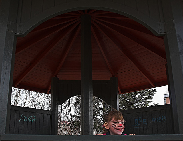
"Here I am" is a nice addition into the Window Framed challenge.
This was a very interesting location with a great little face to grab our attention. The image feels natural, unfortunately the graffiti is there but that is something we cannot avoid sometimes.
The image does feel dark. I understand that more then likely you were working with natural light, which is impossible to control. The lighting takes away from the little girl. I think it was an interesting pavilion to take a shot at. I just wish there was a better placement of the girl because this is a really cute idea. |
|
Comments Made During the Challenge  |
|
|
04/30/2006 02:50:23 PM |
|
the lighting is a little flat, which is hard cause it is natural light (or looks to be), some contrast whould help the image over all and add some dynamics- (light and shadow) |
|
 Photographer found comment helpful. Photographer found comment helpful. |
|
|
04/30/2006 10:47:07 AM |
|
Haha, love the expression on the kid, makes this photo work :) |
|
| Photographer found comment helpful. |
|
|
04/30/2006 09:57:01 AM |
|
Not well lit, the girl isn't enough of the shot to be dominating, and the graffiti doesnt' help. I would've chosen a different location myself. |
|
| Photographer found comment helpful. |
|
|
04/30/2006 02:02:41 AM |
|
Great expression. Good job on the exposure. I would have put more of her in the shot. |
|
| Photographer found comment helpful. |
|
|
04/30/2006 12:24:47 AM |
|
Cute shot... might have tried using a fill flash... |
|
| Photographer found comment helpful. |
|
|
04/29/2006 10:55:06 PM |
|
Composition feels unbalanced... I don't like that there's a pole coming out of her head. |
|
| Photographer found comment helpful. |
|
|
04/29/2006 06:46:38 PM |
|
I like it. It's fun! I might have cloned out the graffiti. |
|
| Photographer found comment helpful. |
|
|
04/29/2006 02:27:32 PM |
|
seems a little grainy to me |
|
| Photographer found comment helpful. |
|
|
04/27/2006 06:54:25 PM |
|
I can see where you were aiming for the symmetry of the pavillion but having the subject so low in the photo creates an imbalance to me. Still, I rather like the idea! |
|
| Photographer found comment helpful. |
|
|
04/25/2006 12:35:23 PM |
|
The picture is overall too dark. The only brightness is a blown or overcast sky, which doesn't add a whole lot either. Her expression is nice, but I also feel she is being lost in the picture. |
|
| Photographer found comment helpful. |
|
|
04/24/2006 10:58:51 PM |
|
too bad you're not allowed to clone out the graffitti in the background. otherwise it's a fun photo. |
|
| Photographer found comment helpful. |
Home -
Challenges -
Community -
League -
Photos -
Cameras -
Lenses -
Learn -
Help -
Terms of Use -
Privacy -
Top ^
DPChallenge, and website content and design, Copyright © 2001-2026 Challenging Technologies, LLC.
All digital photo copyrights belong to the photographers and may not be used without permission.
Current Server Time: 06/28/2026 09:03:30 AM EDT.