| Image |
Comment |
| 08/14/2006 12:53:05 AM |
|
 Photographer found comment helpful. Photographer found comment helpful. |
| 08/14/2006 12:45:42 AM |
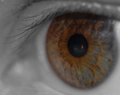
The Candleby ltlmschrisssComment: wonderfully captured eye. 7 (yer gonna get hammered on this one because the candle occupies, what, 200 pixels?) |
| Photographer found comment helpful. |
| 08/14/2006 12:44:40 AM |
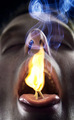
Spicy!by steinarComment: Neat idea, but boy, the shot is right up your nose... ;) That's not gettin' ya bonus points. I wish the coloring was better and the flame a bit less exposed. 5 |
| Photographer found comment helpful. |
| 08/14/2006 12:34:11 AM |
Rusty Wineby Jason_CrossComment: With shots like this you'll hit 6 with regularity. The capricious gods of math just beat you this time. A great shot! |
| Photographer found comment helpful. |
| 08/11/2006 12:34:41 PM |
Beachedby ShutterPugComment: I might have liked a crop which was more in landscape format rather than nearly square. Here, I'm not quite sure which bits and pieces are our main subject. The rocks? The logs? The thing in the background? (If this were advanced, I would have cloned that out in a heartbeat). The divide between beach and water is also smack down the middle. The other crop may have allowed for one to dominate more than the other. Sharpness seems just a bit soft to my eye, but I get all fanatical about that, so just ignore me. |
| Photographer found comment helpful. |
| 08/11/2006 12:25:18 PM |
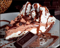
Chocolate Creme Pieby idnicComment: Holy cow Cindi, this is your shot? I think you got really lucky with a 5.4...
1) The whipped cream is blown
2) The picture is oversharp (look at the reflections on the chocolate cream layer)
3) There is something in the left corner which doesn't belong in the background.
4) It's centered.
5) It's static.
Ouch. I'm only so harsh cuz I know you are capable of far better. Did you put Rikki's army under retainer? ;) |
| Photographer found comment helpful. |
| 08/10/2006 05:59:09 PM |
The Lion Lies Down With The Lambby GeneralEComment: I think you are a victim of the shot being too cerebral. In the average 3-5 seconds the voter looks at a shot they aren't going to pick up on the contrasts between the prickly needles and the soft feather. People were also likely keyed into "tranquil or silent" part of zen due to the challenge description.
The focus and lighting are well done. You capture nice detail in the feather. The composition is perhaps a bit static. Not to exciting. I think the overwhelming 5's show people appreciated the technical quality but didn't care for the subject. |
| Photographer found comment helpful. |
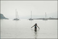
| 08/10/2006 03:17:44 PM |
zen-sur-zeeby xtineComment: I actually don't mind this picture at all. I may have tried a few things, but I think that would have led to a different shot and maybe not what you were going for.
If cropping would allow, I may have tried to push the girl even further in the corner. My impression of zen is large areas of negative space. This would have been accentuated even more with the girl further from the center.
To go for the different look, I may have boosted the contrast to the point the boats are almost sillouettes and tried to add a tint to the picture with color balance. Maybe orange, maybe blue. It would be worth a try. |
| Photographer found comment helpful. |
| 08/10/2006 03:11:43 PM |
Lights, Camera, ACTION!by Jaded_HousewifeComment: I think you found the weakest point yourself. The blur of the clapboard (nicely done BTW in hold the rest still) is lost in the white background. Therefore the best effect of the shot is lost. :(
Otherwise the composition is nice (if not a bit centered). The lighting is good (except those white background highlights). The focus is great. The blur is also great. Since we were looking for "action" and since it was lost in the background, I can see why you got voted lower, but with a nicely color background I bet this would have done much better. |
| Photographer found comment helpful. |
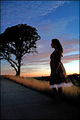
| 08/09/2006 02:44:17 PM |
Hushed Melodiesby ShannonLeeComment: The Zen challenge was difficult because everybody probably came in with a different idea of what Zen was. Personally, I was looking for a minimalist picture. In that regard, this canvas is too full. I think I may have had the same idea as a lot of other people as at least 8 of the Top 10 shots involve negative space or at least wide swaths of similar texture (the B&W field shot). You do capture a feeling of serenity quite nicely.
The sky is well captured. Nice colors, nice texture with the clouds. That's the best part of the shot. The sillouettes are nice too, but there is quite a bit of halo around the tree. If that's from burn/dodge, then it's your bad. If it's from a high-radius USM, you didn't go high enough. ;)
I'm not too crazy about the model's pose. To me it looks like she wants to walk somewhere, but yet she's standing. In other words, I can't quite tell what she's supposed to be doing. |
| Photographer found comment helpful. |
Home -
Challenges -
Community -
League -
Photos -
Cameras -
Lenses -
Learn -
Help -
Terms of Use -
Privacy -
Top ^
DPChallenge, and website content and design, Copyright © 2001-2026 Challenging Technologies, LLC.
All digital photo copyrights belong to the photographers and may not be used without permission.
Current Server Time: 06/21/2026 11:59:39 AM EDT.