| Image |
Comment |
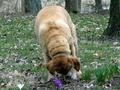
| 03/29/2004 02:38:51 PM |
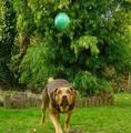
catch the ballby slonkoComment: Great idea, what a concentration that dog is showing. Would be more suitable for a portrait format, so with some parts of the side cropped away. |
 Photographer found comment helpful. Photographer found comment helpful. |
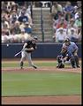
| 03/29/2004 03:19:07 AM |
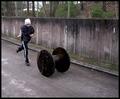
My Son In Motionby MonaComment: I see motion, but I don't see motion blur, looks pretty sharp to me. Some more thought to the angle of view to exclude the fence would also have improved the picture in my opinion. |
| Photographer found comment helpful. |
| 03/23/2004 02:12:43 PM |
|
| Photographer found comment helpful. |
| 03/23/2004 02:10:57 PM |
|
| Photographer found comment helpful. |
| 03/23/2004 02:10:21 PM |
|
| Photographer found comment helpful. |
| 03/23/2004 02:09:20 PM |
|
| Photographer found comment helpful. |
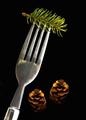
| 03/23/2004 02:08:37 PM |
Fortune Magazineby dsidwellComment: simple but very effective. Might need some more empty space at the top for text of the magazine cover. Great surface as well. 10 |
| Photographer found comment helpful. |
| 03/23/2004 02:08:08 PM |
|
| Photographer found comment helpful. |
| 03/23/2004 02:07:48 PM |
Dog Worldby Crafty SueComment: sorry, very bad picture, focus is behind the dog not on the dog, head is down, can't recognise the type of dog, composition is bang in the middle, not making it more interesting. Exposure is fine. Can't see this on any cover. |
| 03/23/2004 02:03:02 PM |
|
Home -
Challenges -
Community -
League -
Photos -
Cameras -
Lenses -
Learn -
Help -
Terms of Use -
Privacy -
Top ^
DPChallenge, and website content and design, Copyright © 2001-2026 Challenging Technologies, LLC.
All digital photo copyrights belong to the photographers and may not be used without permission.
Current Server Time: 06/18/2026 12:48:29 AM EDT.