| Image |
Comment |
| 02/06/2006 02:30:49 PM |
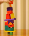
Steady Does Itby talmyComment: I gave this a 6. I thought the concept was good, colors also good. Main 'detractors' in this for me were; choice of base/background (minor) and the seemingly 'adult' hand (again minor) - if it were a small/child's hand, would have likely given it a little extra in my opinion. If the frame were a little wider and subject even more off-centered, likely would have helped too - again 'in my opinion'. Again, not good you received no comments during Challenge. |
 Photographer found comment helpful. Photographer found comment helpful. |
| 02/06/2006 02:13:59 PM |
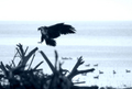
Returning from the huntby jbsmithanaComment: I gave this a 6. Nice capture. I recall thinking that 'if only' to see more of the nest would have made for a great shot, plus it seemed like a natural setting, which is always a good thing. The main reasons I didn't score this higher were the toning (loss of color/detail), the composition (but obviously an opportune capture - just seemed 'out' to me, if the placement within frame were the opposite of what it is here, likely have made this better, but a moot point in opportunity shots) and the slightly dominant branches at the fore with minor gamma(?) issues in the blacks. Not good that you didn't receive a single comment during the Challenge. |
| Photographer found comment helpful. |
| 02/04/2006 08:35:11 PM |
Rawby GunnsiComment: Again, I am not an expert in photography nor in advanced post-processing, especially involving RAW image conversion etc. If you are wanting to learn how to get more out of your images perhaps someone with more experience and knowledge will offer some help and advice. I did a 5 min edit on your shot bringing up the lightness and saturation, which brought out the grain more - I then applied a 'basic version' of Neat Image to it (rather than selectively softening/processing/etc) mainly for efficiency - I had to apply it 3 times, and still some vignetting/etc can be seen around some edges. edit:removed example Message edited by author 2006-02-06 14:34:32. |
| Photographer found comment helpful. |
| 02/04/2006 06:23:35 PM |
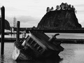
Grounded 2by KathycComment: 7 - Interesting photograph. Criticism; that bird nesting upper left, is a very good element here and if it were incorporated more 'somehow' would have been better in my opinion. The grain(?)/toning/b&w works well in this shot, however just a fraction too dark, resulting in loss of detail/elements/character, again - in my opinion. |
| Photographer found comment helpful. |
| 02/04/2006 09:52:50 AM |
|
| 02/03/2006 11:11:24 PM |
Summer freedom.by banditComment: 7 - Nice capture. Criticism; mainly the bottom and left crop/'cutting'. Perhaps a fraction more centered too, not sure. Nice contrasting 'warm feel' to this, especially in her hair, compared to the seemingly gray sky/clouds above - if 'that' could be emphasized 'somehow' may have given this just a little extra in my opinion. edit:typo Message edited by author 2006-02-08 06:10:11. |
| Photographer found comment helpful. |
| 02/03/2006 11:02:06 PM |
Yellow Tulipsby banmornComment: 7 - Nice. Nice color(s). Criticism; difficult, as the best focus is on the leaves/straps, which looks intentional, but perhaps if just a fraction more detail in either the middle or right flowers/color may have made this even better in my opinion. Maybe some more light 'play' incorporated. More finely tuned cropping bottom left corner too. |
| Photographer found comment helpful. |
| 02/03/2006 10:49:51 PM |
Experiance by egillbjarkiComment: 7 - Nice portrait/character capture. Toning works well. Criticism; not much, perhaps either cropping even tighter at the top to eliminate that hair upper right, but minor and changes the face/expression slightly so not sure. Typo in your title, unless it is deliberate. |
| Photographer found comment helpful. |
| 02/03/2006 10:32:53 PM |
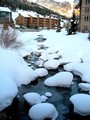
Creek With Snowby mystardreamComment: 4 - Good potential. Criticism; the apartments/chalets/whatever detract in my opinion from the overall feel of this shot, including their color. Perhaps this with toning or b&w may have been better not sure. I think this even cropped, still using this good sharp perspective (even sharper be better), trying to get a fraction more detail in the water/creek/ice/snow, and cropped at the bend of the creek/just before the 'railing'/fence, may have made this even better in my opinion, although obviously - a quite different shot. |
| Photographer found comment helpful. |
| 02/03/2006 10:26:51 PM |
Balanceby hussar_lasalleComment: 6 - Nice capture, composition and colors. Like the leaf perspective. Criticism; difficult but.. sharper. Perhaps also, depending what you had to work with, a tighter crop on the left to center the subject and leaf more may have also made this even better, not sure. |
Home -
Challenges -
Community -
League -
Photos -
Cameras -
Lenses -
Learn -
Help -
Terms of Use -
Privacy -
Top ^
DPChallenge, and website content and design, Copyright © 2001-2026 Challenging Technologies, LLC.
All digital photo copyrights belong to the photographers and may not be used without permission.
Current Server Time: 07/27/2026 03:56:07 PM EDT.