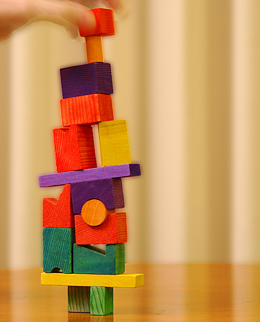
I gave this a 6. I thought the concept was good, colors also good. Main 'detractors' in this for me were; choice of base/background (minor) and the seemingly 'adult' hand (again minor) - if it were a small/child's hand, would have likely given it a little extra in my opinion. If the frame were a little wider and subject even more off-centered, likely would have helped too - again 'in my opinion'. Again, not good you received no comments during Challenge.
I like the colors and it certainly meets the challenge topic, but I see a sort of haloing or glow around some of the blocks, especially the darker ones. Perhaps that was an intended result of your chosen editing but it is a negative to me.
OK, this shot did not receive any comments during the challenge. If you look at the Gaussian distribution of votes here at DPC, there is another curve, inverse to the votes curve, that describes comments. The closer your photo is to the ribbon (either blue or brown) the more comments you get. This one is in the dead peak of the votes curve. Hence 0 comments.
Now that you understand the statistics behind the 0 comments, here is my take on it.
- saturation of the voting body (only 6 comments per entry, see here:challenge stats, while some recent challenges managed to get 15-16-17 comments on the average.
- uninteresting and unappealing photo. You have wooden blocks that would have been fine if:
* there was no blurred hand on the top. If you wanted to include the hand, then you should have changed your title to something else than "steady"
* the blocks were sharper (there is this aura around the blocks caused either by overzealous post processing or by shaky exposure during those loong 250ms)
* the background - those vertical lines/shadows that stretch even across the table, only represent a distraction, they do not enhance the photo at all.
* the colors of the background do not help bringing out the foreground.
All that said, I saw this image, there was an off-center object, did not appeal, did not have that many imperfections, clicked on 5 and moved on.
Your blurring the background resulted in a noticeable halo around the foreground subject, which makes it look artificial. A better way to do it in cases like this when the foreground is easily selectable is to select the foreground, copy it on a new layer, invert the selection, copy the background on another later, then clone the background into the empty area formerly occupied by the foreground (not all of it, but around the border), and THEN do blurring. Then of course place the foreground layer above this new background.