|
|
|
Showing 2941 - 2950 of ~4957 |
| Image |
Comment |
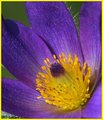
| 04/27/2006 08:04:36 PM | Complement within oneselfby shanky_pecComment: 5 - Nice. Wish it were bigger (640 height). Given the focus is sharper on the petals, perhaps a variation in the composition/crop would have made this even better in my opinion. Colors are nice, but would like to have seen a fraction less green, but difficult. Like the 'hairs' on the petals - again, if to 'somehow' have incorporated them, and 'held onto' the colors, may have made this a stronger image for this Challenge in my opinion. Not sure on the frame. |  Photographer found comment helpful. Photographer found comment helpful. |
| 04/27/2006 08:02:37 PM | Easter Egg?by MarkBComment: 6 - Don't mind the oddness nor abstractness and the coloring is good as is the clarity, seemingly. A variation in composition and cropping, possibly also angle, may have made this even better in my opinion. |
| 04/27/2006 08:01:39 PM | Orange and Blue! Bronco's Rule!by mbakerComment: 2 - Bit of a stretch. Perhaps a tweaking of the colors pp to get the bear a little more orange may have made this a stronger image. Seems a little blurry as well, so aiming for a more 'steady hand' may have helped you. Larger too - again, quality dependent. Still going to be a shot of a bear with a Bronco's hat on - so won't necessarily appeal to most nor hold their attention very strongly, unless it has certain 'dynamics' in it, which perhaps need a little more work here, in my opinion. | | Photographer found comment helpful. |
| 04/27/2006 07:59:48 PM | Mix-upby claudius1234Comment: 5 - Don't mind the concept. The white base/lighting/something isn't enhancing the image nor colors as well as perhaps a different color (difficult) may have. Might just be the lighting though, not sure. Like to have seen perhaps a little sharper angle/perspective, with less brush handle and label detail on the bottles, and more on the colors/paint, if that makes sense. | | Photographer found comment helpful. |
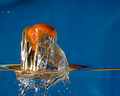
| 04/27/2006 07:57:43 PM | Does Water Conduct Electricity ?by sir_bazzComment: 2 - Ok. Colors seem quite good, the stop motion, whilst showing an unusual 'flow', is not as sharp as it would need to be for a shot like this to work best, in my opinion. However, will be back PC to see how you got this fish out of the water. | | Photographer found comment helpful. |
| 04/27/2006 07:48:54 PM | Break awayby scarbrdComment: 6 - Nice. Like the simplicity and the concept. 'If only' a little sharper focus on the flowers, but difficult. Colors very nice. Composition works as is, in my opinion, but might also lend itself to equally good, (if not better, who knows), variations, to enhance it even more. | | Photographer found comment helpful. |
| 04/27/2006 07:47:25 PM | Libertineby fotomann_foreverComment: 4 - Colors work quite well together here, but not sure they together are the dominant aspect of this shot. The blue toning works well, but the picture used, is possibly controversial re the 'literal artwork' rule, etc. Unusual refraction in the glass. Overall, not my taste/style. | | Photographer found comment helpful. |
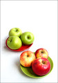
| 04/27/2006 07:38:08 PM | Memories of a country picnicby olbolComment: 5 - Like the concept. Like to have seen the colors richer, not quite so high key (but your call, obviously) and minor aspects, especially of the 'fore apple' (looks like some 'fluff', plus the surface/skin etc) and possibly tweaking of colors - the red dish at the rear clashes slightly with the red of the fore apples, if that makes sense - in my opinion. | | Photographer found comment helpful. |
| 04/27/2006 07:35:14 PM | Splash!by BigKComment: 5 - Like the strong colors. Concept slightly unusual, like to have seen more detail in the water(?) 'rising', quality dependent, perhaps a tighter crop may have helped this, or perhaps a different angle, if possible, who knows. Seems a little grain in the yellows as well, but difficult. Variation in composition may have also given this a bit more of an edge, in my opinion. | | Photographer found comment helpful. |
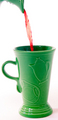
| 04/27/2006 07:32:35 PM | Thirstyby ClubJuggleComment: 5 - The green in the ceramics is nice. Your call on the choice of framing/crop, obviously, but I wonder if a little more width, and more jug/pouring incorporated may have made this even better. A slight nudge rotate up on the left too, just to get it 'level'. | | Photographer found comment helpful. |
|
Showing 2941 - 2950 of ~4957 |
Home -
Challenges -
Community -
League -
Photos -
Cameras -
Lenses -
Learn -
Help -
Terms of Use -
Privacy -
Top ^
DPChallenge, and website content and design, Copyright © 2001-2026 Challenging Technologies, LLC.
All digital photo copyrights belong to the photographers and may not be used without permission.
Current Server Time: 05/16/2026 12:29:28 PM EDT.
|