| Image |
Comment |
| 08/07/2006 07:14:24 AM |
all is calmby owenComment: I gave this an 8. Very serene and 'reflective' (no pun intended). Nice simplicity. Toning may have added something extra for this Challenge, who knows - but the color works well, 'naturally'. |
 Photographer found comment helpful. Photographer found comment helpful. |
| 08/07/2006 07:11:53 AM |
Floatingby banmornComment: I gave this an 8. Especially liked the water tension coupled with the texture(s) and color(s). |
| Photographer found comment helpful. |
| 08/07/2006 07:11:01 AM |
A cold misty morning somewhere in the universeby LalliSigComment: I gave this an 8. The 'feel'/mist that continues into the background/good dof showing the shapes of the land/mountains/hills/ranges, coupled with the water element works well. Not too sure on the dark 'vignetting', but likely adds to the above mentioned overall feel. |
| Photographer found comment helpful. |
| 08/07/2006 07:08:00 AM |
|
| Photographer found comment helpful. |
| 08/07/2006 07:07:06 AM |
Listen to the windby puzzledComment: I gave this an 8. Good meet of the Challenge in my opinion. The composition and 'elements', especially with this toning work well. |
| Photographer found comment helpful. |
| 08/07/2006 07:05:46 AM |
. by pointandshootComment: I gave this an 8. Apt for this Challenge. Nice clarity and gradient too. Good little 'story' in your Comments. |
| Photographer found comment helpful. |
| 08/07/2006 07:03:08 AM |
|
| Photographer found comment helpful. |
| 08/06/2006 04:31:09 PM |
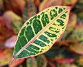
Leaf.jpgby rox_roxComment: Thank you for the comment on my image and using it as an illustration of an idea in the thread Floating leaves color on color. Hypothetically, had you entered this, I would likely have given this a 3, maybe 4. Main reason being how I interpreted the Challenge "Take a picture of a colored subject or subjects on the same color background.". The natural coloring of these leaves is so 'busy' that perhaps 'extracting' just one of the colors from within it and using that as the background color may have worked better (or vice versa). Still wouldn't have "met the Challenge" in my opinion, as I see primarily pink, green and cream/yellow. The only other main detractor is the focus/definition seems slightly lacking. The dof and use of it is good though, in my opinion. edit:removed 'TN'Message edited by author 2006-08-06 18:30:49. |
| Photographer found comment helpful. |
| 08/02/2006 05:38:52 AM |
Hanging onby philupComment: I gave this an 8. Liked the color(s) and the composition. Difficult, but just a little sharper/more definition, especially around the head, make this even better in my opinion. |
| Photographer found comment helpful. |
| 08/02/2006 05:38:46 AM |
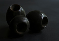
Oby shudderbugComment: I gave this an 8. Really liked the concept - difficult given the colorings, however just wish the blacks were bolder/more 'depth', if that makes sense. Perhaps a variation in lighting, not sure. Also, just a little sharper on the olives/texture(s). |
| Photographer found comment helpful. |
Home -
Challenges -
Community -
League -
Photos -
Cameras -
Lenses -
Learn -
Help -
Terms of Use -
Privacy -
Top ^
DPChallenge, and website content and design, Copyright © 2001-2026 Challenging Technologies, LLC.
All digital photo copyrights belong to the photographers and may not be used without permission.
Current Server Time: 06/10/2026 03:30:13 PM EDT.