| Image |
Comment |
| 11/17/2007 06:37:33 AM |
|
 Photographer found comment helpful. Photographer found comment helpful. |
| 11/17/2007 06:07:01 AM |
|
| Photographer found comment helpful. |
| 11/17/2007 06:04:53 AM |
|
| Photographer found comment helpful. |
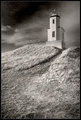
| 11/16/2007 11:42:55 PM |
Schoolboy's Dreamby davequickComment: I never did comment on this, but I gave this an 8. One of my favorite DPC images. Excellent example of timing to provide a classic photograph. I just wish I could see this bigger, mainly to get a good look at the boy's face. I had a look at your other images on your site and you have some very fine examples of photography. This is your only entry at DPC so you may never see this comment, but I hope you do - one day. Perhaps you'll make a poster from this, with this title (which I prefer over the one you had for it on your site) - I think it is a perfect fit. The only thing in this image I think might 'improve' on it would be a more refined crop to the left (and maybe the bottom), but minor and .. not sure as any adjustment might lose too much of the good context. Thanks for putting this on DPC. It's a classic, in my opinion. |
| 11/16/2007 11:30:57 PM |
Hexagonsby krukvaextComment: Now that's a bokeh overload (I mean that in a good sense). Interesting image. Guessing it is too busy in color. Like to see more of a focal point though.. difficult. |
| Photographer found comment helpful. |
| 11/16/2007 11:29:00 PM |
Arches in the Blue.....by NikonJebComment: Nice image, but looks like some pixelation/something issues. Blue toning is nice, but I see traces of red, so not sure (for this Challenge). Fairly minor, but the symmetry seems out, but could be your intent. The gradient is nice - hopefully natural, 'in image'. |
| Photographer found comment helpful. |
| 11/16/2007 11:26:20 PM |
Pink Rose on Black...by 777STANComment: 7 - Nice image. Like the composition. Difficult, but my eye is looking for some balance at the top with the black, so perhaps the anthers, and that area, a bit darker - but unless you did that manually in pp, an overall contrast adjustment looks like it would blow that petal out. Like your tone choice. |
| Photographer found comment helpful. |
| 11/16/2007 11:24:22 PM |
AveryTunnelby twade1Comment: Good potential. Looks like this is very grainy (and apologies if that is intentional), so you may have resizing/pp issues. This bigger (640), if the quality was there would be better. The tones are nice in this image but, I wonder about a variation for added effect, especially in this Challenge. |
| Photographer found comment helpful. |
| 11/16/2007 11:22:15 PM |
Sentinel of Haro Straightby Sunshine86Comment: 7 - Nice image. Like your composition. Difficult, but the lighthouse either softer or sharper - just seems to be 'in between', if that makes sense. |
| Photographer found comment helpful. |
| 11/16/2007 11:20:23 PM |
What's New Pussycat?by meowComment: Good potential, a variation in composition and 'bolder' tones, may have made this much stronger, in my opinion. |
| Photographer found comment helpful. |
Home -
Challenges -
Community -
League -
Photos -
Cameras -
Lenses -
Learn -
Help -
Terms of Use -
Privacy -
Top ^
DPChallenge, and website content and design, Copyright © 2001-2026 Challenging Technologies, LLC.
All digital photo copyrights belong to the photographers and may not be used without permission.
Current Server Time: 07/26/2026 06:04:28 AM EDT.