|
|
|
Showing 961 - 970 of ~1613 |
| Image |
Comment |
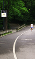
| 07/04/2008 05:32:00 PM | Running Through The Parkby EssAreDubyaComment: Critique Club Review:
Color Saturation and Hue: Colors are realistic and believeable. Skin tones are within normal range.
Brightness and contrast: The sign on the left of the image is blown-out and overly bright. Other than that, the other highlight areas work well.
What I see here is a nice image with a few problems. The sign really competes for attention. The brightness commands the eye to come to it. What happens when I look at this image is that my eye tries to follow the line, but winds up getting yanked away by the sign, and it follows the road less travelled, right up the steps. The steps themselves are a pretty strong competitor to your line. Though the runner is on the line, he is rather small in scale in comparison, and facing away which further minimizes the attention that he can command.
I would really like to see this one done again, with the runner coming towards the camera, running right on the line, and the camera moved or photo cropped so that the so the distractions are minimized by the elimination of the sign and the tree trunk. |
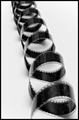
| 07/04/2008 05:19:32 PM | Unwoundby TirascoComment: Critique Club Review:
Color Saturation and Hue: N/A (image is monochrome)
Brightness and contrast: Brights are not overly bright. Darks could be a little darker. Nice inky blacks would have worked well here. I do like the shadows on the foam core, it gives dimension to the piece.
Focus and depth of field: Focus is good, depth of field is a little shallow. The foregound and background both go a little soft. I see your fstop was at 14, I don't know how much more you had left. Perhaps a little greater distance from the subject could have helped increase the depth of field. As this image comes across as an abstract shape, with no real beginning or end, I think that the depth of field is a little more critical here.
A nice interesting take on the challenge. Turning the spiral into your "line" worked very well. |  Photographer found comment helpful. Photographer found comment helpful. |
| 07/04/2008 05:10:29 PM | Curve in a straight worldby snafflesComment: Critique Club Review:
Color Saturation and Hue: N/A (image is monochrome)
Brightness and contrast: Bright areas are washed out, but it fits with the image. Dark areas are nice and rich.
Focus and depth of field are excellent.
I think I might have liked this one cropped a bit shorter. The building runs out into a featureless sky. A bit to the left and a bit shorter would have worked better for me.
I do like how you showed everything else is straight, even the buildings across the street. Very nice touch.
Looks like your score was hurt a bit by the litteralists who only wanted to see one line.
All in all, a nice image that i think should have scored a bit higher in the challenge. | | Photographer found comment helpful. |
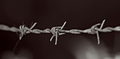
| 07/04/2008 04:39:12 PM | Line of wireby alpharichComment: Critique Club Review:
Color Saturation and Hue: N/A (image is B&W)
Brightness and contrast: Very well done! Dark areas are nice and inky. Highlights have kept their detail while being nice and bright.
Focus and depth of field: Focus is lazer sharp. One can almost feel the texture of the wire. Very nice... Depth of field is used to good effect to concentrate the eye on the intended subject. The busy background becomes a nice moody backdrop.
I like the lighting here. Nice and stark, which is what barbed wire is all about.
On the technical side the subject is centered top to bottom and side to side. The techie voters will have voted you down a bit for that.
Also the hairs on the barb on the left, even though softened, are identifiable and compete with the intended subject for attention. I find myself wondering what their story is. Had you selected that barb for the subject, the competion for attention would be gone, and the score might have increased. I think it might tell a little more of a story that way.
Overall an above average photo, and one I could see hanging on a wall or in a gallery. |
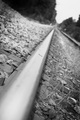
| 07/04/2008 04:27:23 PM | Keeping on trackby chrisgoddardComment: Critique Club Review:
Color Saturation and Hue: N/A (image is B&W)
Brightness and Contrast: The surface of the coin appears blown-out, and some of surface of the rail is also. However, this may be intentional for this image. Otherswise brightness and contrast are very good.
Focus and Depth of field. Focus seems a bit misplaced, depth of field feels a bit shallow. The rocks, spikes, and weeds are very sharp and well done. However, with the gentle curve of the surface of the track, and the lost highlights near the coin, the effect becomes that there is no portion of the track that is really in focus. The eye gets off the track to view the sharply defined objects and hesitates to complete the intended journey. The leading line, want to lead to the background, but it is soft. As is the foreground. Which leaves little for the eye to do.
I do like the angle of the image, and the overall idea. You have some good foundations here to build upon. I see that this is your first challenge entry. A very reasonable entry for a first timer. (Yes I do read the photographer's bio to try to get a sense of their style and where they are coming from.)
Hopefully you will keep going and enter again. |
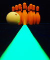
| 07/04/2008 10:31:13 AM | Right Down the Lineby hammersamComment: Critique Club Review:
Color Saturation and Hue: Lots of color! Nothing is over saturated, but there is a green artifact along the edges of the leading line where it is in soft focus, that are a bit odd.
Brightness and contrast: Image could be bit brighter. Contrast is good.
Focus and depth of field: Focus looks a little soft. Depth of field could be improved with smaller aperature.
With the soft edges on the leading line, the spots in the rug start to compete a bit. Most distracting are the line of bright dots along the horizon, leading the eye to the edges of the image.
I do not know how much control you had over the lighting in the black light room. However the top down lighting, results in the bowling pins looking a little flat. The ball has a nice shadow to tell the eye it is round. The pins need a little something also.
I do however, really like the uplight effect from the stripe on the lead pin. That is a very nice touch.
I think what hurt you most was the softness of the image. The rest works really well, and I'd love to see this one redone. This picture has very strong bones and you definetly have an eye for creative use of color. Keep at it, you'll make the top of the class before too long. |
| 07/04/2008 10:16:44 AM | The Dividerby arron_christensenComment: Critique Club Review:
Color Saturation and Hue: Very nicely done. Colors are obviously manipulated, but fit well in this image.
Brightness and contrast: Also very nicely done. The absolute black for congtrast works quite well. Highlighted areas carry detail very well.
Focus and depth of field. Focus is very sharp, which is needed in this image. Depth of field: N/A Surface is two dimensional.
As pointed out below, there is some sort of artifact along the right edge of the frame a bit above the centerline. However, I wouln't think it sufficient to seriously damage the vote on this image.
I like the color, love the featurless black. I would have probably given this image an 8. (I didn't vote.) I'm not sure what it is about this image that didn't get you higher. The purists, would have seen one line. So that wasn't it. It's almost as if the picture doesn't look quite finished. If the red area were smaller, that wouldn't have helped, and I'm not sure more red would have done it either. I've looked at different angles, the red starting in a corner, and nothing makes a huge difference. So there was no obvious "mistake". At this point I think maybe a light, modern, non-competing border (whatever that might be) would finish the image and set it off.
Nicely done...
| | Photographer found comment helpful. |
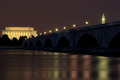
| 07/04/2008 10:00:11 AM | Arlington Memorial Bridgeby treyvusComment: Critique Club Review:
Color Saturation and Hue: Colors are well done, and realistic.
Brightness and contrast: Nothing is blown-out or overly bright.
Focus and depth of field: Very well done. Sharpness is appropriate at all distances.
I like the pastel colors on the river, that works well for me. The dark arches add a nice mysterious, almost foreboding touch.
I wish the sky were dark like the arches, but a cloudy night shot makes that almost impossible in the cities. It would really make the monuments and the lighting on the bridge pop. As it is the sky is lighter than the brige and competes with it.
Perhaps a bit different angle of perspective might help also. You have a nice leading line of the bridge, but unfortunately it goes right into a black treeline. If you could just get the city to take out that one tree...
Overall a very nice picture, I'd like to see it on a clear sky night to eliminate the pale sky. And a very well deserved top 30 finish. | | Photographer found comment helpful. |
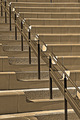
| 07/04/2008 09:43:50 AM | A Line Dividedby zackdezonComment: Critique Club Review:
Color Saturation and Hue: Colors are not realistic, but do work very well with this composition. Nice touch...
Brightness and contrast: Very well done. The sides of a couple of steps in the upper third of the picture are approaching burnout, but they are not distracting and do not really harm the image.
Focus and depth of field: Excellent Sharpness and detail are held throughout the image, which is what is needed in this type of compostition. I do agree however, with a previous comment that the image may have been a little over processed. The image looks over sharpened in a few areas.
Although the line is broken, I don't think it really hurt you. It takes a bit of sitting with the image to notice it. Even then the shadows carry through, which is why it isn't more noticeable, and not harming the image.
I like the sepia effect. It helps warm the image, and it would have been a colder harsher image had you left it natural.
You made a well deserved upper half of the class, but why did this image not score higher? (Personally I really like this image and could see it in a gallery or office.) I like the tone of the colors, I like the roughness of the back of the steps as a counter point to the soothness of the rest of the image. I like the nice clean lines.
Though not noted in the comments below, you may have recieved a bit lower vote because the litteralists will see more than one line. Which can happen all too often.
Nice work! | | Photographer found comment helpful. |
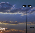
| 07/02/2008 10:58:31 PM | Light Poleby 777STANComment: Critique Club Review:
Color Saturationa and Hue: Colors and saturation are very nice. Hues are believeable.
Brightness and contrast are good.
Focus and depth of field are very good.
I think the problem here is you have this really nice sunset(?) photo, with light poles in the way. The rays of light grabb the eye and pull it down to the lower left corner, all the while fighting the light poles. End result two subjects, one picture.
The light poles sort of pop out of nowhere, and look a bit tilted. The litteralists also probably voted you down a bit because there were two light poles rather than one. (Oh yes, it does happen.)
As this is an advanced edtiting challenge, I would like to see this picture done without the light poles, and then one of the sun's rays highlited for that single line. | | Photographer found comment helpful. |
|
Showing 961 - 970 of ~1613 |
Home -
Challenges -
Community -
League -
Photos -
Cameras -
Lenses -
Learn -
Help -
Terms of Use -
Privacy -
Top ^
DPChallenge, and website content and design, Copyright © 2001-2026 Challenging Technologies, LLC.
All digital photo copyrights belong to the photographers and may not be used without permission.
Current Server Time: 07/19/2026 03:38:25 PM EDT.
|