Very simple shot of the binding on my guitar. Used my inspirations for my photo of an item side challenge, but really wished I could have used either of two other shots I had in there instead.
Photoshop was: convert from raw (reduced yellow saturation, increased blacks), cloned out couple finish spots and the strap peg, curves, curves again with a mask on the binding to make sure it was all white (part of it was still yellowish), selective color to touch up the red, usm, rotate, crop, save for web.
Statistics
Place: 41 out of 142 Avg (all users): 5.9750 Avg (commenters): 8.3333 Avg (participants): 6.0645 Avg (non-participants): 5.9184 Views since voting: 1025 Views during voting: 292 Votes: 160 Comments: 7 Favorites: 0
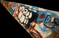
Color Saturation and Hue: Very nicely done. Colors are obviously manipulated, but fit well in this image.
Brightness and contrast: Also very nicely done. The absolute black for congtrast works quite well. Highlighted areas carry detail very well.
Focus and depth of field. Focus is very sharp, which is needed in this image. Depth of field: N/A Surface is two dimensional.
As pointed out below, there is some sort of artifact along the right edge of the frame a bit above the centerline. However, I wouln't think it sufficient to seriously damage the vote on this image.
I like the color, love the featurless black. I would have probably given this image an 8. (I didn't vote.) I'm not sure what it is about this image that didn't get you higher. The purists, would have seen one line. So that wasn't it. It's almost as if the picture doesn't look quite finished. If the red area were smaller, that wouldn't have helped, and I'm not sure more red would have done it either. I've looked at different angles, the red starting in a corner, and nothing makes a huge difference. So there was no obvious "mistake". At this point I think maybe a light, modern, non-competing border (whatever that might be) would finish the image and set it off.
This works very well for the challenge, and overall I like the image...but you've got something on the right edge. It almost looks like a little white triangle. Not terribly significant, but something to fix--7