|
|
|
Showing 931 - 940 of ~1613 |
| Image |
Comment |
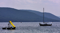
| 07/19/2008 08:49:35 AM | Yellow Slide On A Hazy Lakeby EssAreDubyaComment: Critique Club Review:
Color, Saturation, and Hue: Nothing is over saturated, the yellow pops well.
Brightness and contrast: The yellow is nice and bright, but the rest of the scene comes across as a bit cool, as if a little under exposed.
Focus and depth of field: Focus is sharp. Depth of field appropriate.
I really like the yellow slide. It pops quite nicely. However, the larger scale of the sailboat competes heavily for the attention of the eye. The passing boats compete to a smaller extent. I think I would have liked a little tighter crop here.
The horizon at lakes edge appears to be off level a bit. A little rotation and crop will fix this. There appears to be a little sensor dust, or are they birds, in the sky and above the foreground hill (and in front of the background hill) to the left of the sailboat.
The colors in the hills look a little over processed. Possibly over sharpened.
There not much that could be done with the sky, the weather is what it is. But either a more dramatic day, or possibly change the angle so the mountains take more space. Sunrise or sunset could work here too.
I like this picture. I gave you a 6 in the voting. I think this subject has a lot of potential. I'd like to see it done again, with more isolation of the slide. The idea of this nice bright yellow slide, the embodiment of fun, is sitting alone and unused is a good choice.
|
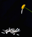
| 07/18/2008 08:07:10 PM | To Pull The Petal Will Decide My Fateby arron_christensenComment: Critique Club Review:
Color, Saturation and Hue: Colors are excellent. Nothing is over saturated and the hues are accurate for the subject.
Brightness and contrast: Brightness is good. Contrast is good as well. I really like the inky black of the background. There is one little nit to pick here. In between the two petals closest to the bottom of the image, there is a little dot, right in the middle about aligned with the top of the right petal. It's really insignificant, and at first I thought it was dirt on my monitor. Some of the white petals seem to lose some detail. But most have plenty of detail.
Focus and depth of field. Focus is very good, and depth of field is appropriate for this subject.
I like this picture a lot! Great use of negative space. I like the saturation of the yellow and greens here. The colors really pop in this image.
In the voting I gave this picture a 9, and I'm a little suprised that it did not finish even higher.
Congratulations on a very well deserved top ten finish. |  Photographer found comment helpful. Photographer found comment helpful. |
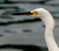
| 07/18/2008 07:57:38 PM | The Yellow Eyeby tpbremerComment: Critique Club Review:
Color, Saturation, and Hue: Colors are accurate, nothing is over saturated, hues are good for the challenge. The whites are nice and white.
Brightness and contrast: Brightness is very good. Contrast might be just a little bit high. Looking at the bird's bill, the detail gets lost on the lower half. I would have liked to seen some detail there. There is great detail in the white of the bird's feathers though.
Focus and depth of field: Focus is nice and sharp, depth of field is shallow to help isolate the subject.
Unfortunately while the shallow depth of field should have helped you, it also hindered you in this image. The water is renedered very softly, but then the waves formed large dark patterns to distract the eye in a couple of places. Perhaps sharper here would have worked better. Or as already suggested, an alternate background. Perhaps if you had been able to take the image from a lower angle to include the horizon and some sky.
I like the compostion, and I think the picture would stand the test of time, and look good hanging on the wall even a couple of years later.
| | Photographer found comment helpful. |
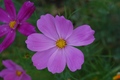
| 07/18/2008 07:42:53 PM | Poppies will put them to sleepby DrunkcaballoComment: Critique Club Review:
Color, Saturation, and Hue: Colors appear accurate, saturation is not overdone, and hue is appropriate.
Brightness and contrast: The brightness is a little low on this image, which makes the colors look a little bit cool. A little brighter would help the colors of the flower pop.
Focus and depth of field: Focus is good, depth of field could be made more shallow with a larger aperature, to help eliminate competion for the subject.
The grass is still distinct enough to make the background look busy and distract the eye. The flowers at the left, with their deep purple hues, are still distinct enough to compete. Their softness also tends to trick the eye into thinking that the subject is a little bit soft was well.
I would suggest that next time, try not to center the subject quite as much, and either move the other flowers out of the way or include them in the focus zone. | | Photographer found comment helpful. |
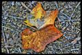
| 07/17/2008 11:01:59 PM | "The Lost Leaf of Alice"by Joker1114Comment: Critique Club Review:
Color, Saturation, and Hue: Colors are obviously manipulated for effect, but work well for this composition.
Brightness and Contrast: Both are very good. Plenty of great detail is visible, with nothing overly bright or overly dark.
Focus and depth of field: Focus is very sharp, depth of field is appropriate for this image.
This image is quite interesting. The background is very busy, and it competes with the leaf like crazy. At the same time, the color manipulation makes things look a bit out of focus, unless you look close. Centering the subject is the kiss of death to the rule of thirds purists, and likely hurt your score quite a bit.
I think the biggest problem is that this is the wrong medium for this image. The presentation on the computer screen for voting isn't large enough to do this image justice. As I sat here looking at this and trying to figure out what was really grabbing me, and what I wanted out of it, I realized I want to see this image BIG! You've moved the leaf from straight photograph to art. I could see this blown up on a wall in a bank lobby or a gallery. If this image was about five feet tall, I think it would really come into its own. | | Photographer found comment helpful. |
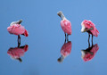
| 07/16/2008 10:18:30 PM | Pretty in Pinkby Shadowfax23Comment: Critique Club Review:
Color, Saturation, and Hue: Colors are beautiful, very realstic. Nothing looks over saturated or over processed.
Brightness and Contrast: Both are excellent. Highlights are not blown out, contrast is appropriate for this image, shadows hold details very well. Over all lighting is very good. Nice work...
Focus and depth of field: Focus is excellent. Extremely sharp, as it should be in this case. Depth of field works well.
I might have liked a little tighter crop to get a better look at the birds. I like the separation of the one, from the other two. I might have like the two on the right a bit closer, but then this isn't like posing people. Perhaps one bird facing the camera would have been a bit better also, but then again, it isn't like they take direction.
Beautiful birds, and I really enjoyed this photograph. Congratulations on a well deserved top ten finish. You were up against some really good stuff. In another challenge, you might well have taken home a ribbon.
| | Photographer found comment helpful. |
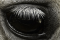
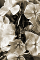
| 07/14/2008 09:32:23 PM | Stable Dreamsby Joker1114Comment: Critique Club Review:
Color, Saturation, and Hue: N/A image is monochrome.
Brightness and contrast: Contrast is good, brightness seems a little low.
Focus and depth of field: Focus is nice and sharp, depth of field is excellent for this image.
I think the biggest problem with this image has already been pointed out. The eye came out dark and featureless. Had the whites of the eye come out properly, I think this image would have scored much better. When the eyes are not right, people tend to vote an image down. (Evidently something must make them uneasy about odd looking eyes.)
| | Photographer found comment helpful. |
| 07/12/2008 03:43:44 PM | Lit by LightBulbby eransh10Comment: Critique Club Review:
Color, Saturation, and Hue: Colors are good. Skin tones are accurate, and nothing is over saturated.
Brightness and contrast: Highlight areas are starting to blow out. See forehead, and near right eye. Any brighter and it would become very noticeable. Shadow areas hold good detail.
Focus and depth of field: Focus is nice and sharp. Depth of field is appropriate for image.
Subjective: You were killed by the litteralists who did not see a lightbulb. Even though you used two strobes, it did come across as single bulb lighting. However, they wanted to see the bulb.
I like the look of the lighting, looks like stage lighting. Though it is maybe a tiny bit harsh for my taste as the highlights were starting to burn out, as I mentioned at the top. While I do not need to see a lightbulb, I don't think it fit the challenge as well as others. I think you would have done much better in a free study or portrait challenge, with this photo. |
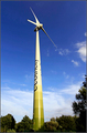
| 07/12/2008 03:24:40 PM | The Answer is Blowing in the Windby bobonacusComment: Critique Club Review:
Color, Saturation and Hue: Colors are bright, and fit the subject. Nothing is over saturated.
Brightness and Contrast: Both are done well. Nothing is blown out, shadows hold detail well.
Focus and depth of field: Focus is very sharp, depth of field is appropriate for this image.
Subjective: Meets challenge well. It's green and it is colored green. A two-for-one deal. Nice interpretation.
Things I would have liked to seen. Either more clouds or fewer clouds would have worked better for me. I liked the layered clouds in the bottom half of the picture. The puffy clouds at the right, distracted the eye and pulled it towards the edge. As did the tree at the right edge. If the windmill were more towards the left of the frame, perhaps the tree at right could have been used to provide scale. Cropping the tree out would have worked well also. As is, the windmill is a bit centered.
Overall a very interesting photo, a nice take on the challenge, and a well deserved top 25 finish. | | Photographer found comment helpful. |
| 07/12/2008 02:08:44 PM | Flower Bulbby posthumousComment: Critique Club Review:
Color, Saturation, and Hue: N/A image is monotone
Brightness and contrast: Highlights are about at the limit in the bright areas (see flower to left of bulb base) shadow holds details well.
Focus and depth of field: Background distractions are nicely minimized, but closest flowers go a bit soft. (see bottom edge of lower right flower.) Maybe one more f-stop would have helped.
Subjective: Meets challenge well. I like the idea, but the lightbulb is centered, a rule of thirds no-no for technical voters. Break the rule only if you have a good reason. I think the bulb just does look a little bit just stuck in there.
I do really like the way you matched the flowers to the bulb. Nice work. At first I thought I would rather have seen this image in color. But as I sit with it a bit, you have won me over and I can see your vision. | | Photographer found comment helpful. |
|
Showing 931 - 940 of ~1613 |
Home -
Challenges -
Community -
League -
Photos -
Cameras -
Lenses -
Learn -
Help -
Terms of Use -
Privacy -
Top ^
DPChallenge, and website content and design, Copyright © 2001-2026 Challenging Technologies, LLC.
All digital photo copyrights belong to the photographers and may not be used without permission.
Current Server Time: 07/19/2026 02:27:37 AM EDT.
|